we+Ruby Gardens
An elegant identity for a mixed-use building complex in Amsterdam, set in a retro-modern trend. Based on shapes inspired by nature, harmony and ecology. Calm, gentle, delicate, nostalgic.
About Ruby Gardens
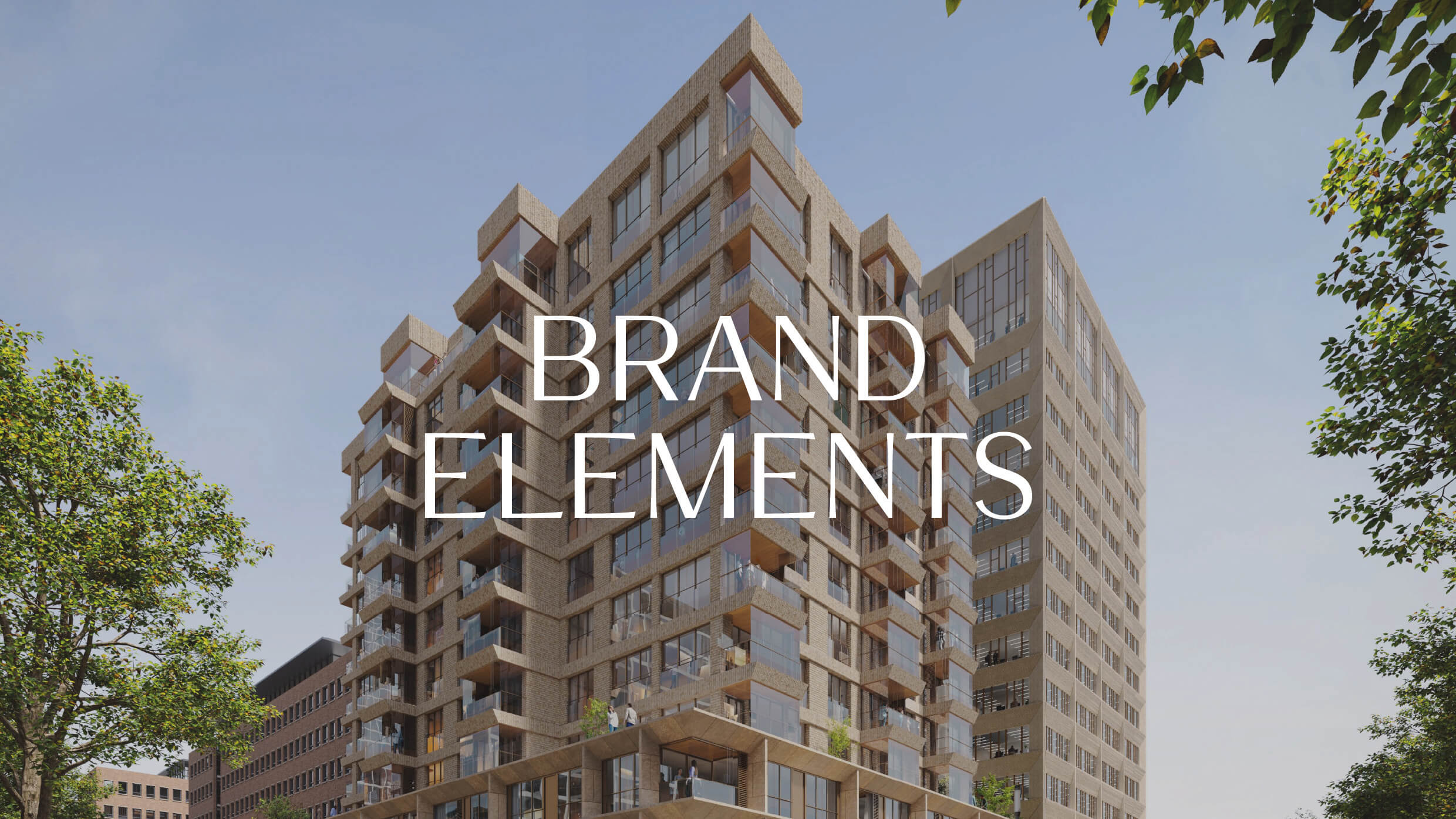
Ruby Gardens is a new development and the cornerstone of a vibrant new neighbourhood in the Amstel III area, located in Amsterdam Zuidoost. Creatively and thoughtfully designed, with a top floor warmly illuminated like a lighthouse, it will become a new iconic city landmark. Two elegant towers of warm-toned brick, granite and concrete are supported on a natural stone plinth. One tower is for residents, the other for offices. All enjoy high ceilings and great views.
On top of the plinth sits a public roof garden – visible from the ground level – complete with eating, meeting, work and event spaces.

Illustrations and icons
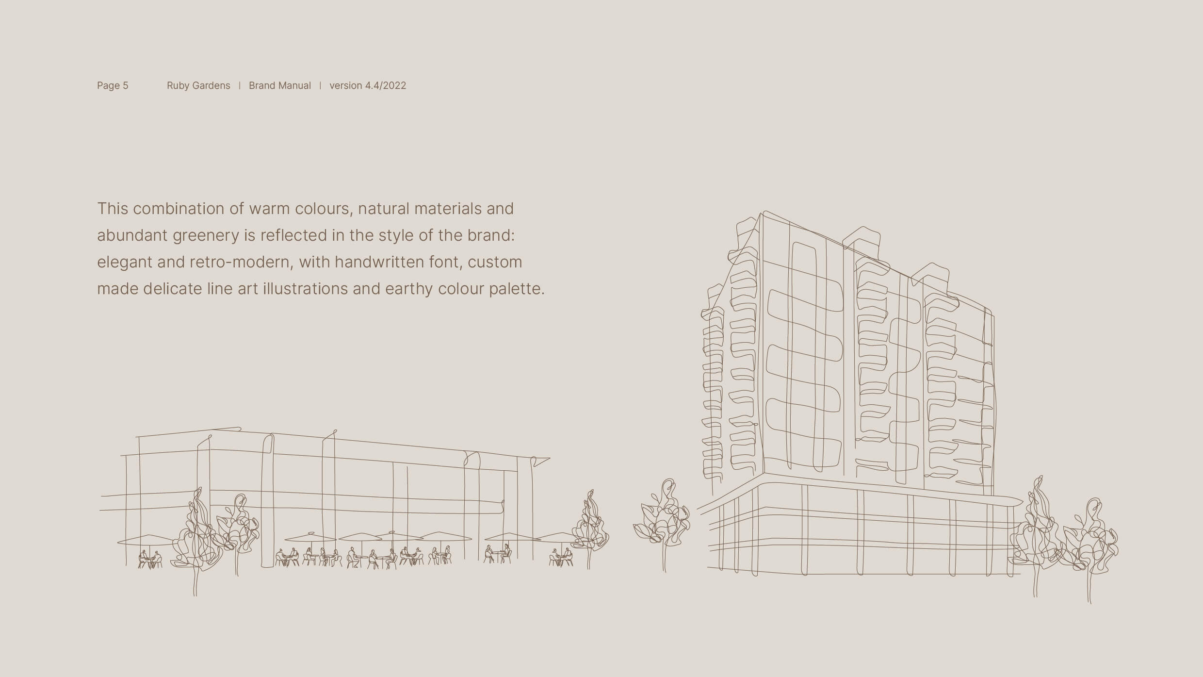
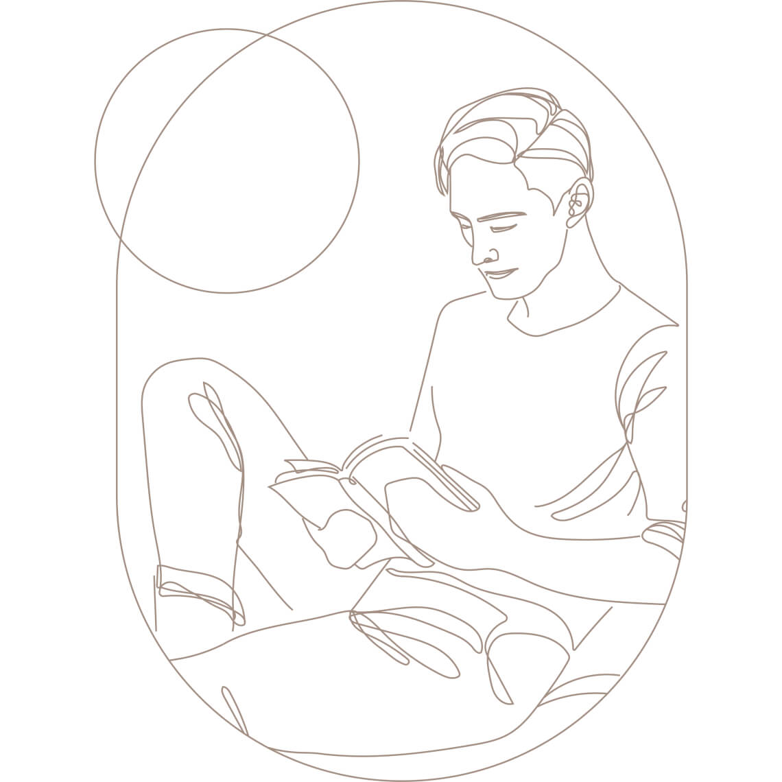
In the case of Ruby Gardens, the collaboration with illustrator Agnieszka Kumańska was of great importance. Her elegant, beautiful icons and illustrations have become an important element defining the brand’s personality. Their organic character and unique style perfectly harmonises with the delicate nature of the brand and enriches the visual language.




Shapes and
colours
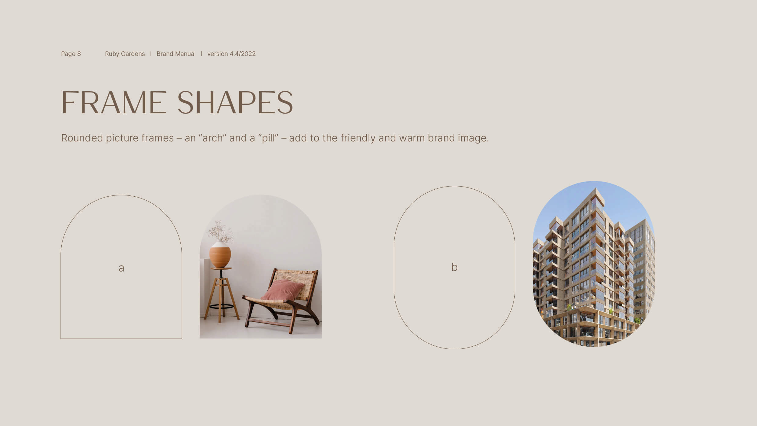
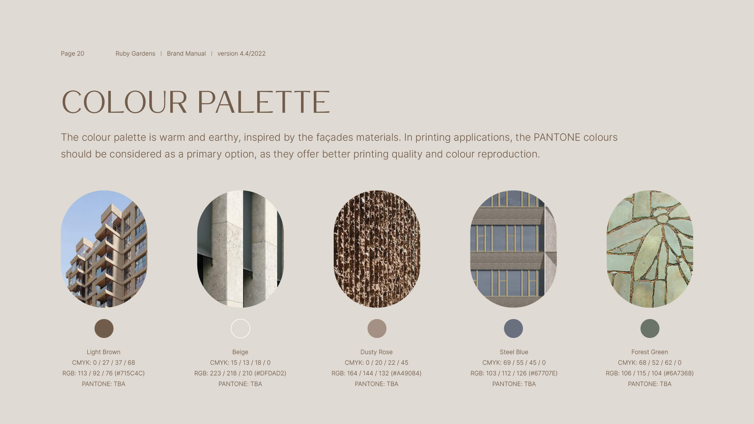
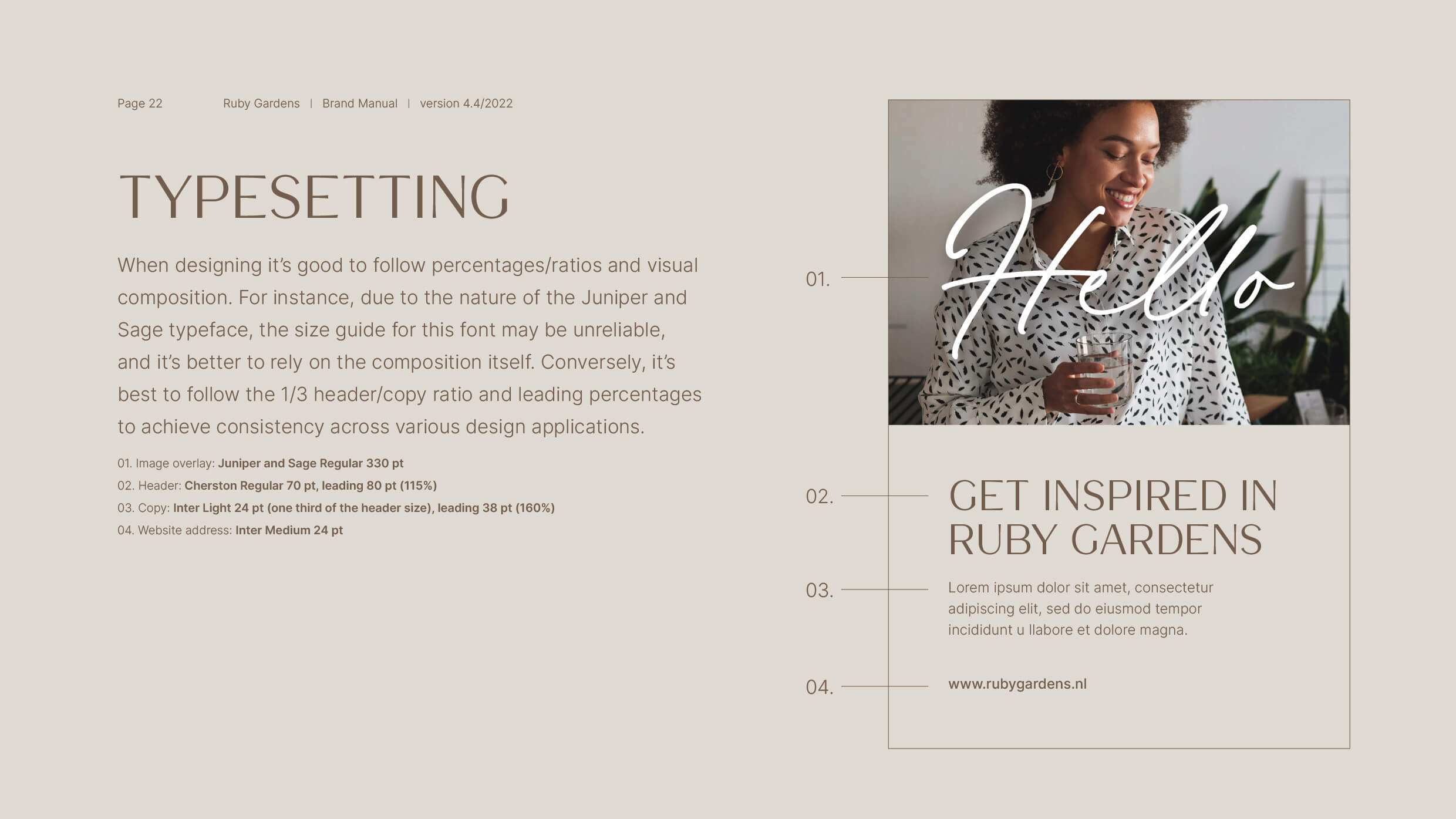
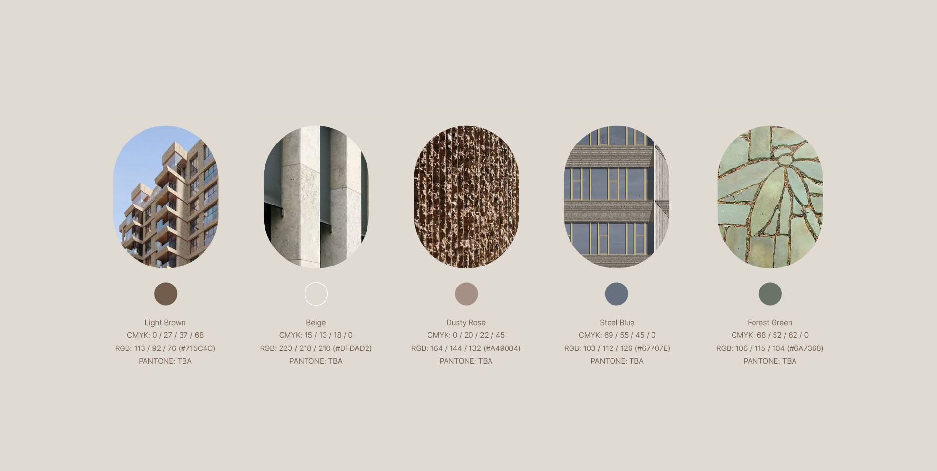
Earthy warm colour palette inspired by the façades materials, arches and nature-inspired oval forms, line-art illustrations and handwritten font, come together in a consistent brand image. This combination adds up to the elegant and retro-modern style of the brand.



Sections
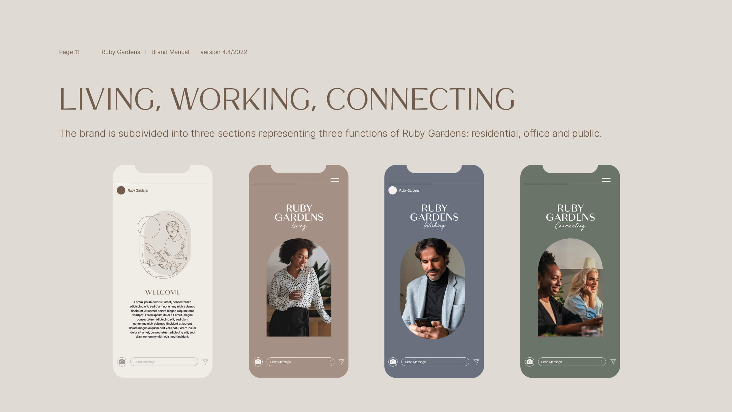
The brand is subdivided into three sections representing three functions of Ruby Gardens: residential, office and public.
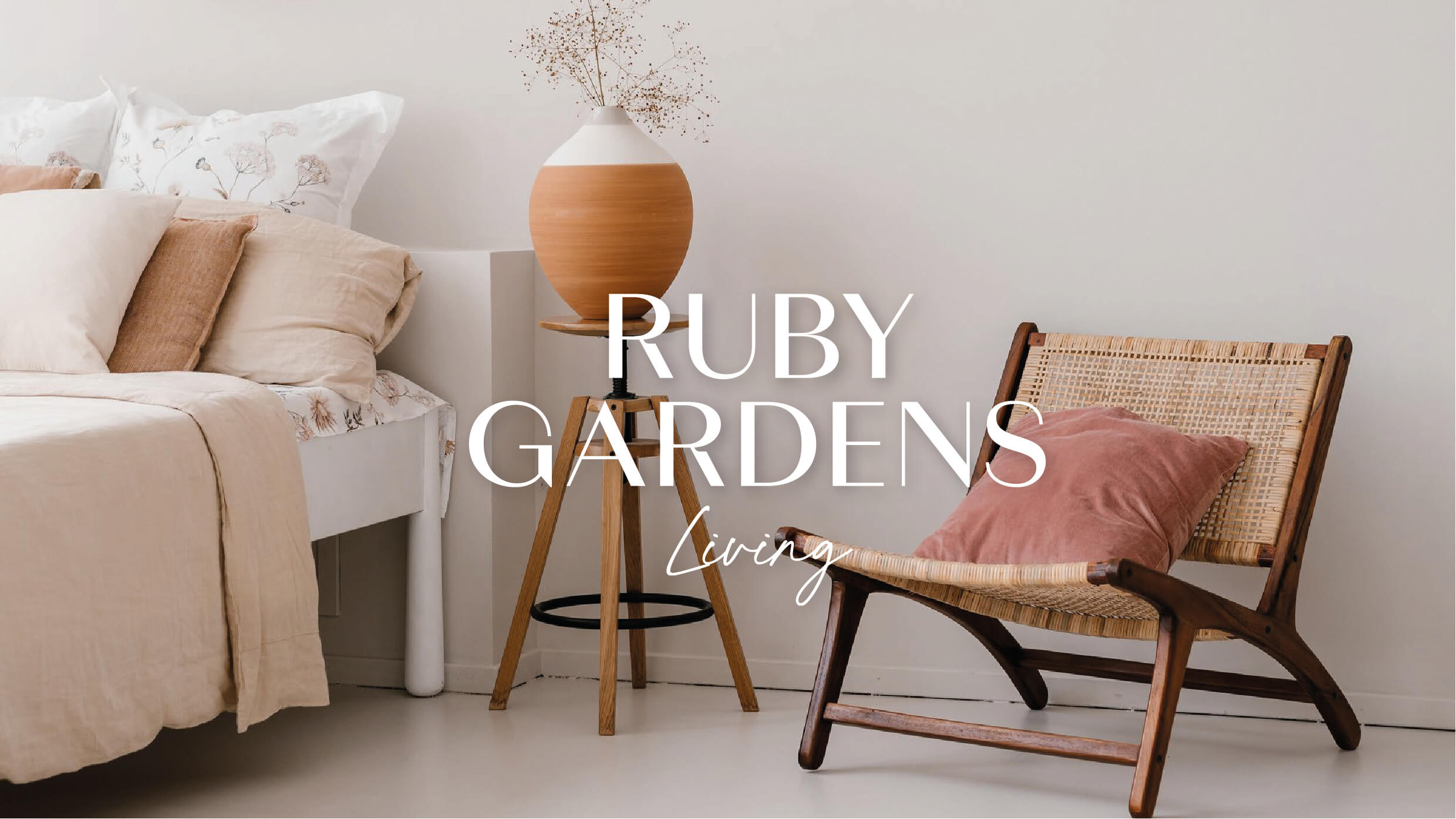
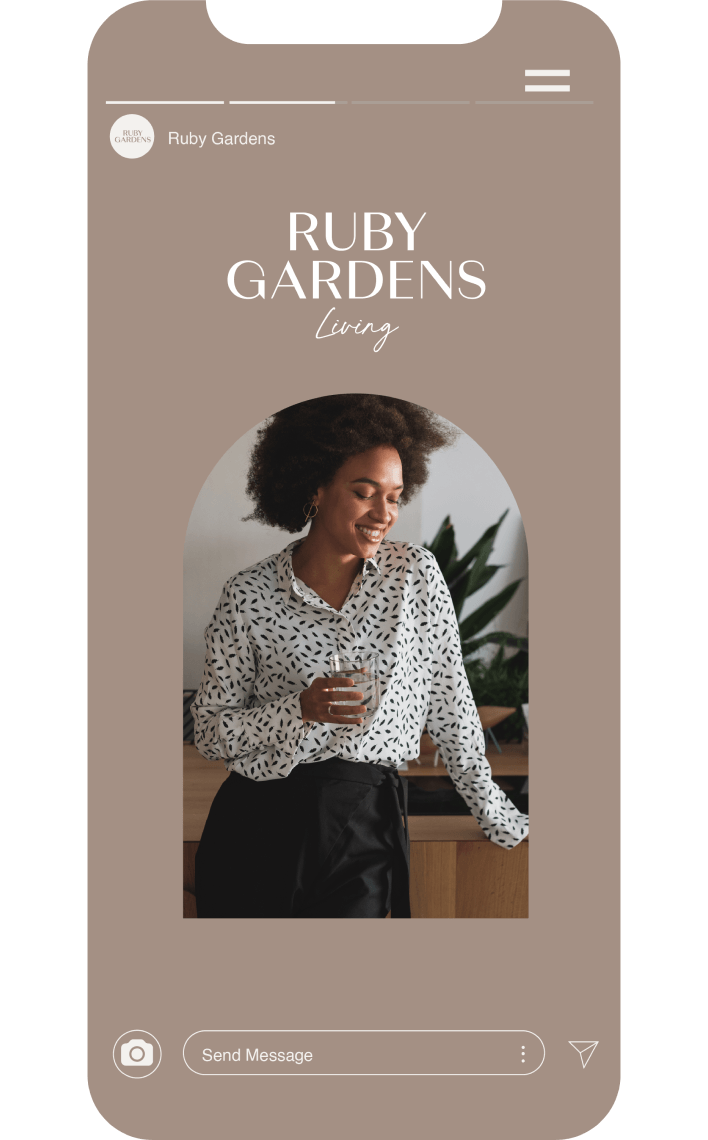
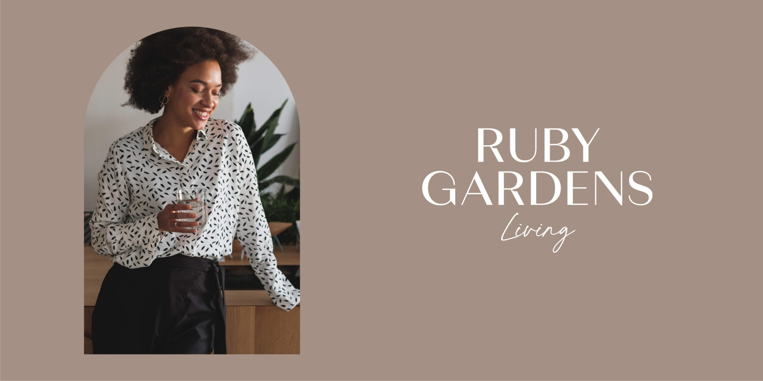
“Living” part of the brand identity reflects the stylish, casual, and laidback vibe of future residents. Combining the warm, cosy feel of home, but still aspirational and elegant.
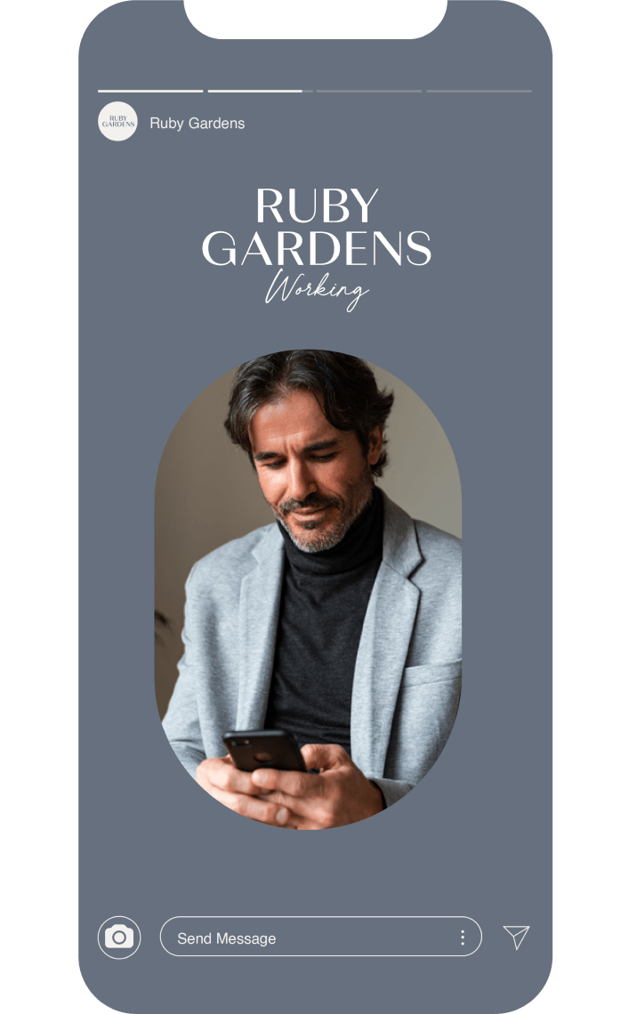
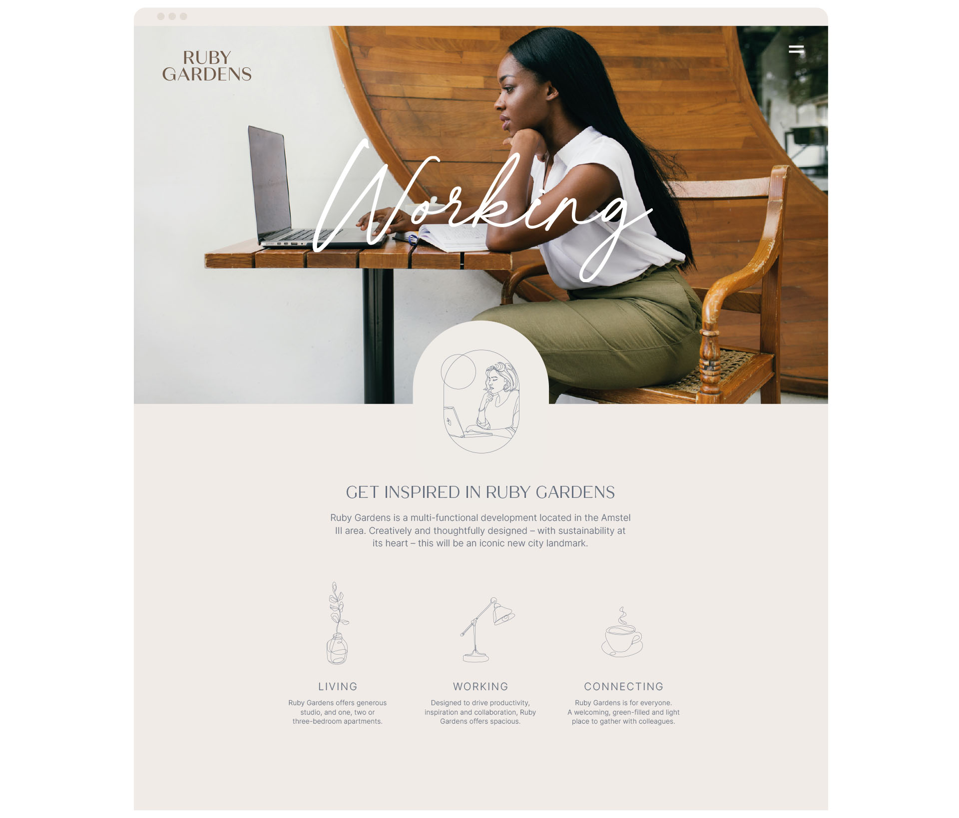
The “Working” brand identity is designed to appeal to this professional audience. The cooler, steel blue palette feels more toned down, modern and tech. It stands on its own yet remains part of the wider brand family.
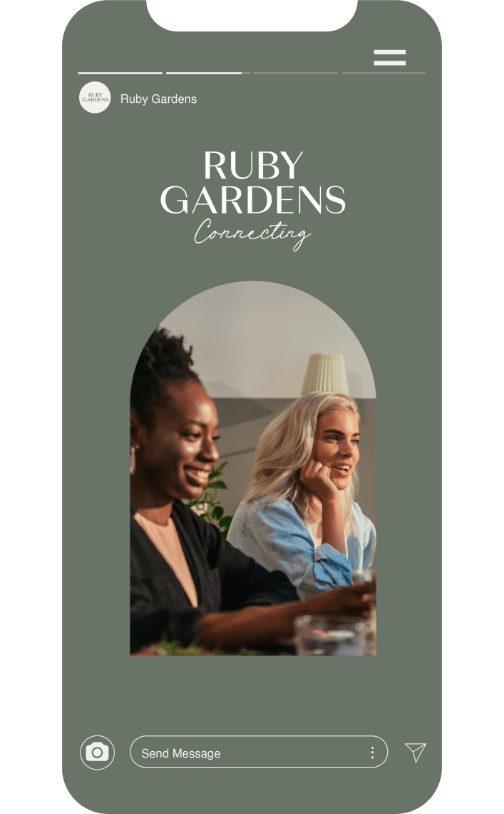
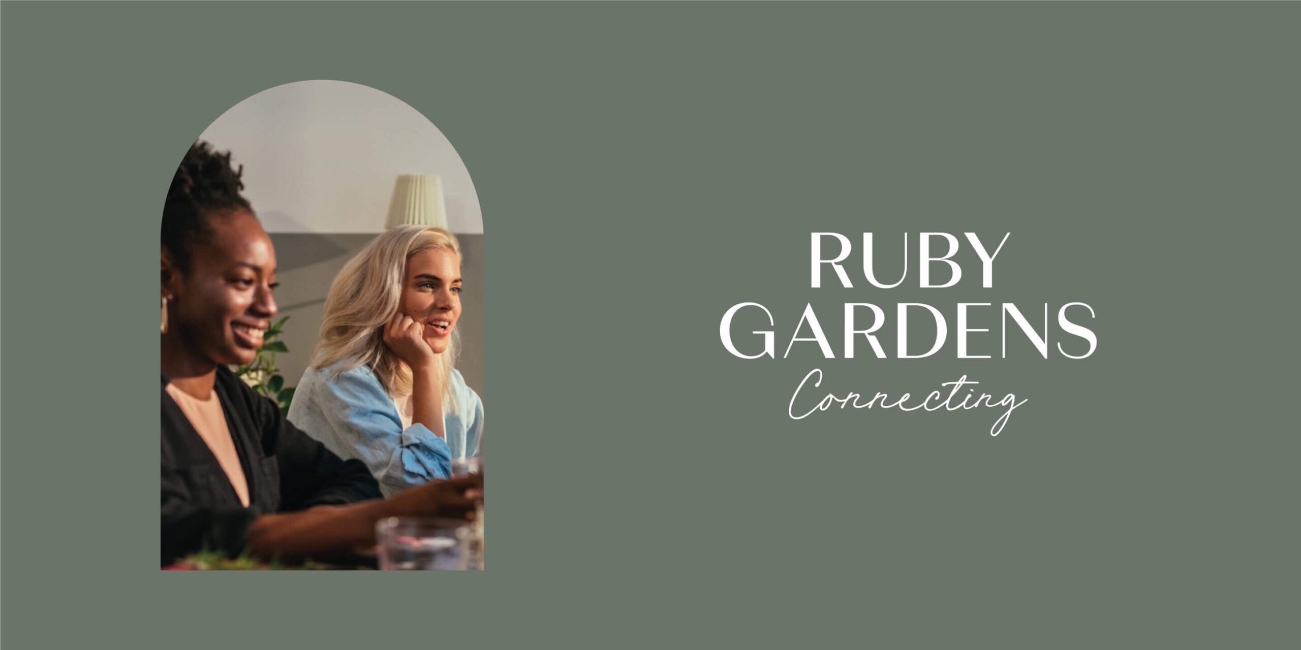
The forest green of the “Connecting” element of the brand reflects the vast amount of greenery and biodiversity both within and around the development. It supports the image of Ruby Gardens a place for people to connect and gather in a welcoming, green-filled, light and airy environment.



Branding
materials
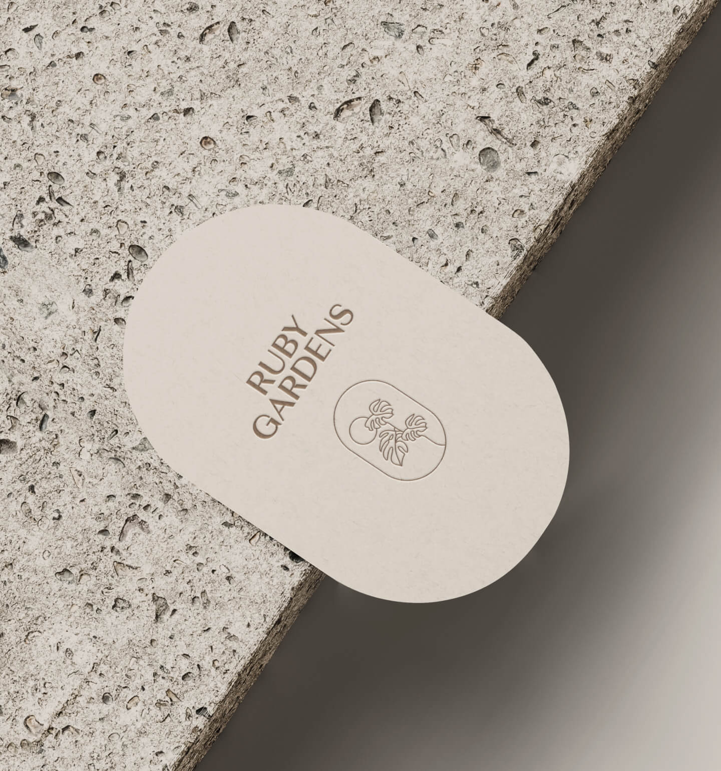
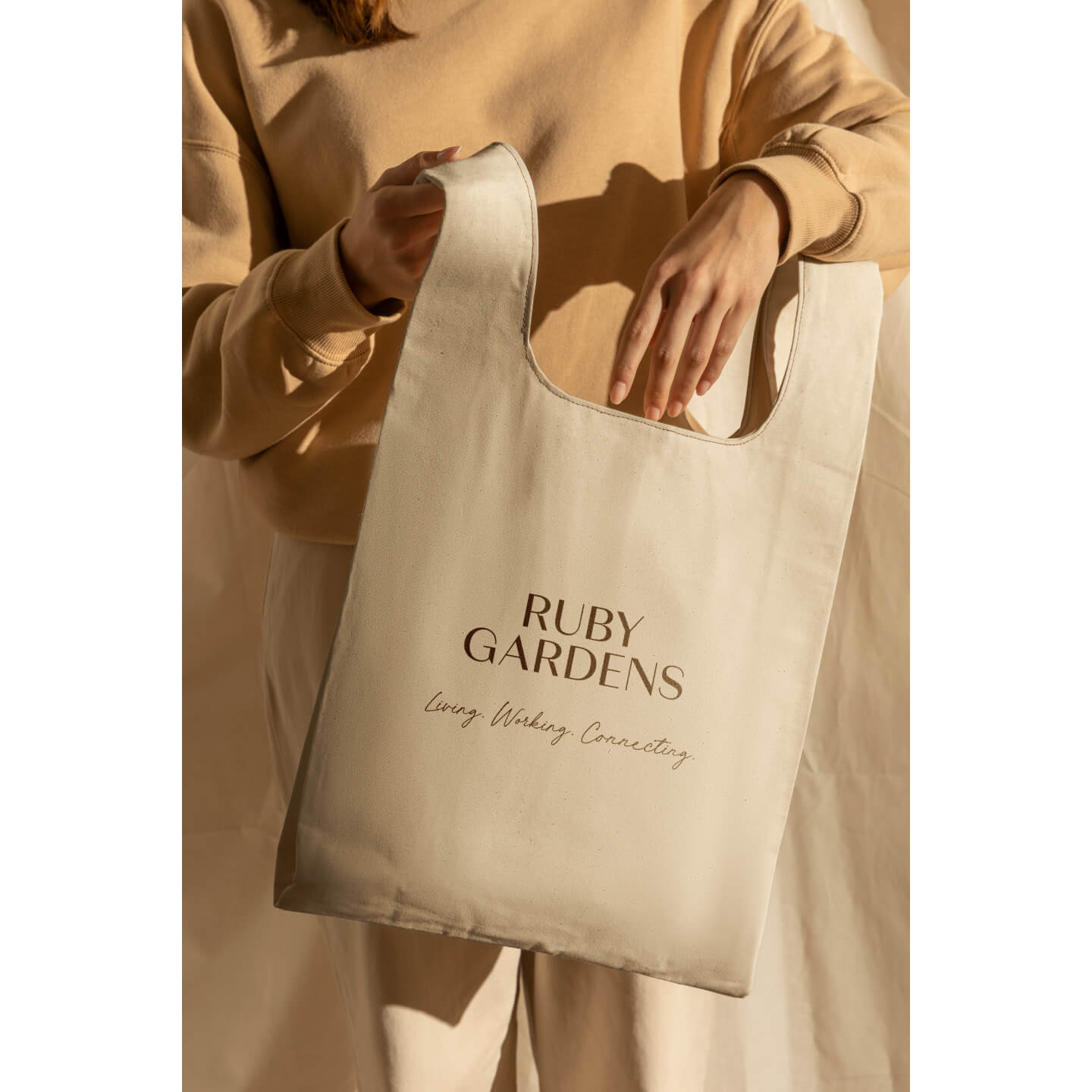
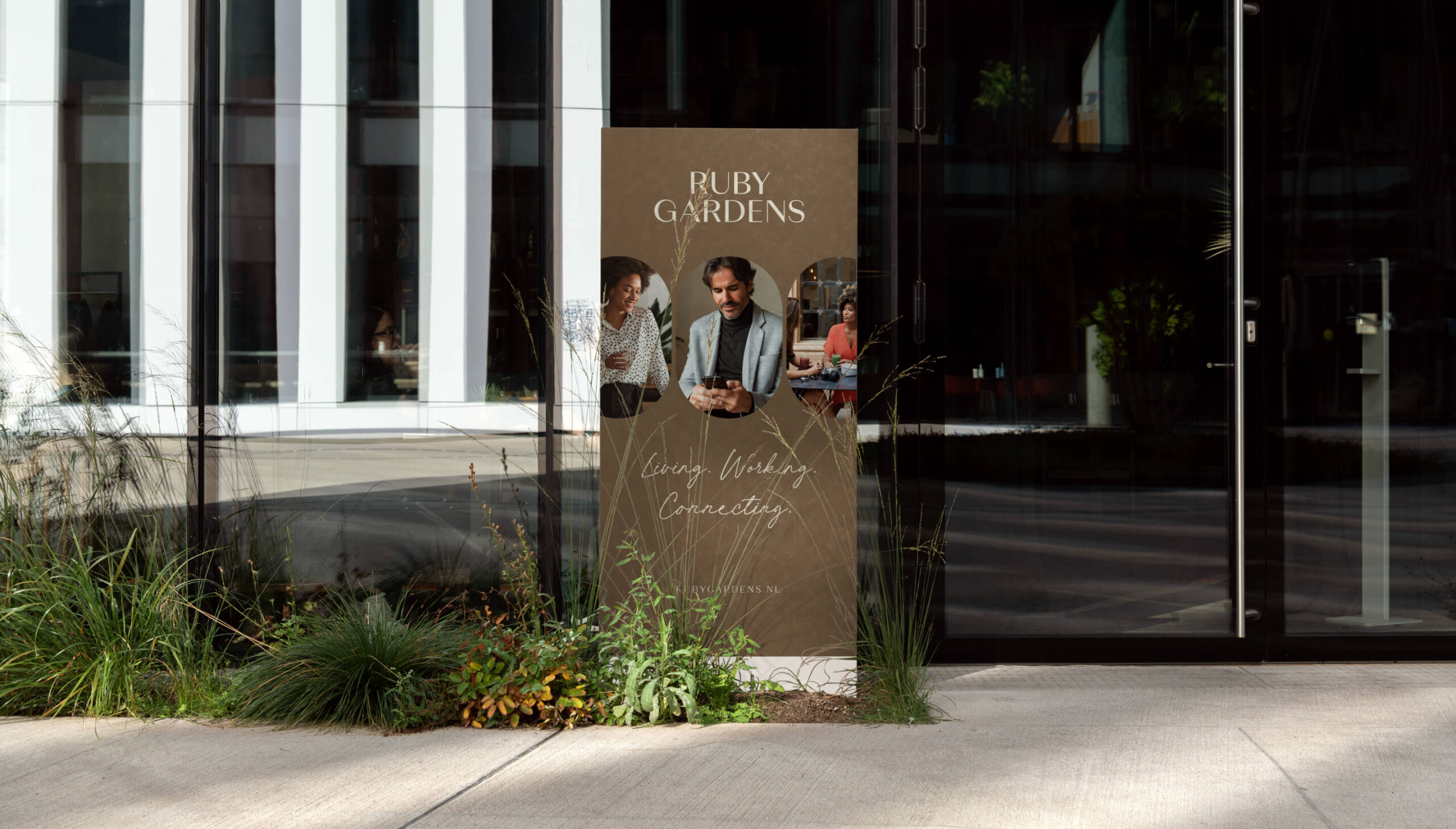
A wide selection of branding documents and supporting items like tote bags, leaflets, press ads, banners, gadgets, occasional materials, notepads, pens, stationery etc. were designed to communicate brand values across various on-line and off-line channels.

Website
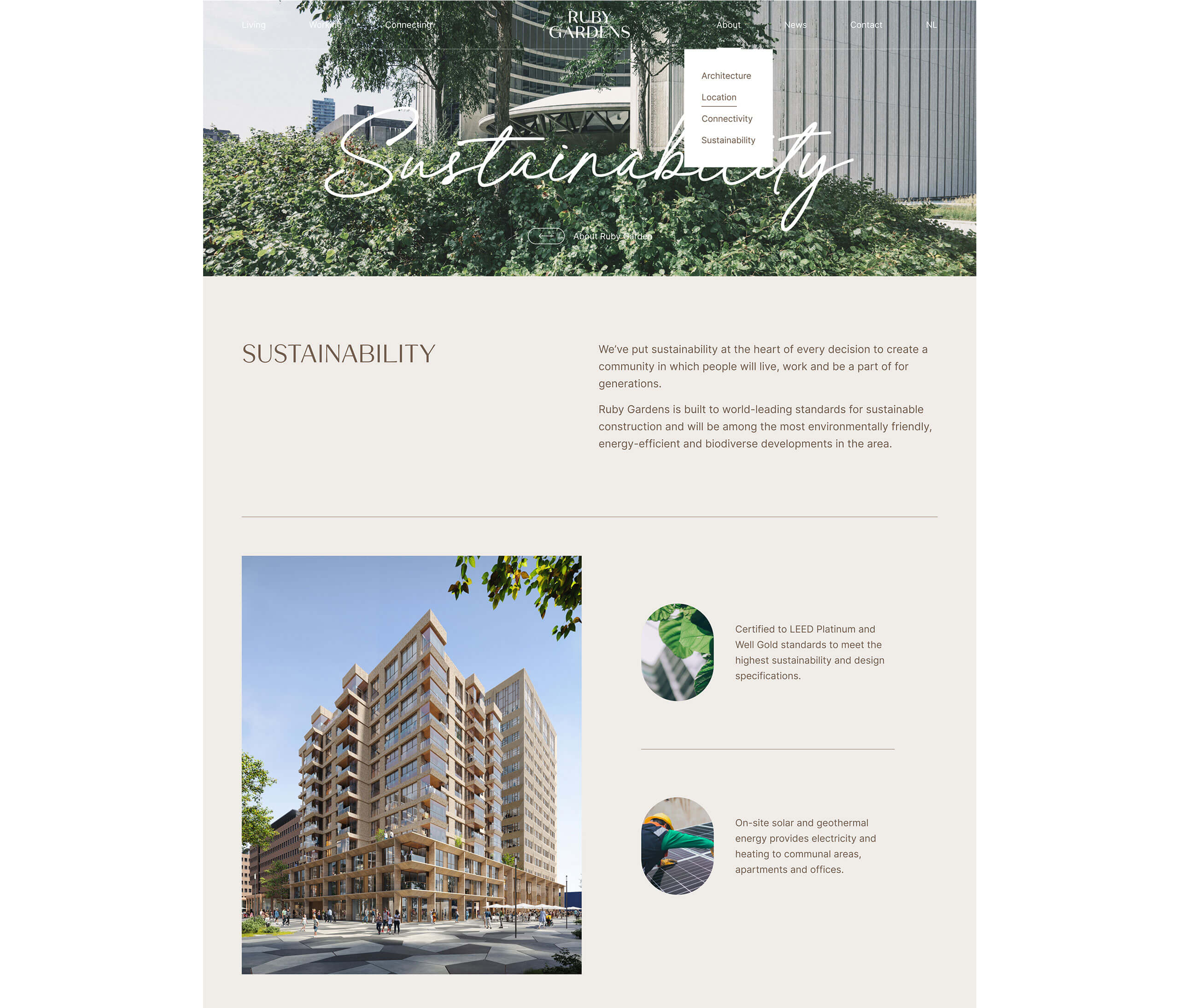
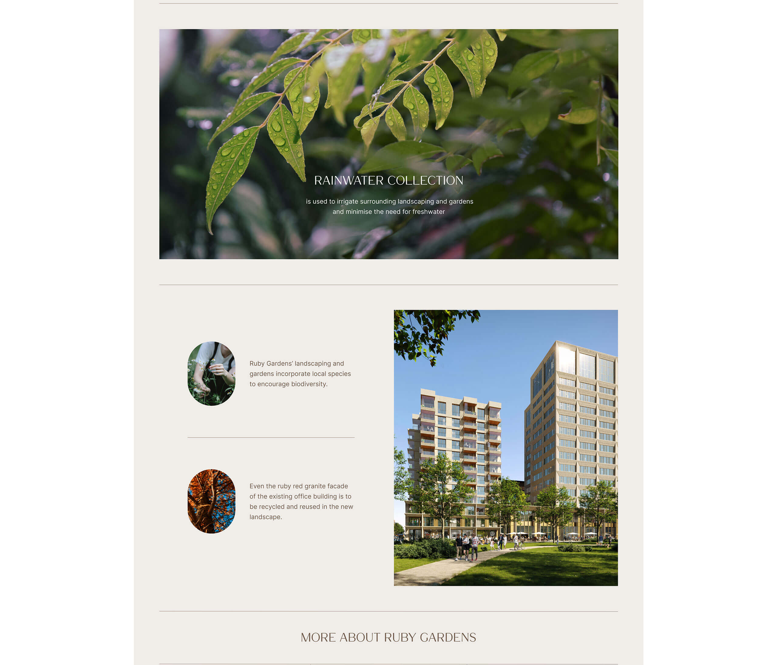
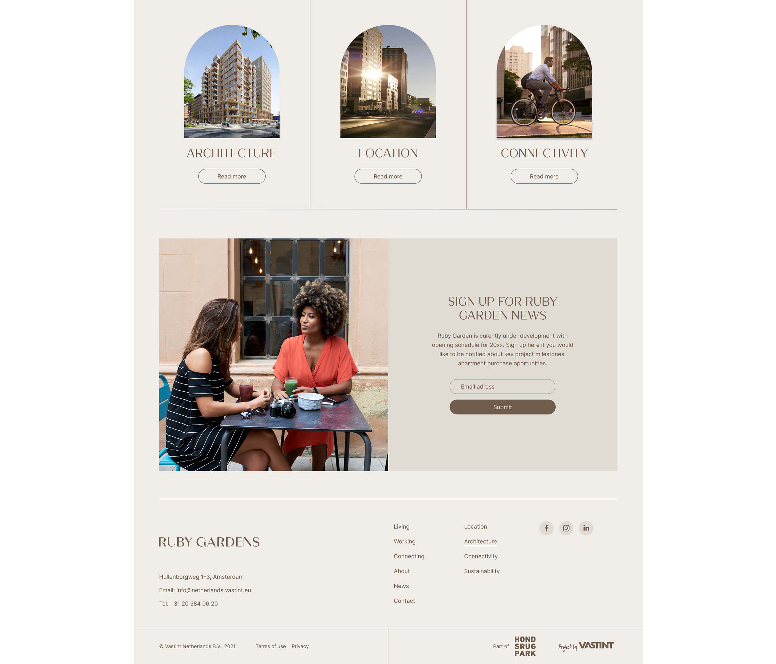
Across all branding materials and items, carefully designed responsive website stands out as the most important carrier of Ruby Gardens brand values and style. Precisely planned structure and consistent, elegant visuals were carefully designed to stimulate interest in the complex across all potential target groups.


Social media
As a natural extension of the on-line web presence, we designed a series of social media templates to keep the brand communications alive and consistent, in order to drive user engagement across all touchpoints.
