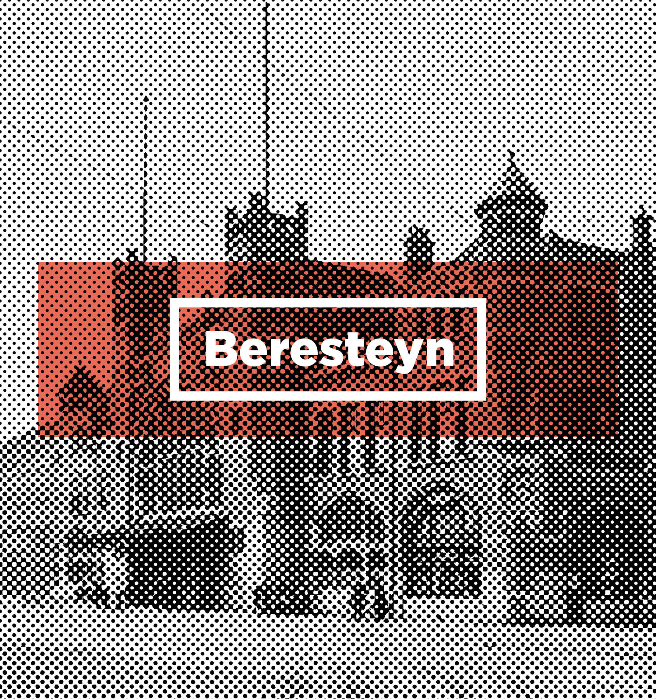
we+Beresteyn
Our task was to create a visual identity for a complex of buildings situated in the very heart of the Dutch city of Haarlem. The city authorities decided to breathe new life into the neglected site adjacent to the main railway station and to revitalise it as a modern mixed-use residential and office development. In our visual communication, we focused on highlighting the project’s historic surroundings (the 19th-century railway station, which is listed as a historic monument), whilst maintaining a modern and clean style of presentation.
Where the contemporary
meets the historical
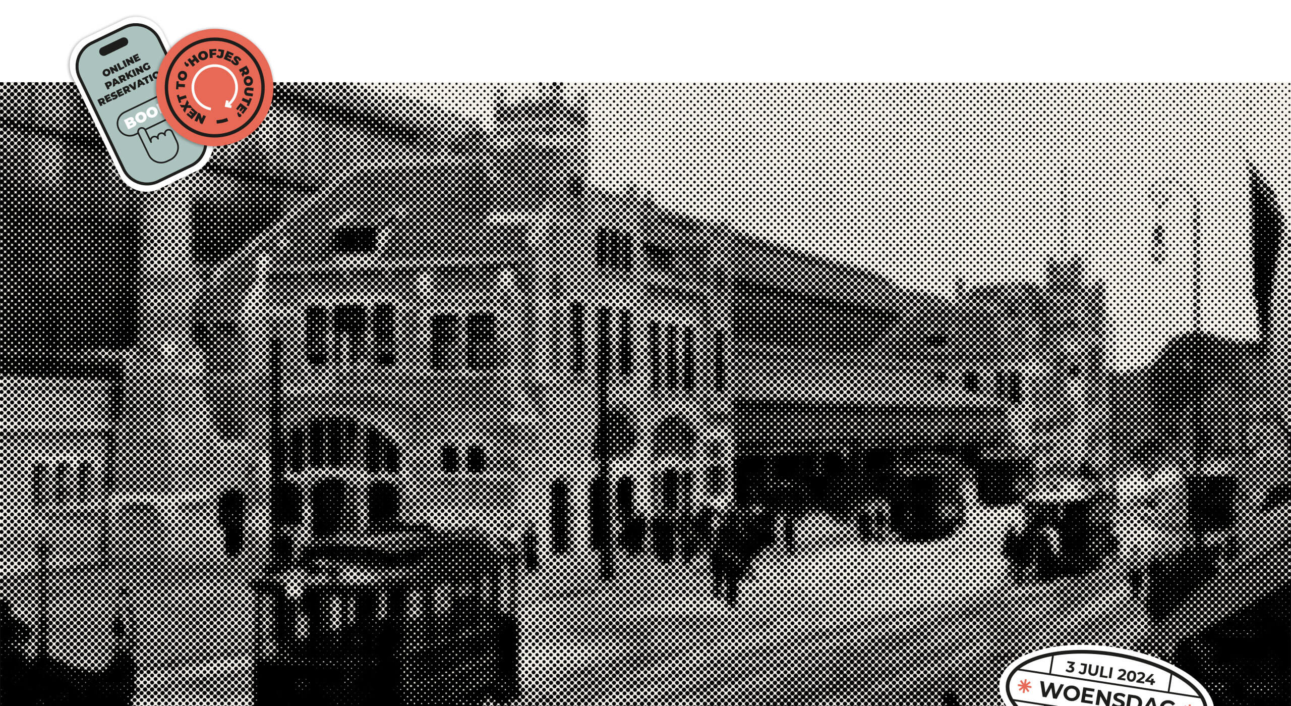
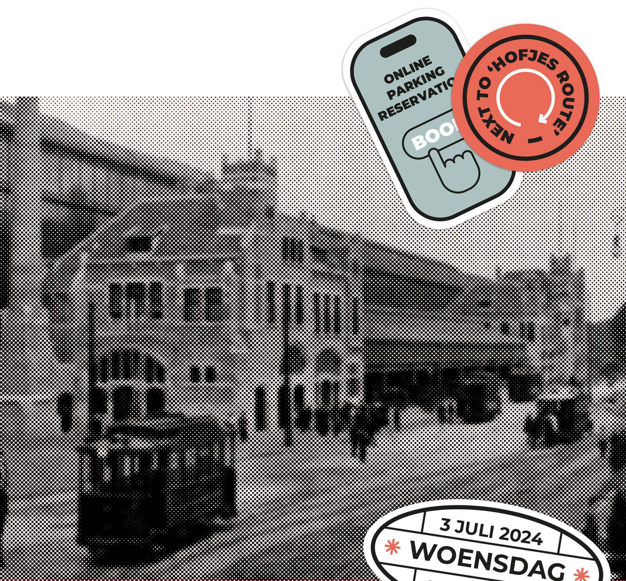
Halftone photography
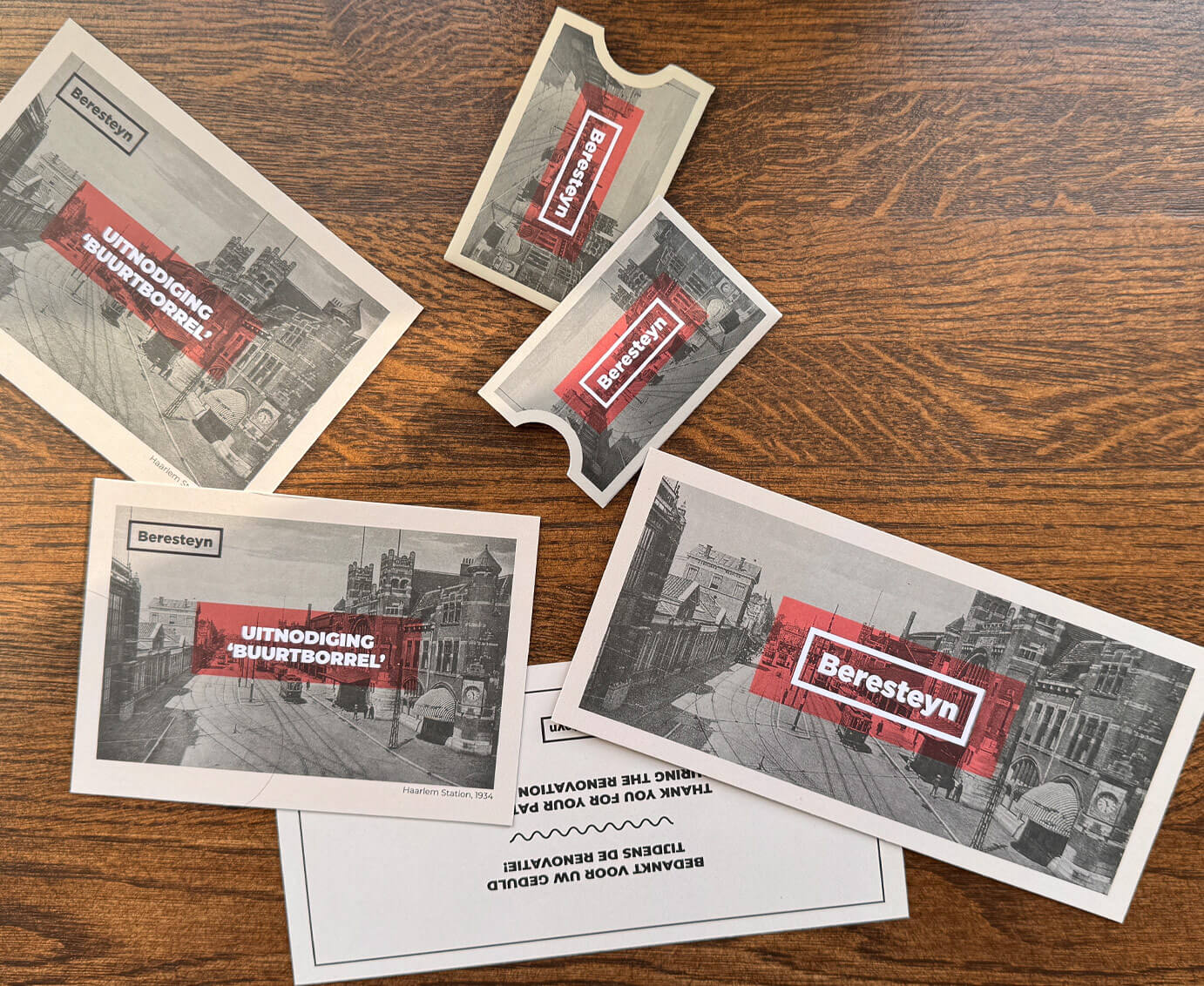
The raster, used here as a stylistic device to build the brand’s character, evokes analogue printing and brings to mind archival materials and the print media. This approach ties in with the narrative of combining the traditional character of the site with the new, redefined purpose of the development. It also emphasises the raw, authentic nature of this historic site.
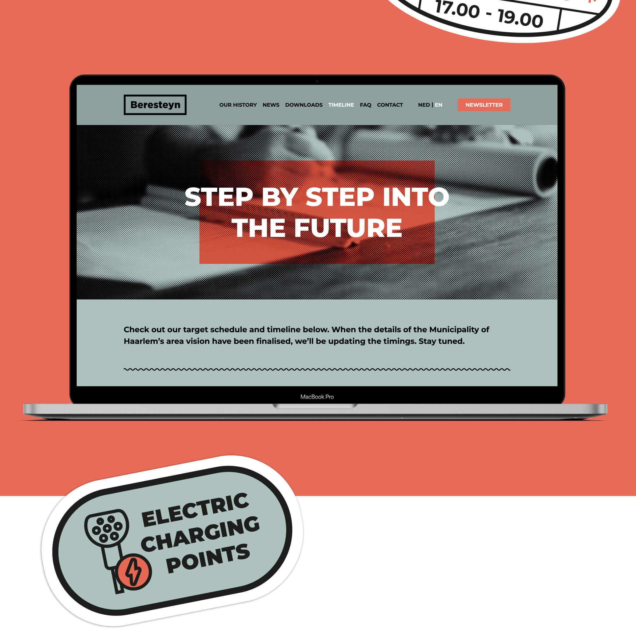
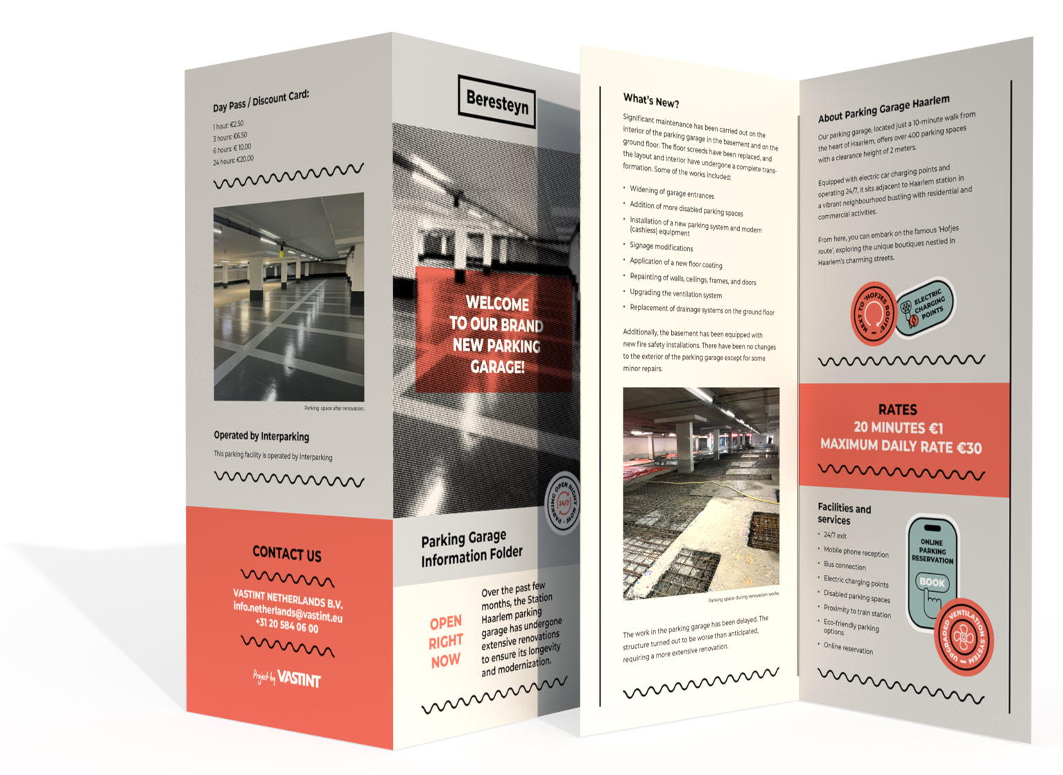
A dialogue between the past and the present
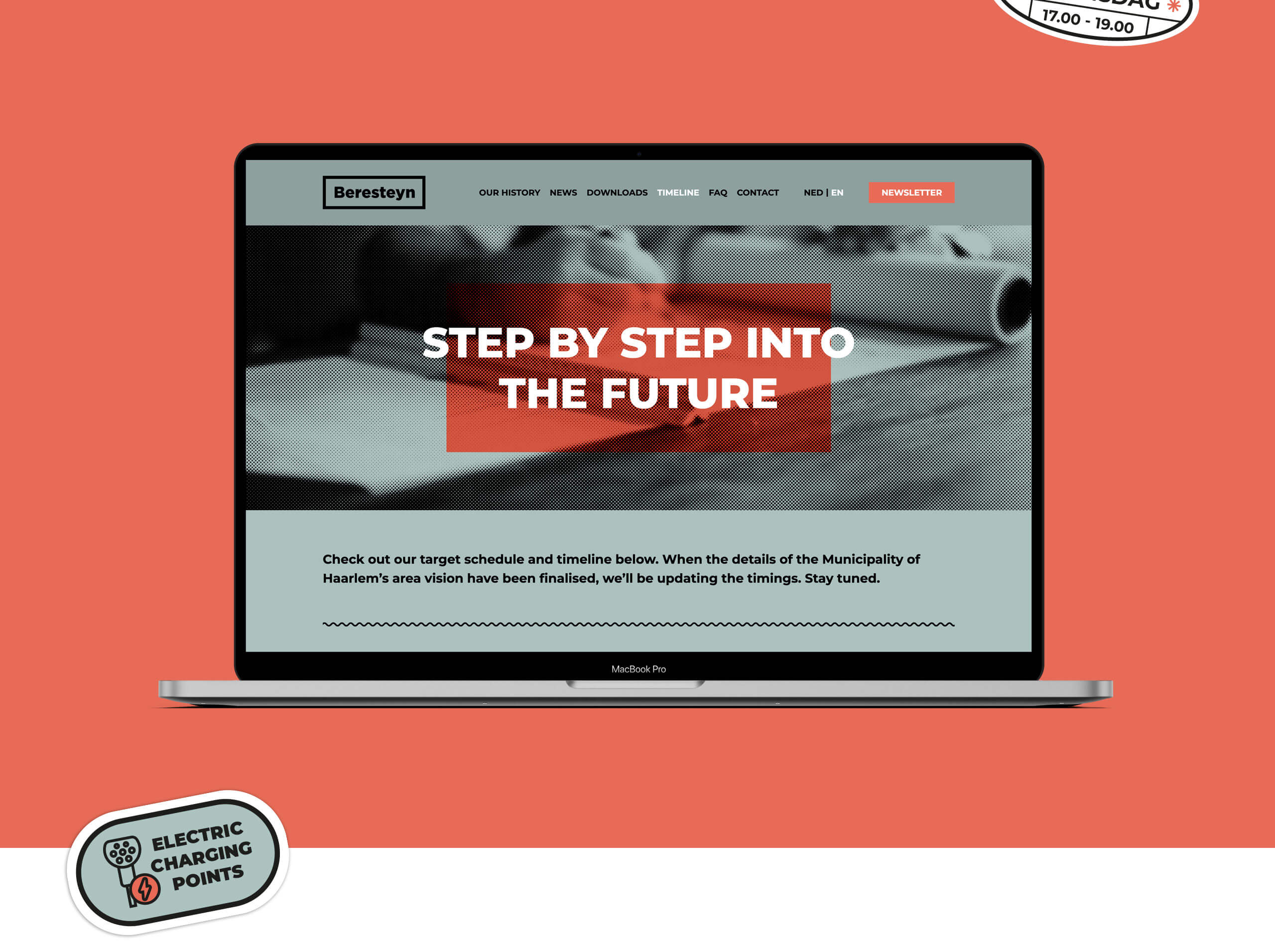
The result is a comprehensive visual identity that successfully highlights the historical aspect of the site and combines it with modern solutions and functionalities. The style employed effectively fosters an emotional connection between future users and the complex, whose function has changed so significantly.
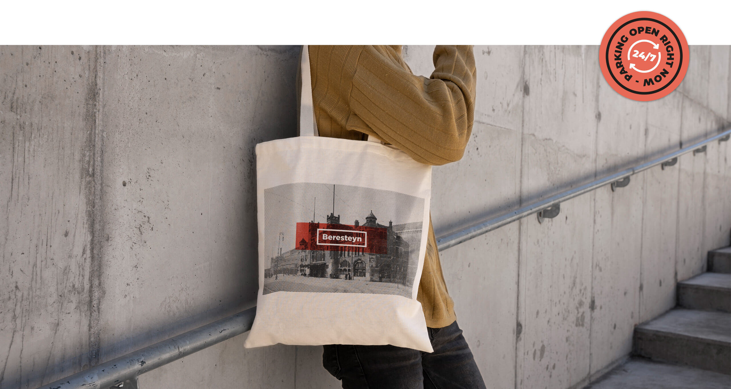
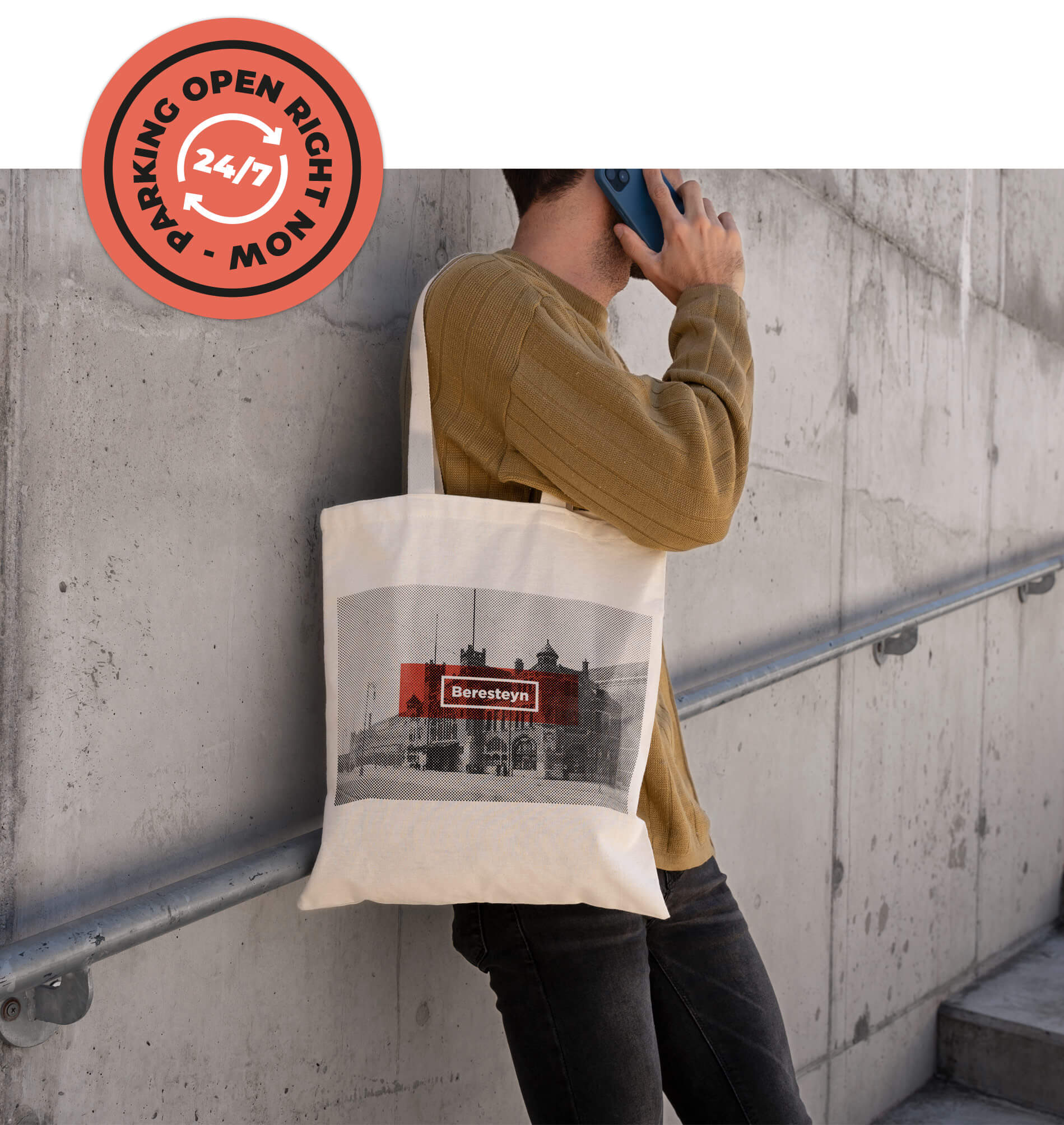
A unique atmosphere
Drawing on the brand’s established visual language, we have developed a range of graphic elements inspired by rubber stamps, postage marks and postcards, whose ‘retro-analogue’ character contrasts with modern design. The use of these elements in the visual identity lends the project authenticity, highlights the history of the place and builds a narrative that references the past, yet is presented in a modern context.