we+Vitberg
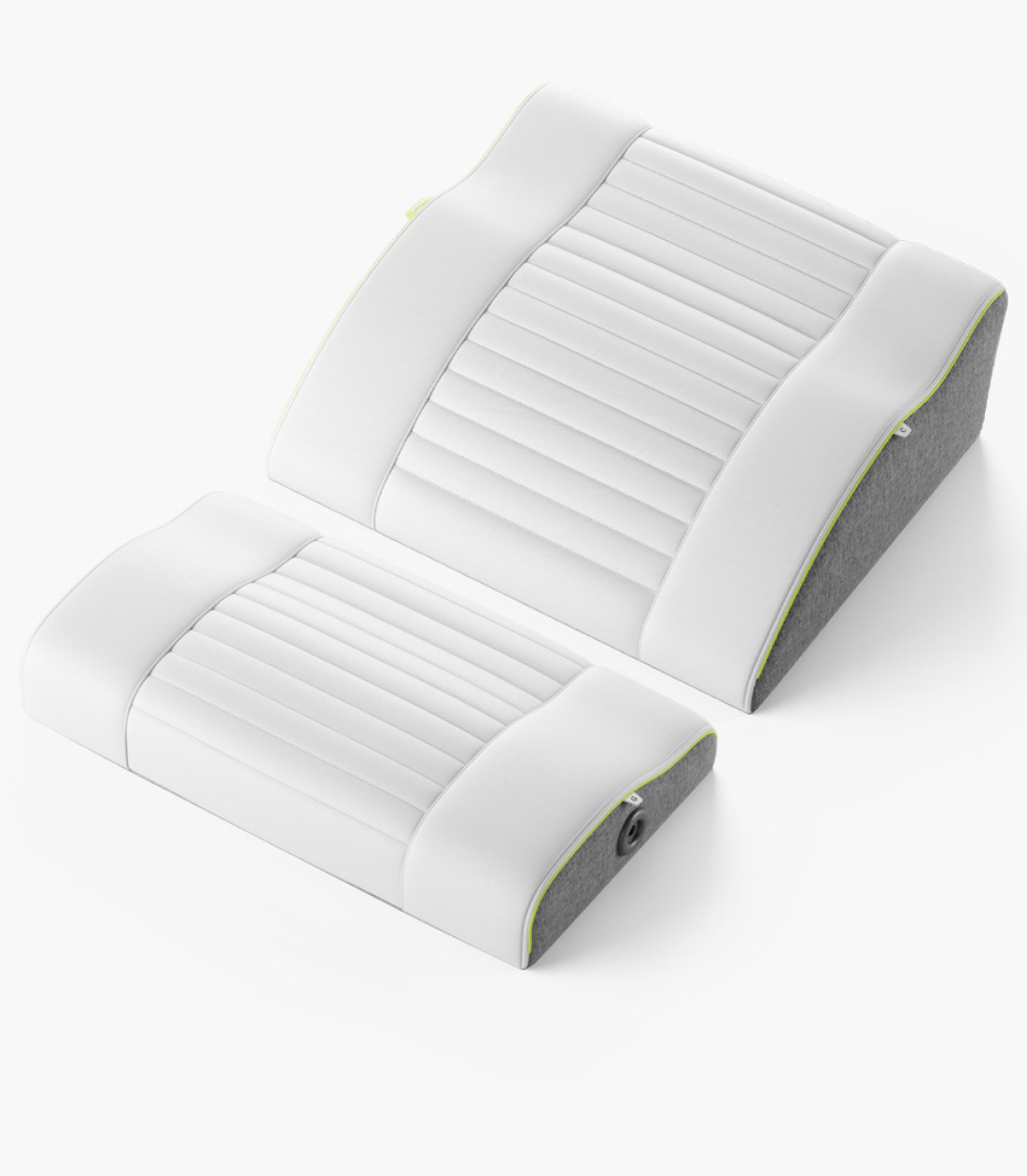
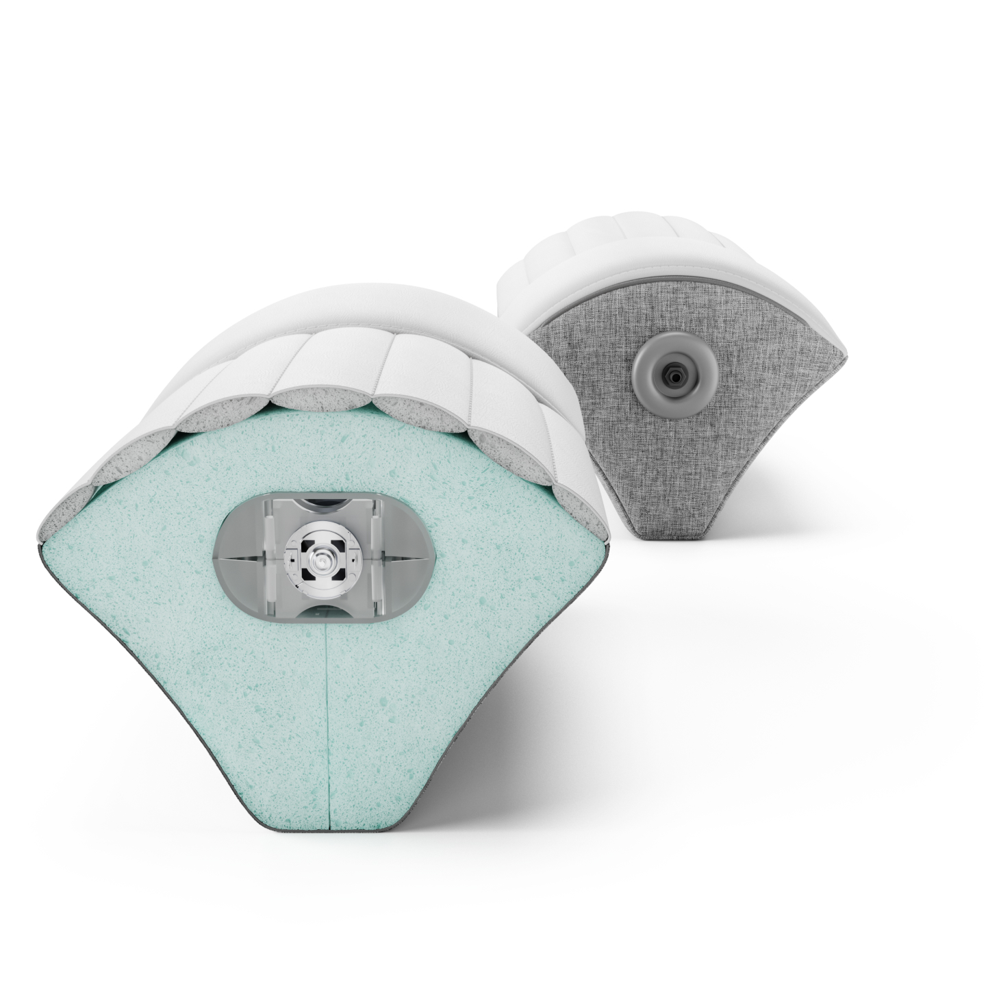
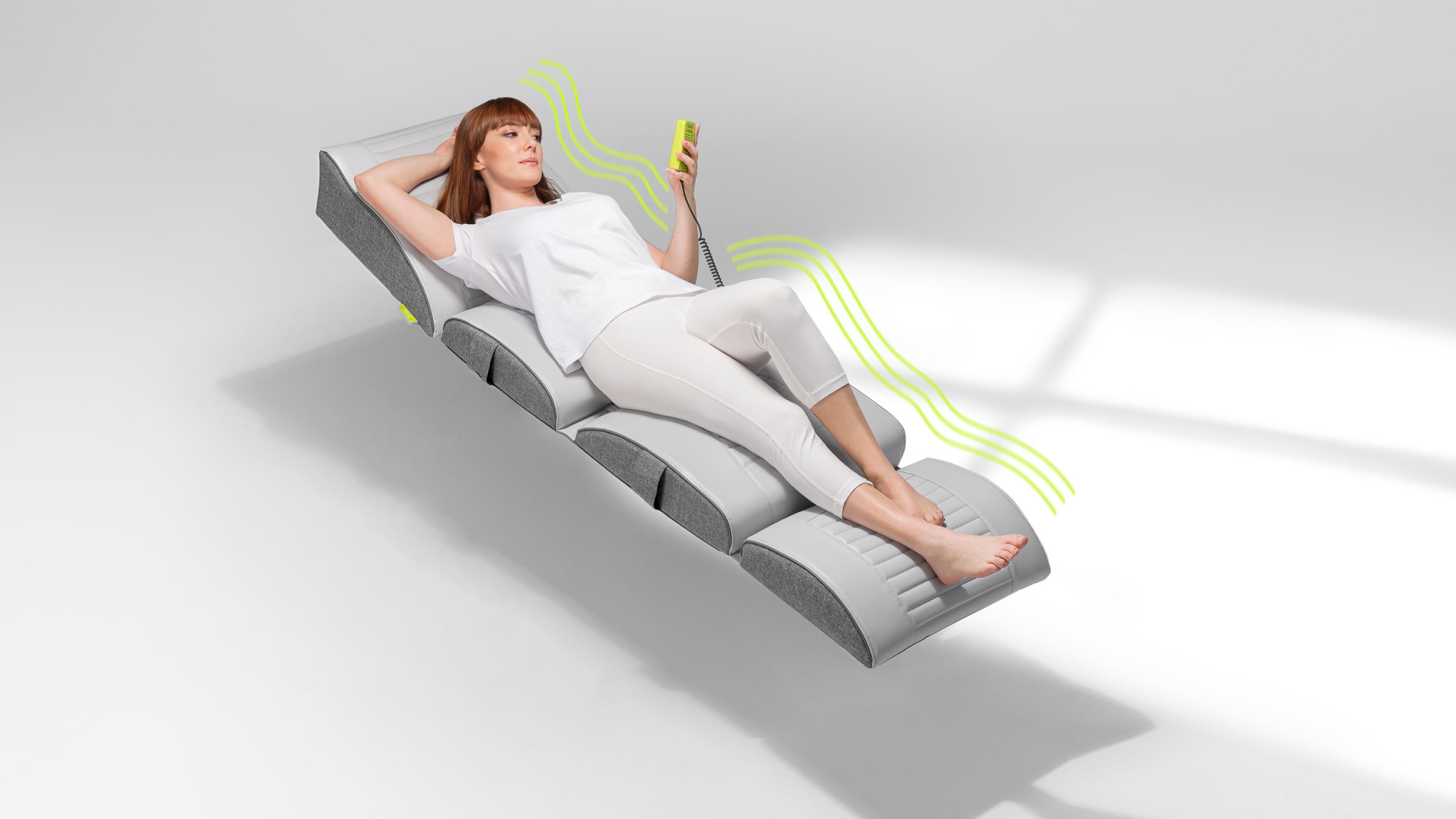
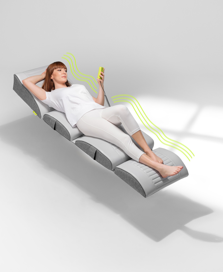
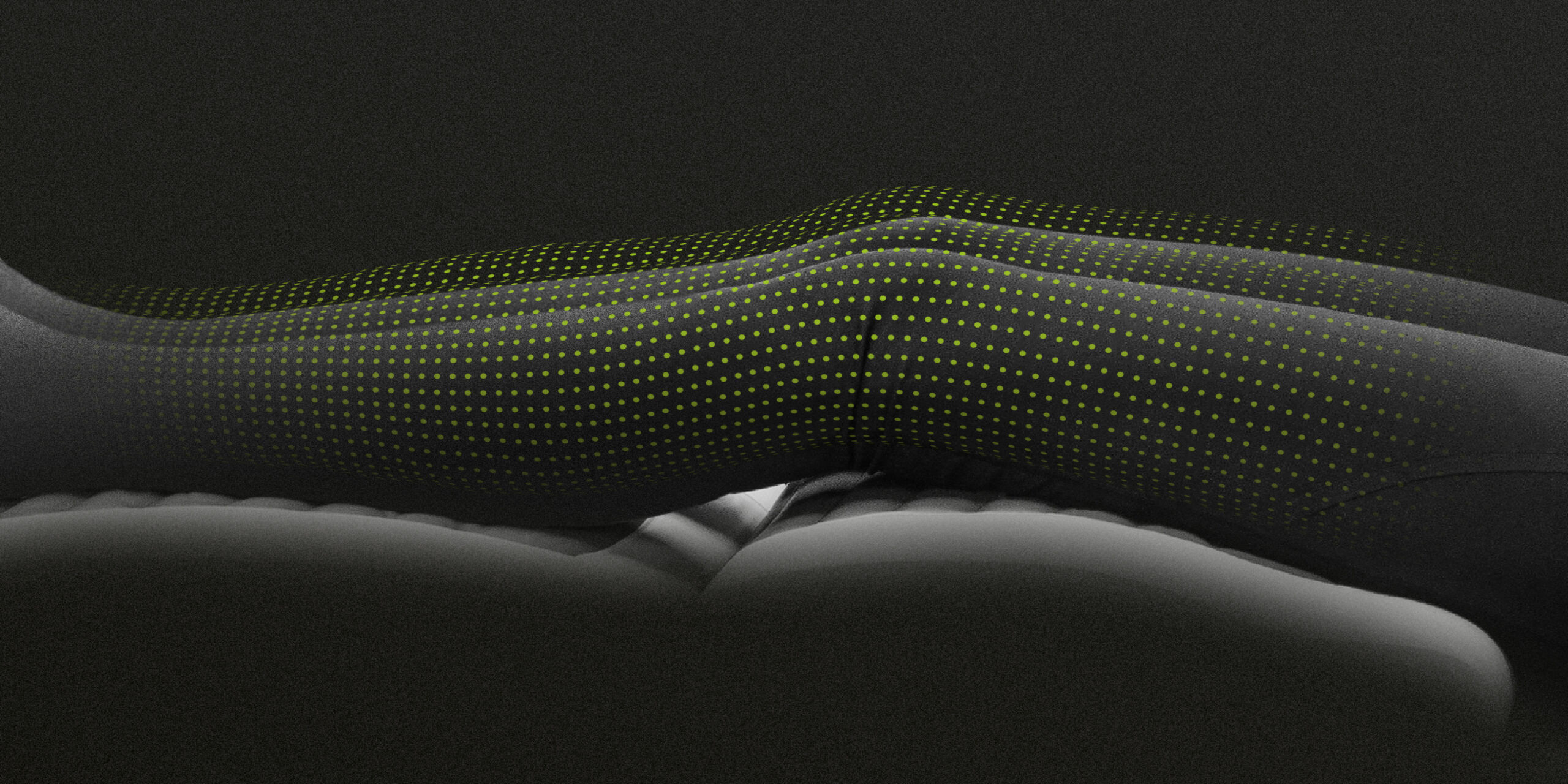
Vitberg is pioneering the use of vibration therapy in medicine and rehabilitation. We designed a comprehensive new corporate identity, including variants of the logotype, print materials, product packaging, instructions, iconography, animation styling, social media and print communications, and POS materials.

Challenge
The company’s previous identity reflected its cold and medical-focused character. Due to the change in Vitberg’s target group and brand philosophy, there had to be a corresponding shift in visual communication.
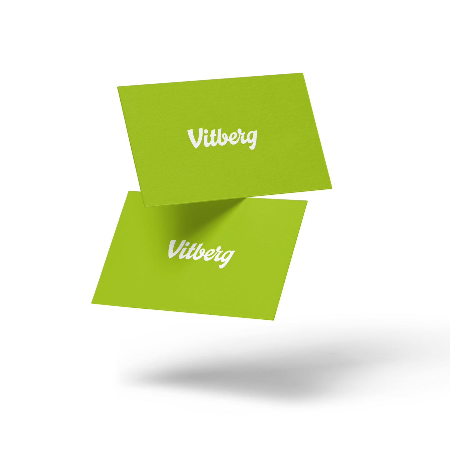
We created a logo that responds much better to the new challenges. The basis of the new image is a friendly typography, combining the company’s tradition and experience with a modern and innovative product character.
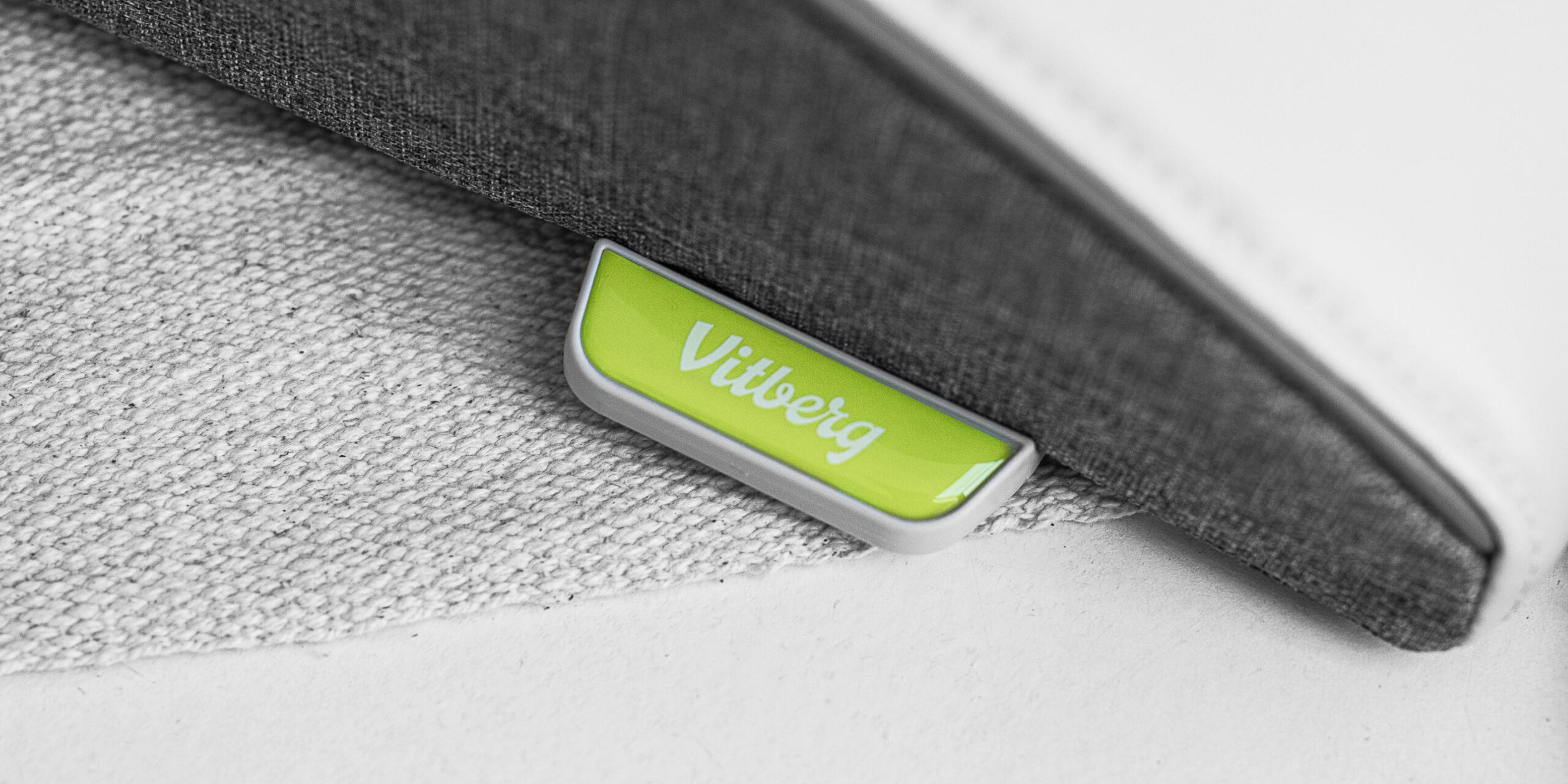
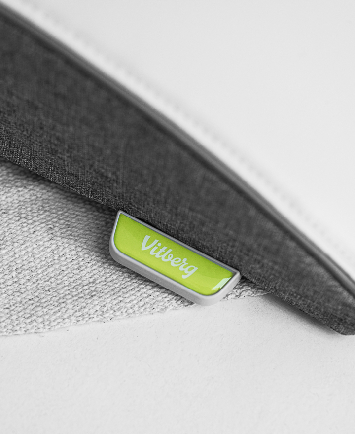
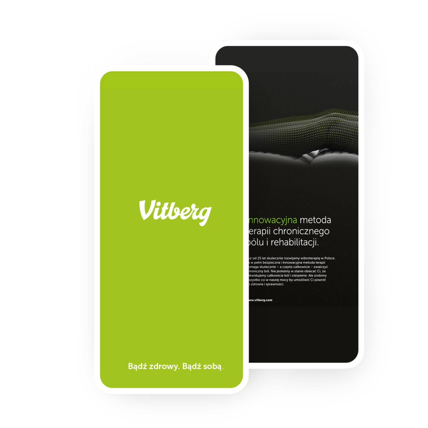
Green and friendly
The brand’s colour scheme has also changed. The friendly green communicates health and vitality.
Products
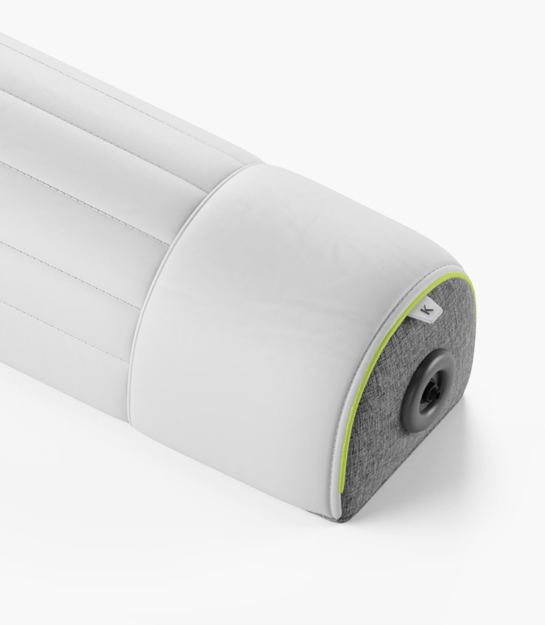
We created the identity for the company headquarters and Vitberg clinics across the country. We also participated in defining the new design and colour scheme of the rehabilitation units.

Brand materials
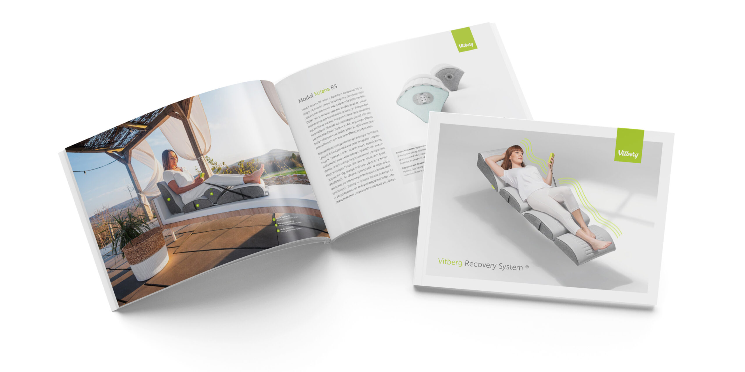
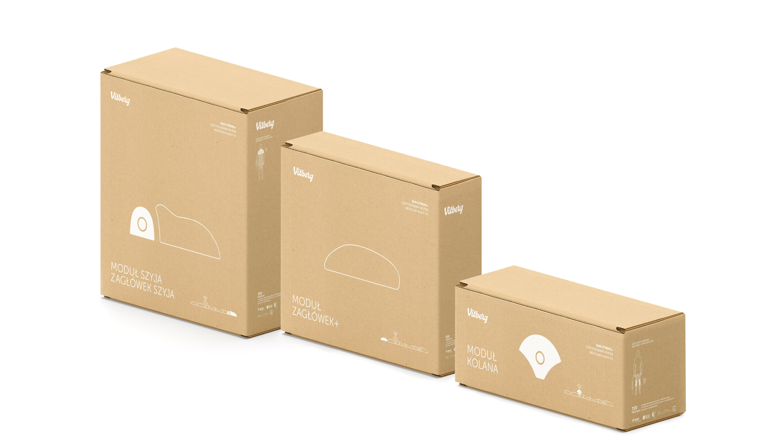
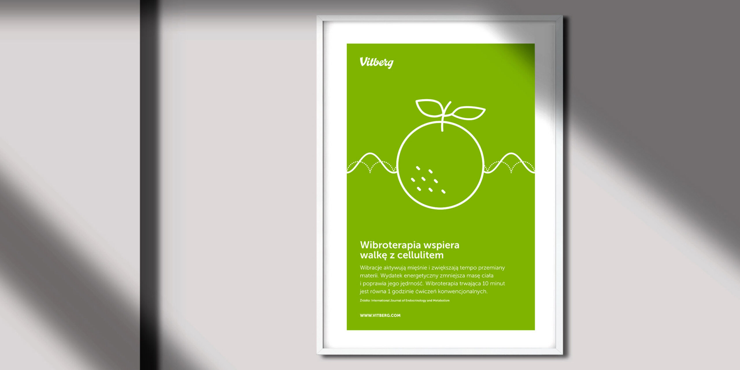
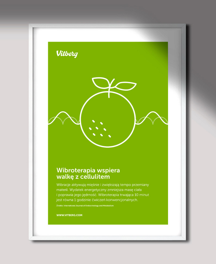
We selected a brand font and developed rules for its use. We prepared a range of basic printed materials, packaging designs, posters and flyers. Even after this stage of the work was closed, we provided assistance with further branding, overseeing the creation of new materials.
