we+Vastint
Vastint has been our client since 2011. Our original branding served the company well all these years, but over the last decade Vastint changed — a lot. The brand had to keep up.
becoming a leader
In recent years, Vastint’s scale and market presence increased greatly. The company grew multifold, built a strong Europe-wide portfolio, and carved out a personality all its own: authentic, humane, confident, dynamic, rooted in its values, and always looking ahead. The question was: how do you bottle that kind of energy into a brand identity?
the idea
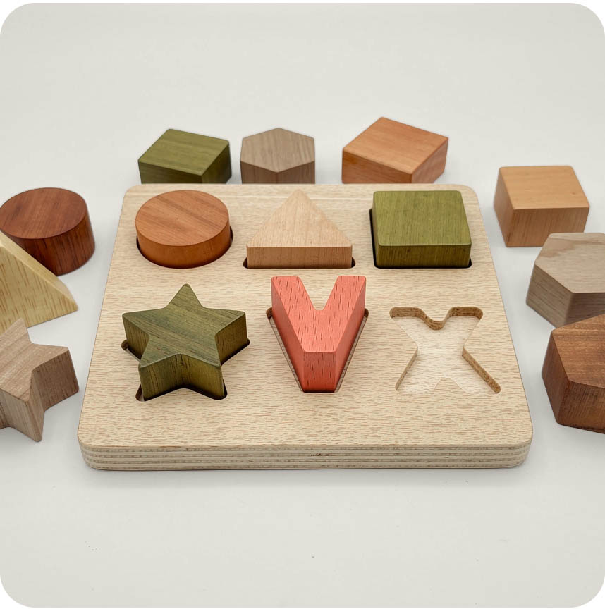
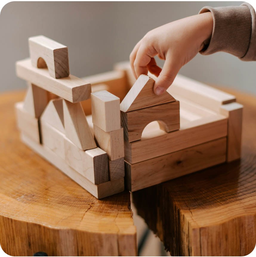
We went back to basics. Literally. Building blocks. The same ones we all played with as kids. Simple shapes, vivid colours, endless possibilities. Structure and freedom, hand in hand.
pure joy
of creation
We wanted to capture the pure joy and excitement of creating. Playful geometric shapes, like children’s building blocks, spark the imagination. It is this electrifying creativity and energy that enable us to make something wonderful.
the Vastint way
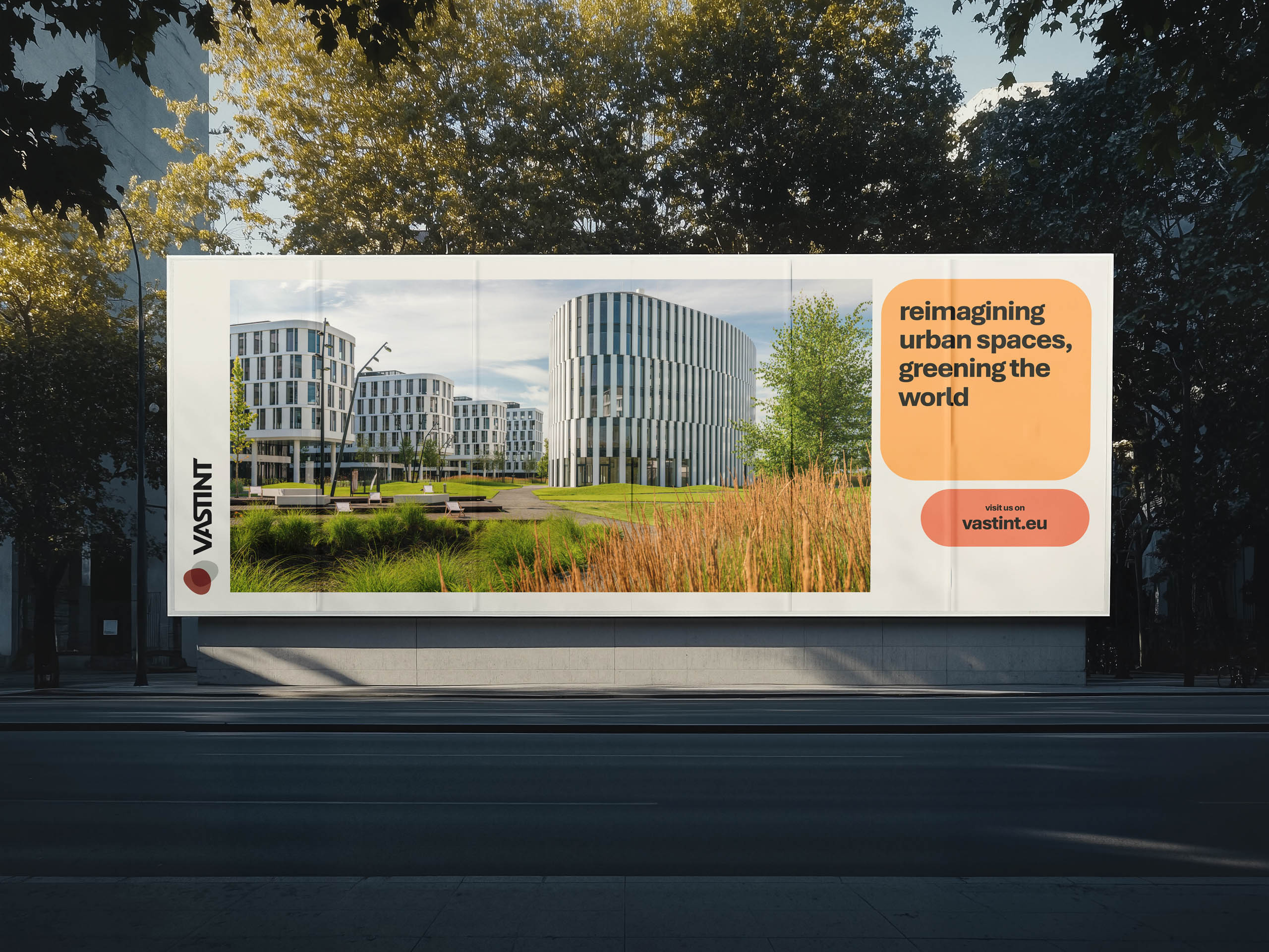
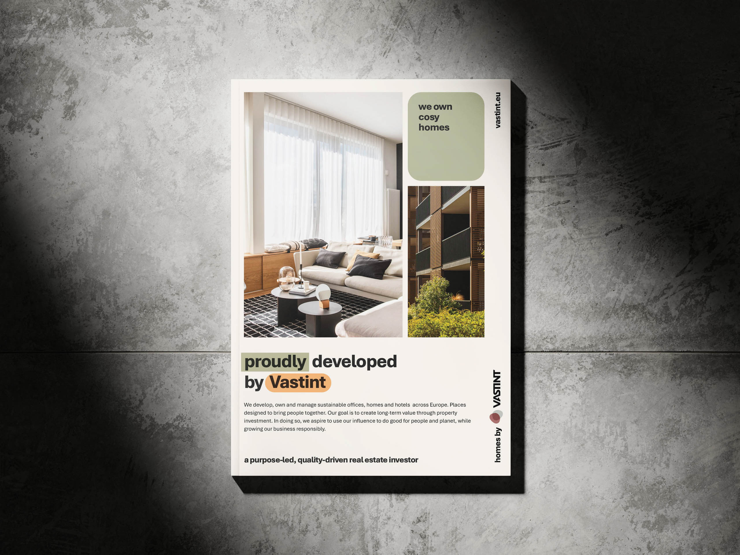
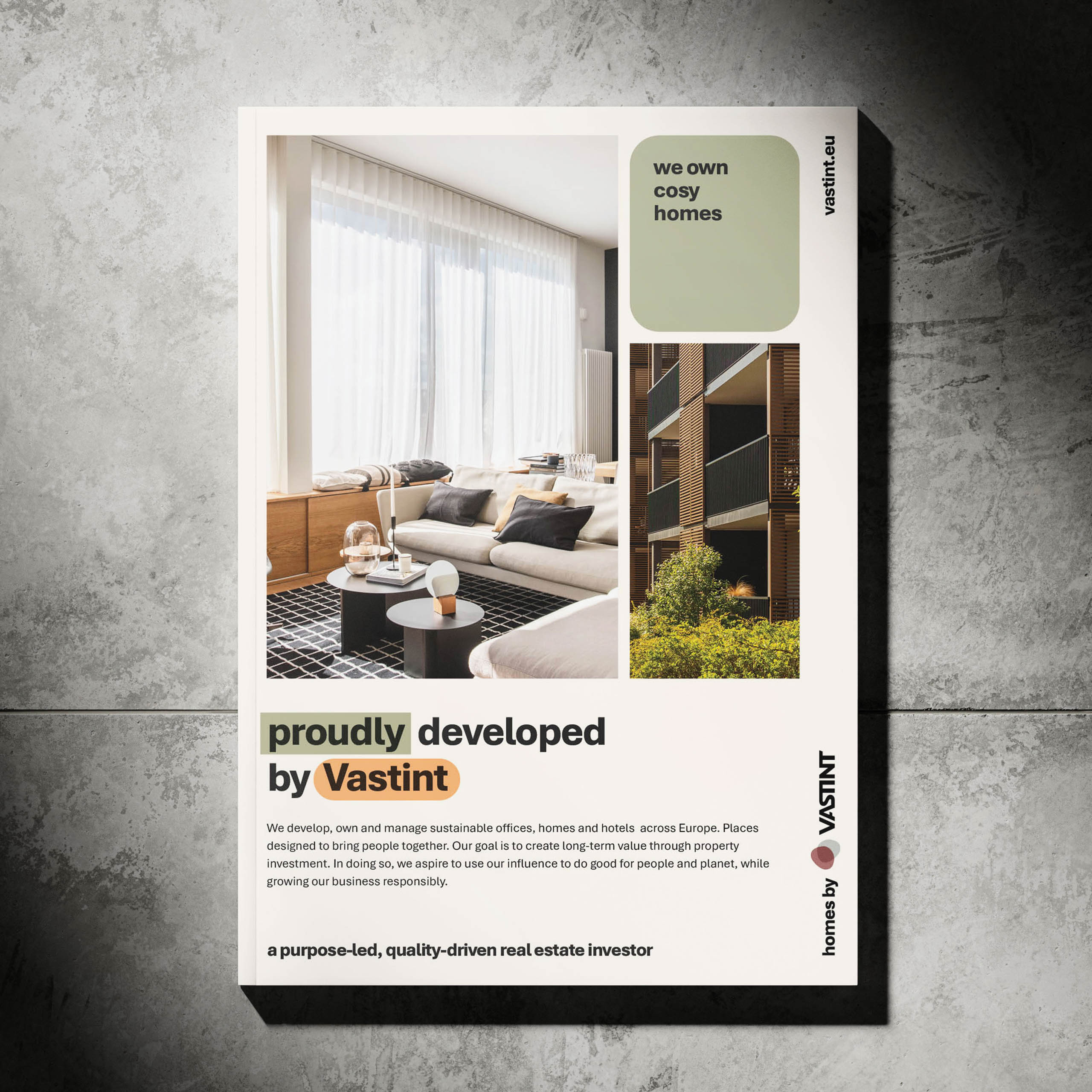
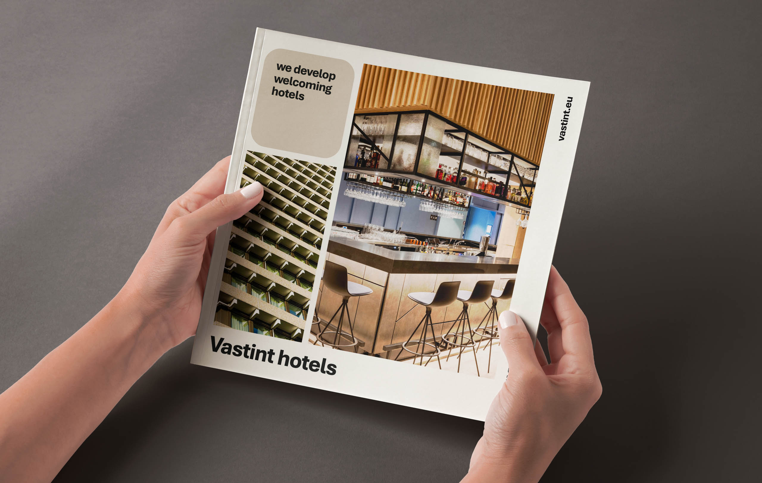
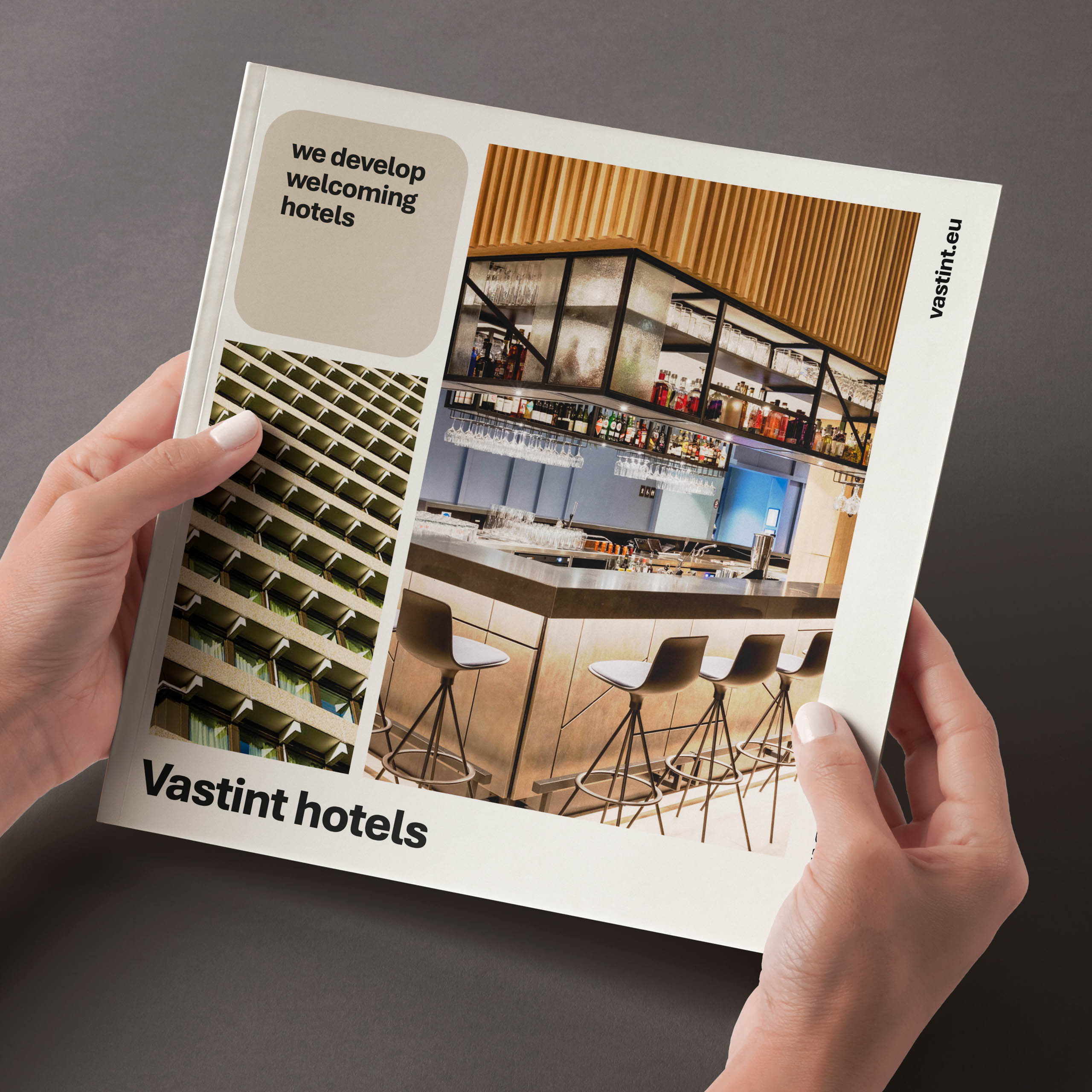
The logo evolved to tell that story. The big shift? We now often use it vertically — not as a gimmick, but as a genuine statement. It works beautifully in gridded layouts, makes smarter use of space, and quietly (but confidently) stands out from the crowd.
colour system
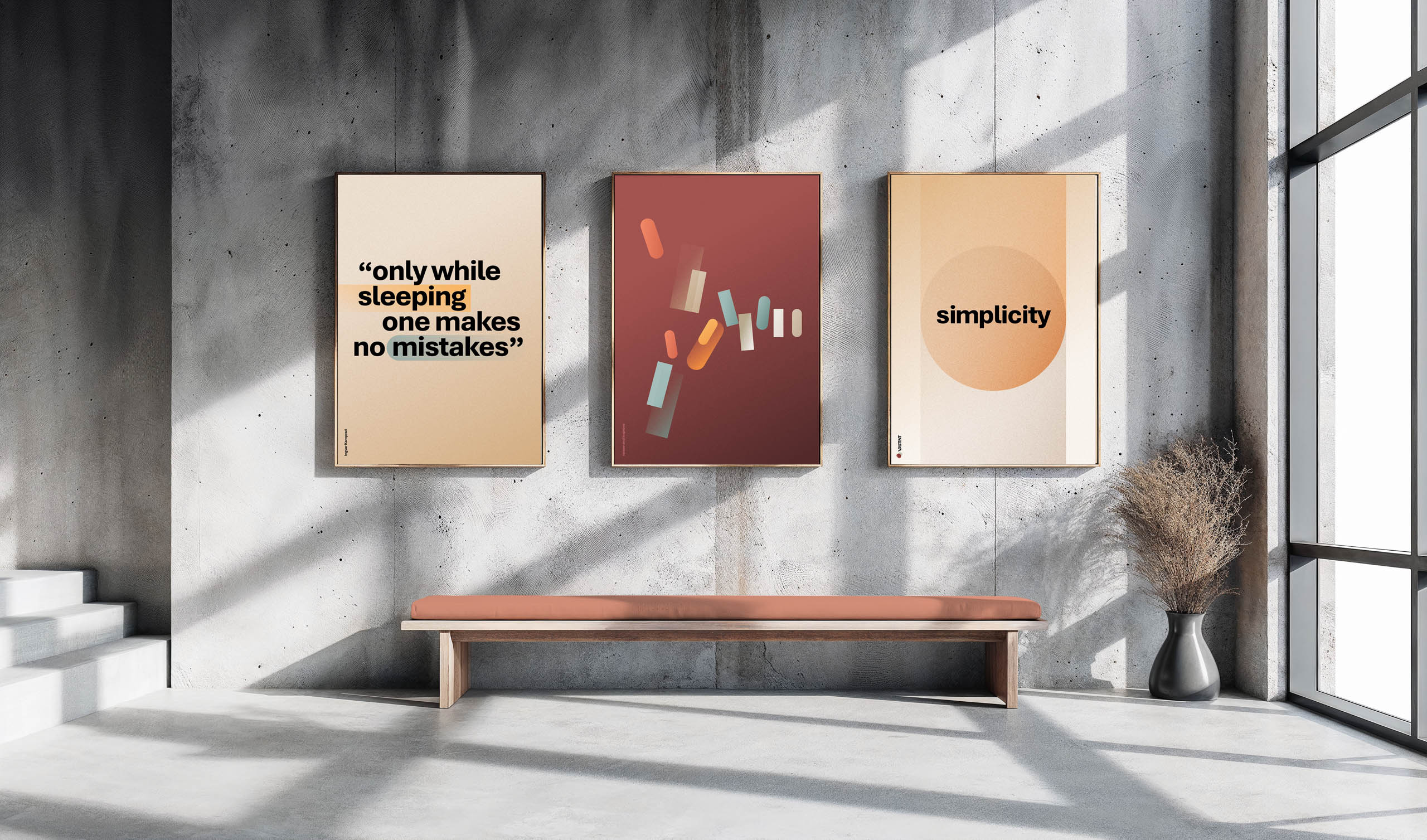
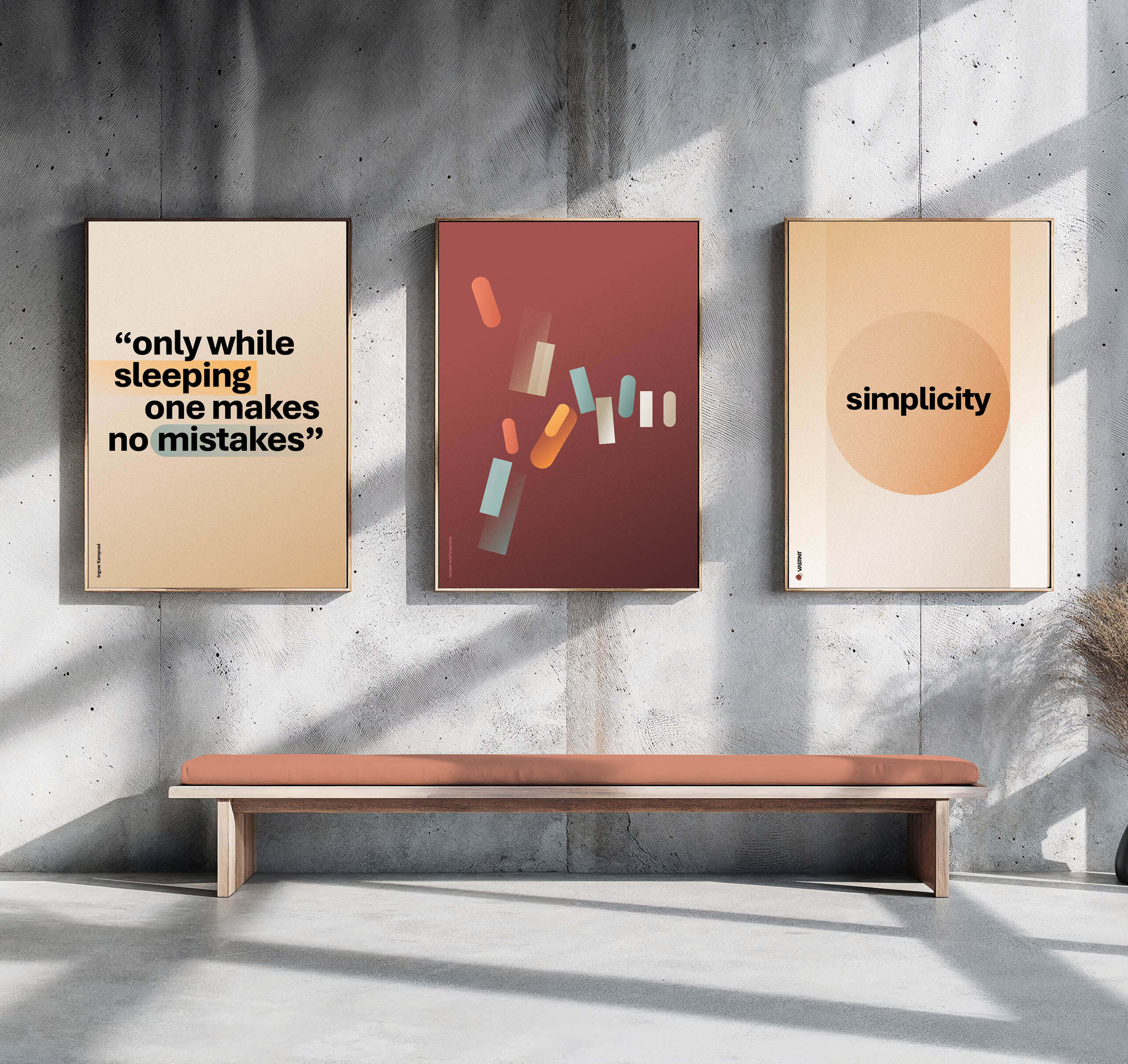
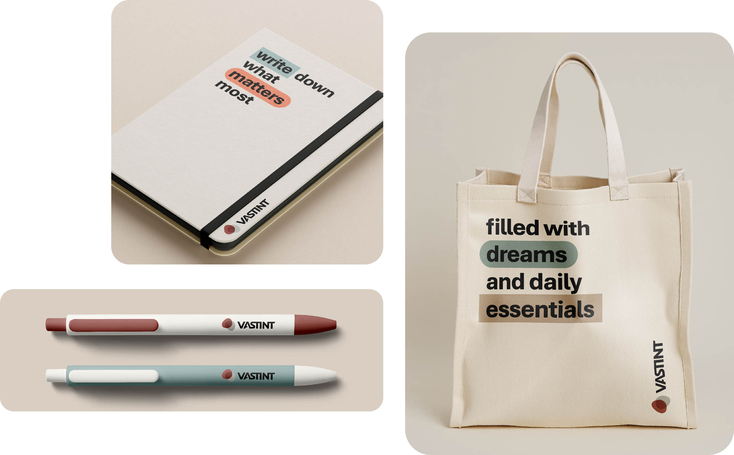
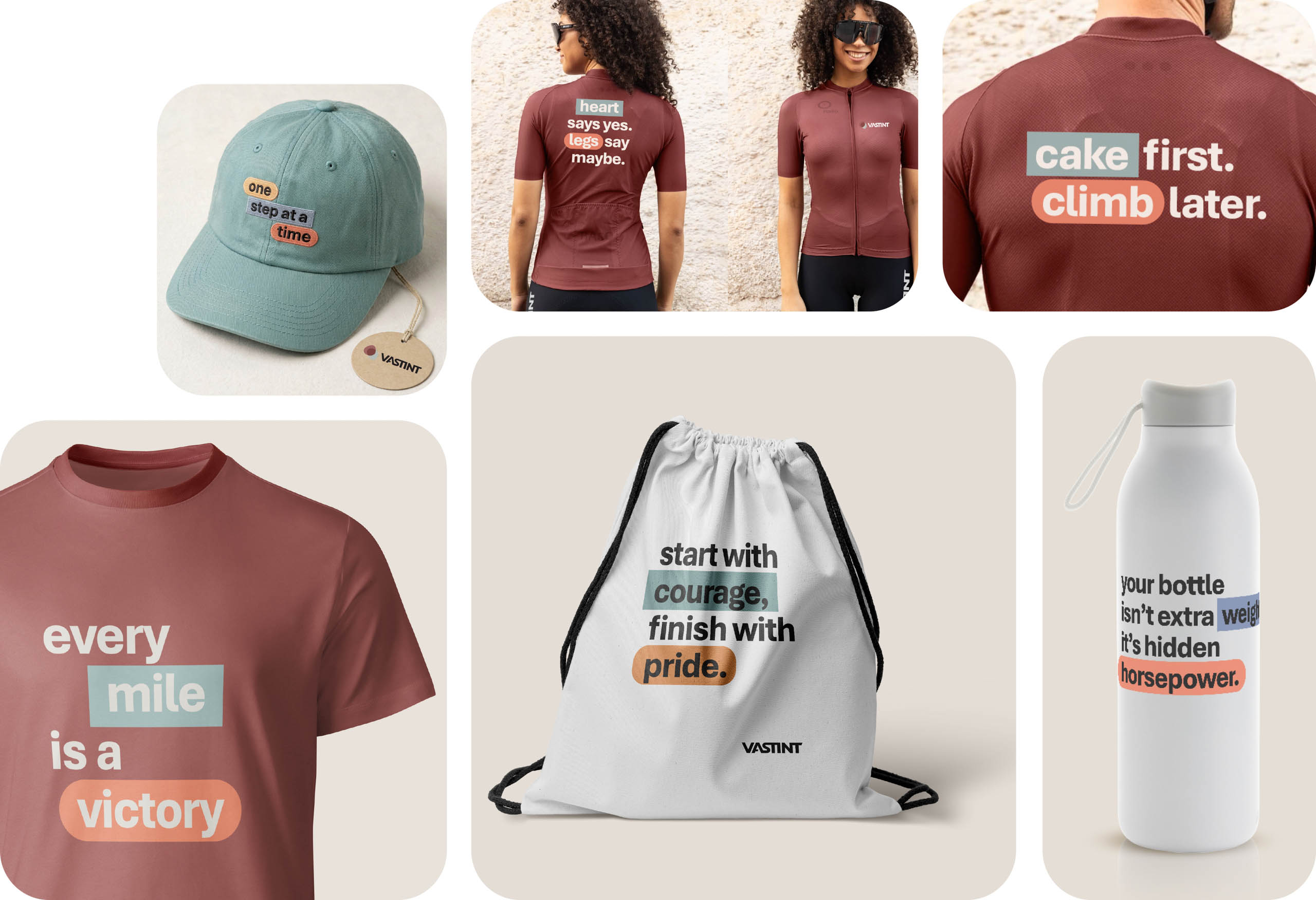
Colour does a lot of heavy lifting here. We built a warm, contemporary palette split into clearly defined groups, each with its own job to do within the system. Nothing random, everything purposeful. The new visual system captures the essence of Vastint: modern, dynamic, and forward-looking.
the website
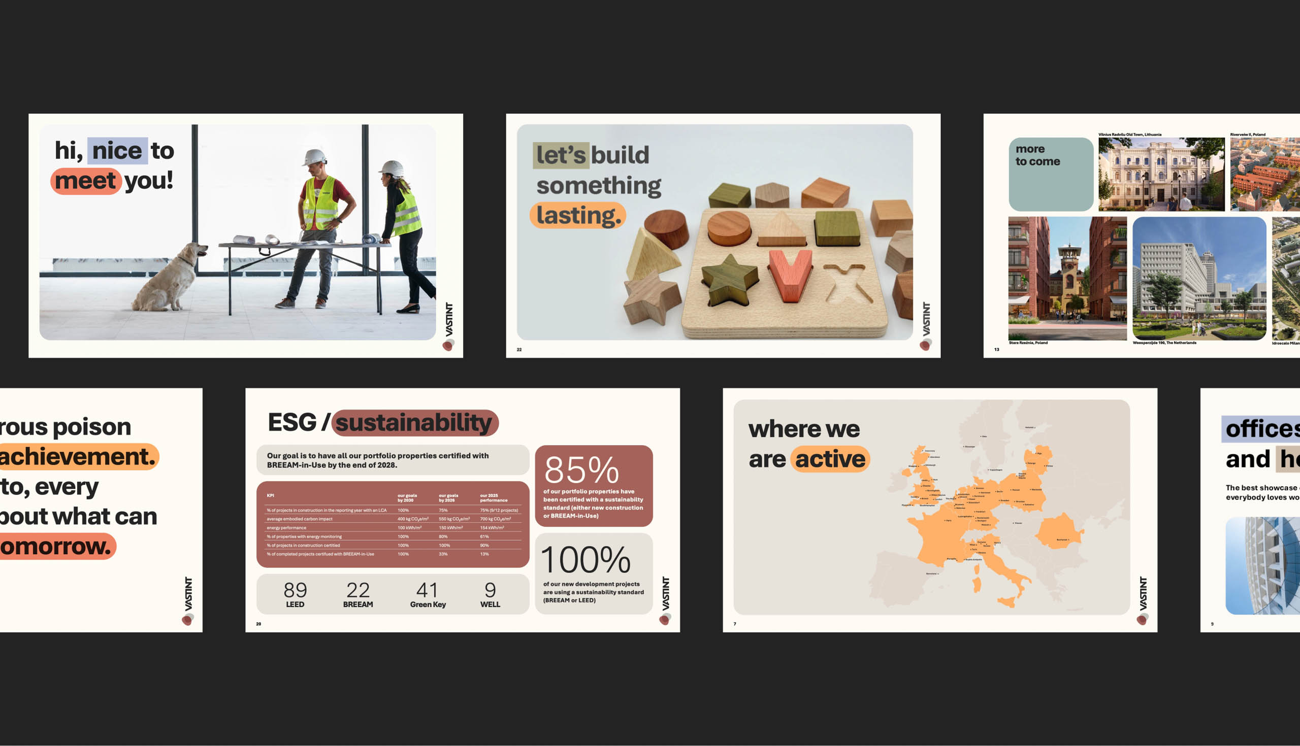
The new website was designed from the ground up, more like an application than a traditional website. Instead of long, content-heavy pages, information is structured into focused, interactive screens that help users quickly find what they need. Bite-size chunks of information make the site a joy to explore, focusing on top-level info and creating a clearer, more intuitive browsing experience.
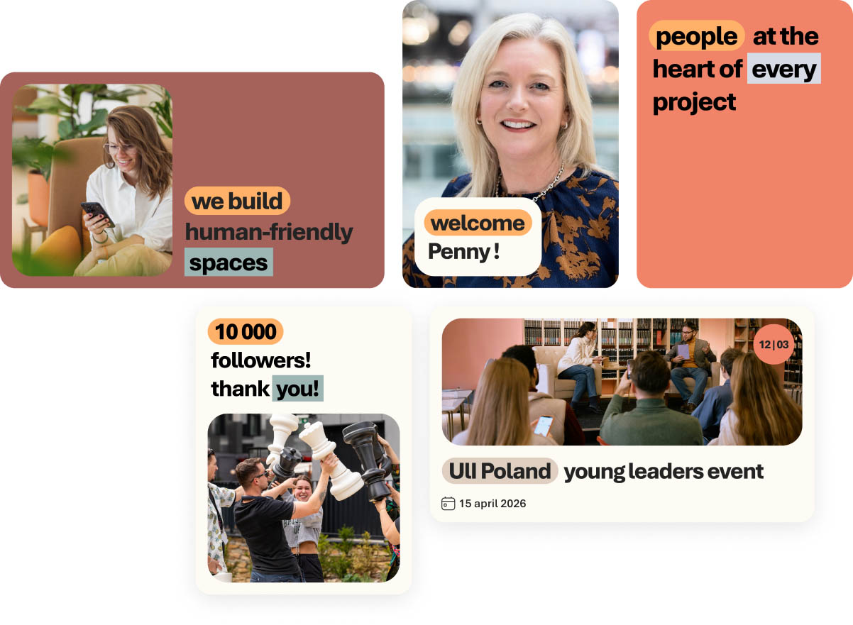
social media
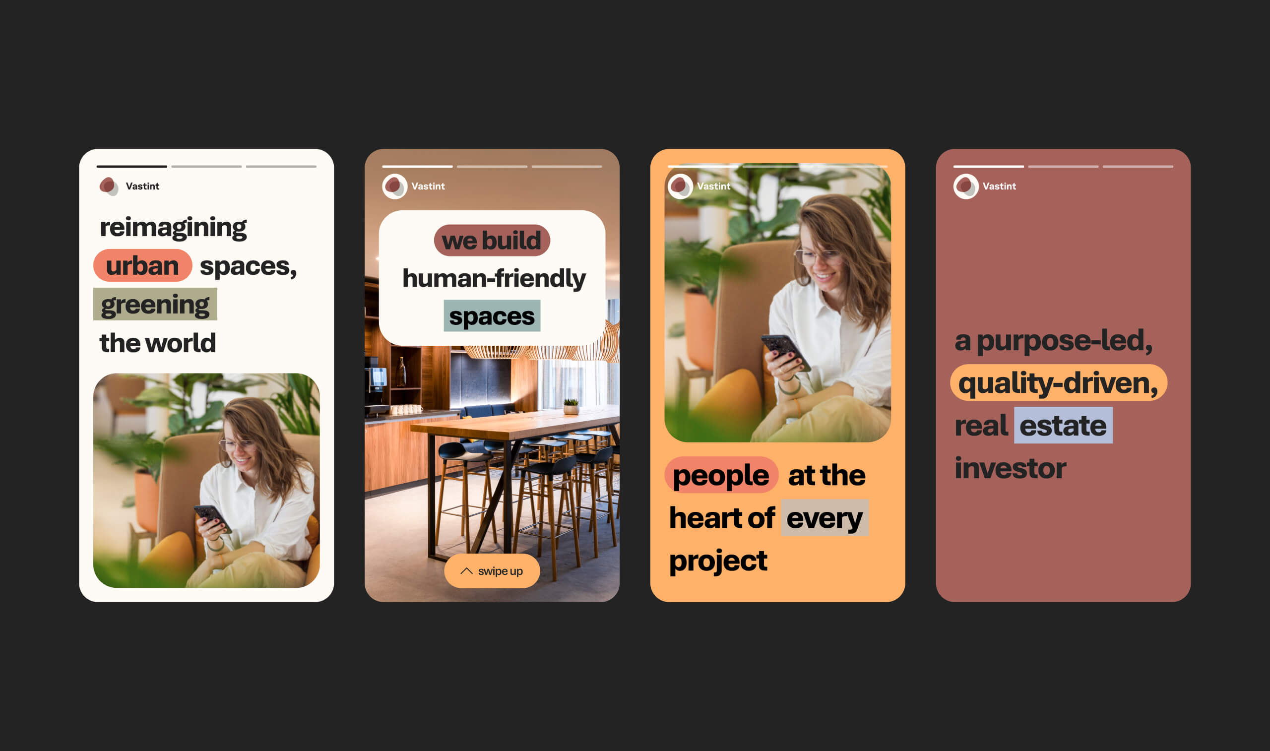
Vastint’s new visual language was basically made for social. Punchy, quick to read, truly comes alive in motion. Animation has become a big part of our social strategy, as this identity was built to move.