
we+Startup Poland
Visual identity for a technology think tank representing Polish start-ups and connecting them with investors and customers.
Brief
Startup Poland had ambitious aspirations for its brand. They were frustrated with their visual identity, which seemed bland and inconsistent. Inspired by thought leaders such as TED, they wanted to create an identity that would appeal to the aesthetically conscious start-up community, industry and public administration. Their publications were to be beautifully presented. As they stated in their brief: ‘we want to be able to hang the covers on the walls like posters – with pride’. To achieve this, we started with a question: what if the secret to a beautiful, consistent design concept lies in limiting the means of communication?
Solution
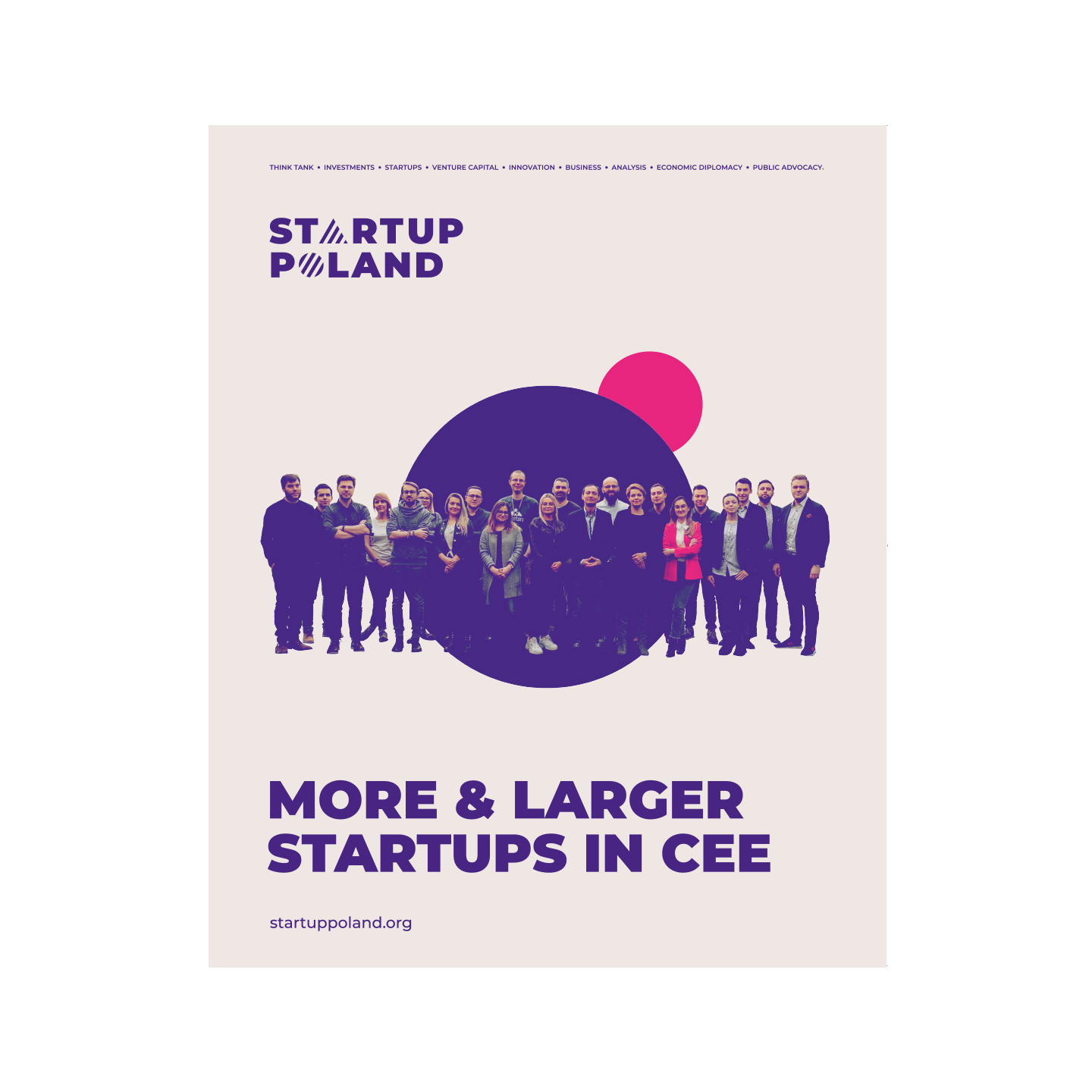
We wanted our idea to be strong, unique and easily scalable. We made the circle its heart. A spherical cell is a symbol of new life, a circle is a symbol of community – these associations fit perfectly into the world of start-ups.
Our experience shows that strict limitations can trigger creativity. As can be seen from the diversity of cover designs we created as part of the project, the circle motif became an inspiration for a whole range of ideas. It forced us to look for simple, powerful metaphors and imposed a consistent character on all elements of the brand.
Result
Startup Poland has undergone a complete visual transformation. A bold brand identity has brought order to the visual chaos. A new approach to the visual language of publications has raised the brand’s prestige and strengthened its credibility in the eyes of key audiences.
Following its relaunch, Startup Poland has seen an increase in the number of publication downloads and event registrations.
With its new identity, Startup Poland continues to innovate and support the development of the start-up ecosystem in Central Europe.
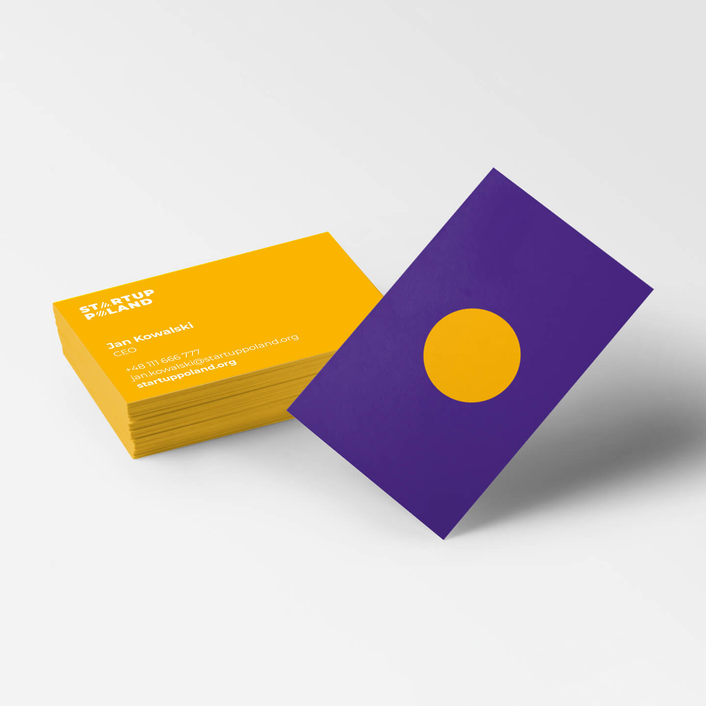
Scalable
design
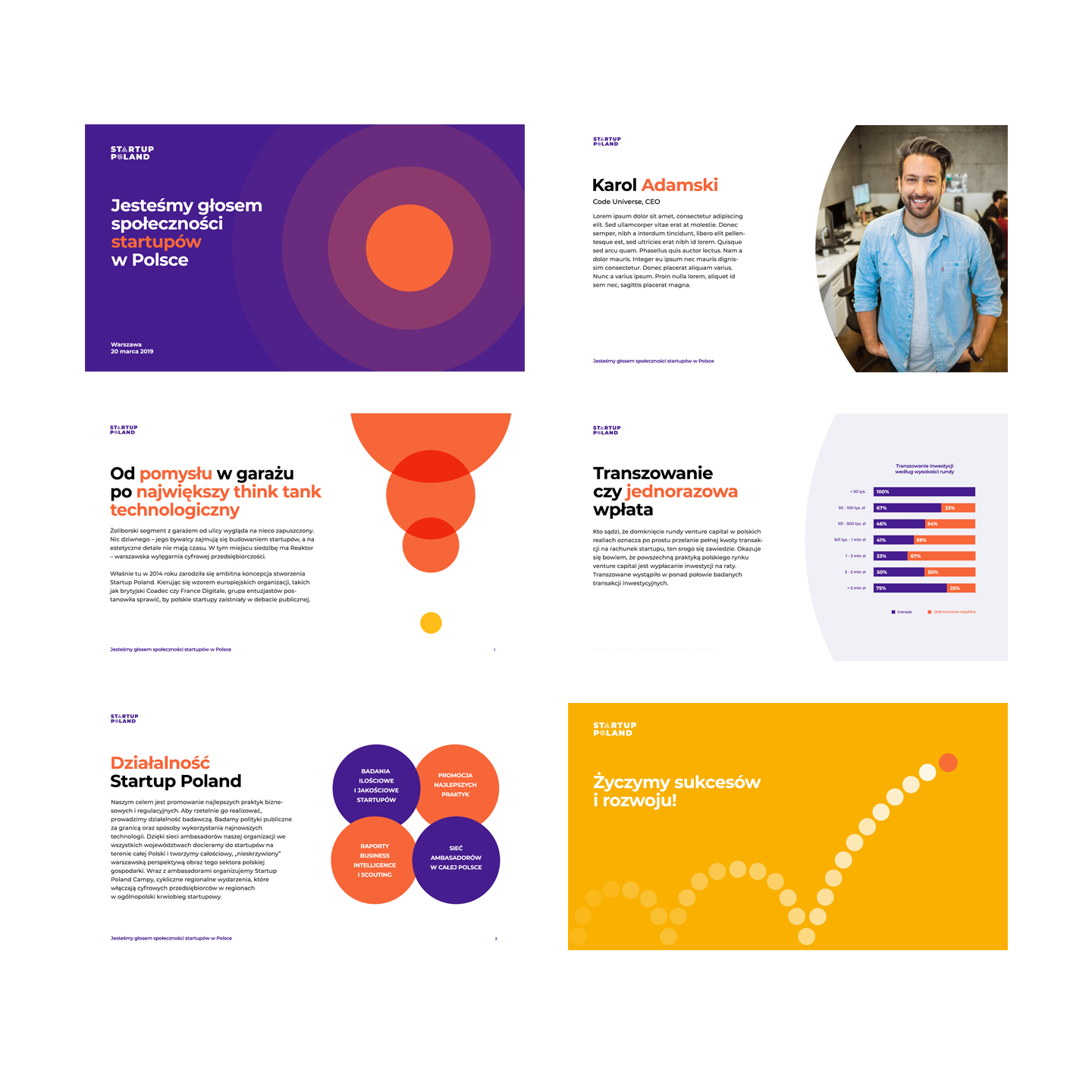
Visual identity is easy to apply online, in print and on social media. It maintains a consistent visual style and allows for attractive presentation of charts and infographics.
Colour palette
A vibrant yet harmonious palette of fine colours creates visual balance, with occasional colour accents for contrast. Colour can also make the logo more dynamic or subtle, depending on the audience and situation.
Publications
We designed covers for various topics related to the start-up community, each based on a separate idea, but connected by a consistent and recognisable style. We used the circle motif in every theme, from big data to hydroelectric power and AI.
Startup Poland Camp
Startup Poland Camp is a place for meetings, but also for fun and social exchange of ideas and concepts. So we added a triangle to our ‘round’ logo as a symbol of a tent. It refers to the informal nature of gatherings, conferences and events.