we+MOC Radio
Polskie Radio, together with its regional radio stations, established MOC Radio – Association of Radio Media Employers. The organisation brings together and represents 17 entities, and our task was to create a coherent visual communication strategy for it.
Project timeline

1: explore + evaluate
Briefing
and talks
The first and particularly important stage in the development of a new project is the initial discussion. It allows us to define the requirements for the project and the goals we want to achieve together. It allows us to get to know the client’s needs better and to respond to them more accurately when creating a visual identity project for a new brand.
2: define + distil
Analysis
and strategy
Our primary challenge was to create a visual identity that would reflect the professional character of the many different entities associated with the organisation.
At the same time, it was important to develop a concept that would give a distinctive character to the newly established brand.
3: imagine + inspire
Brand concept proposals
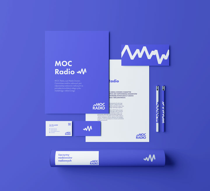
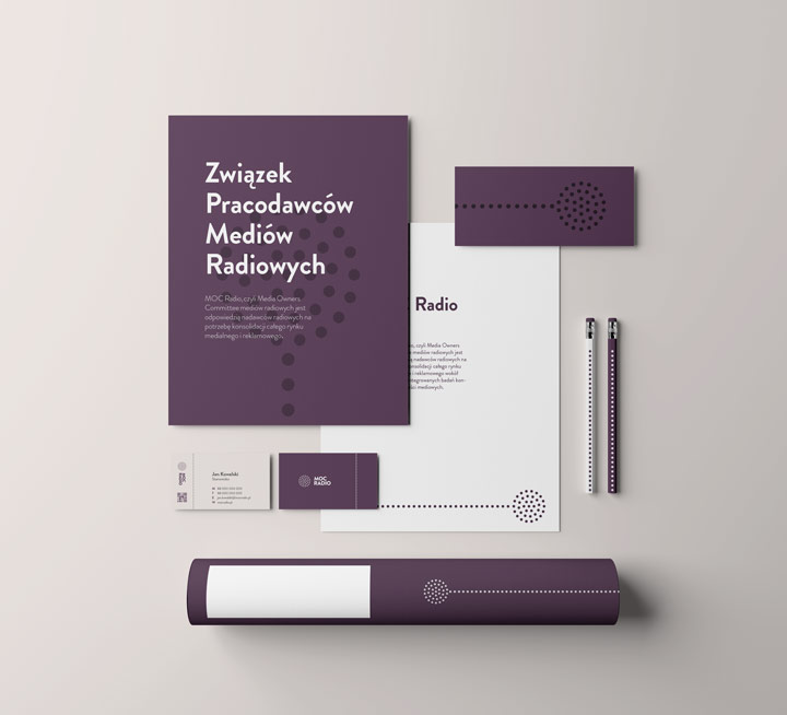
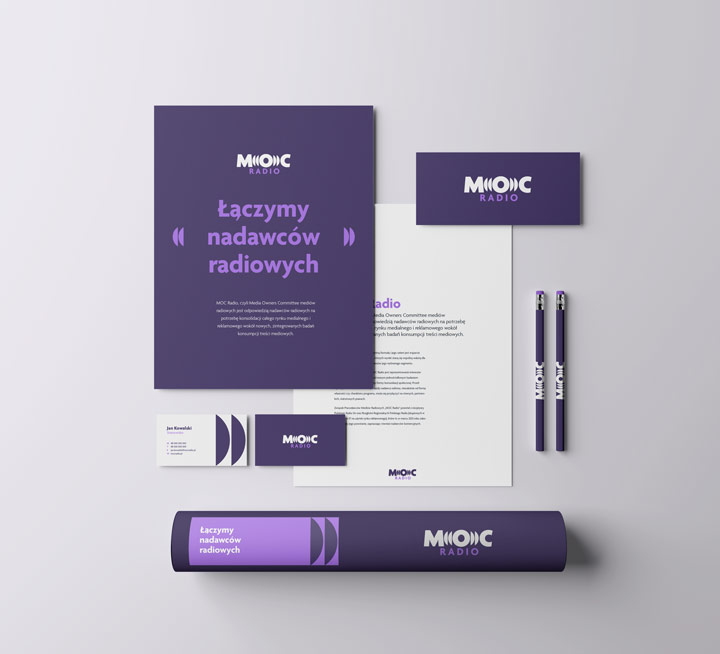
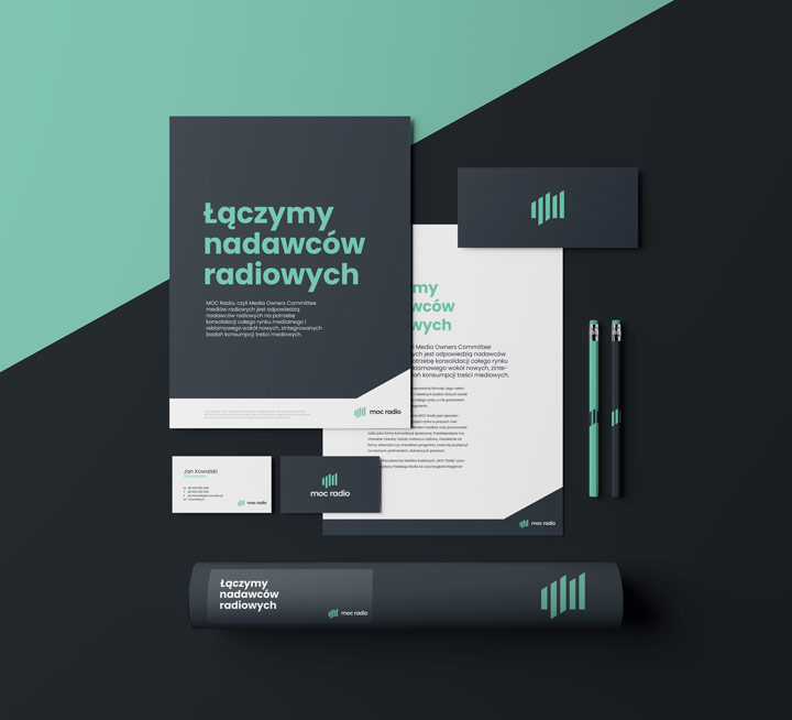
In response to the brief, we developed four concepts for the organisation’s logotype, each of which addressed the client’s needs in a slightly different way. Along with the logos, we presented our idea for translating the logotype concept into further visual communication.

Selected logo
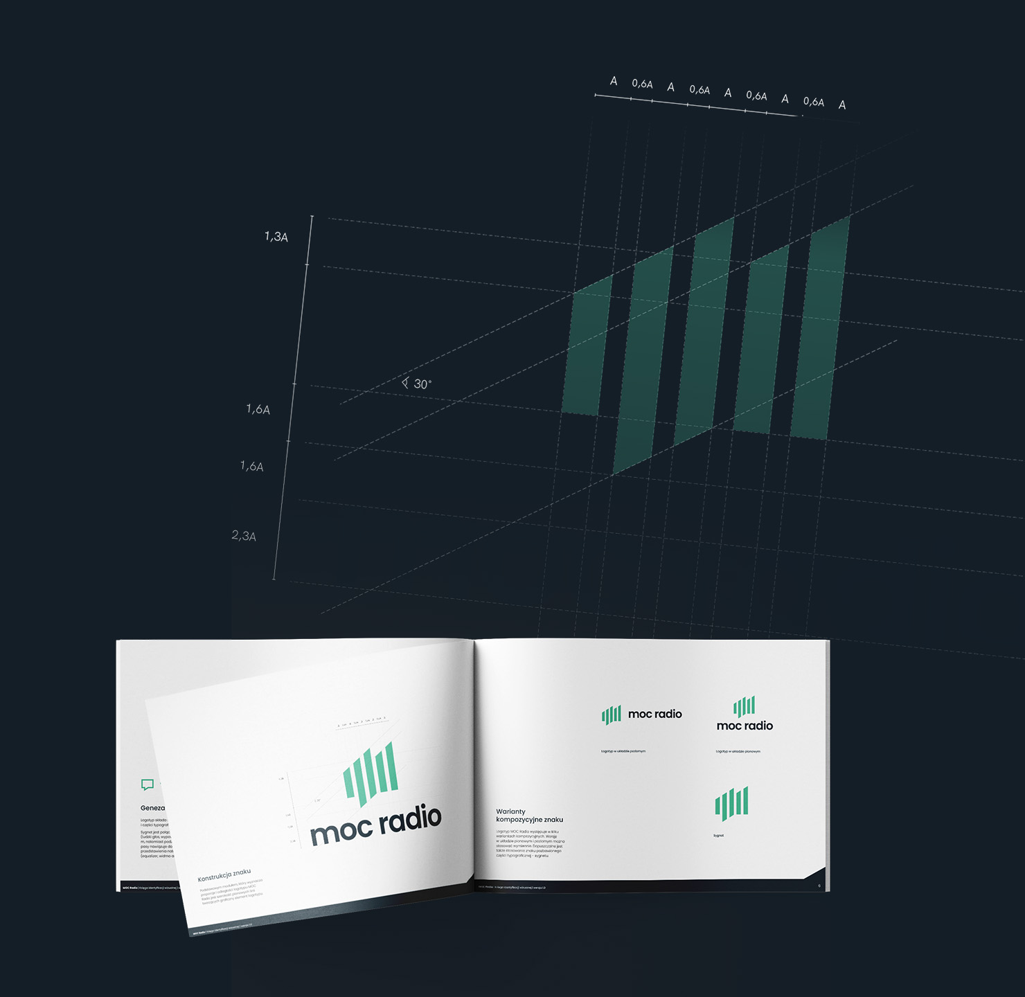
In the course of joint meetings-workshops, we worked out the target shape and colours of the logo. The logotype refers to the organisation’s area of activity. The symbol is a combination of rhythmic stripes referring to the graphical notation of a sound wave, a cloud referring to openness to dialogue, and the letter M. The logo was complemented by simple, contemporary typography. We opted for a strong and modern colour scheme – a combination of navy blue, sea green and pure white.
4: realise + refine
Refining the selected concept
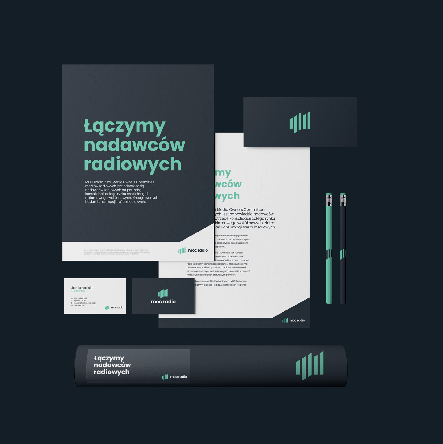
In the course of further work, we developed a preliminary concept for translating the logo into marketing materials.
Brand manual
We created a visual communication book for the selected concept. Together with the client, we worked out the principles we followed in the course of further work on the organisation’s communication. This way of working made it easy to control the coherence of the whole.

5: launch + learn
Website – desktop
A particularly important element of the work on the creation of MOC Radio was the website. At the initial stage, we created a functional mock-up of the site so that we could work with the client to fine-tune the layout of the content and basic functionalities before embarking on the graphic design.
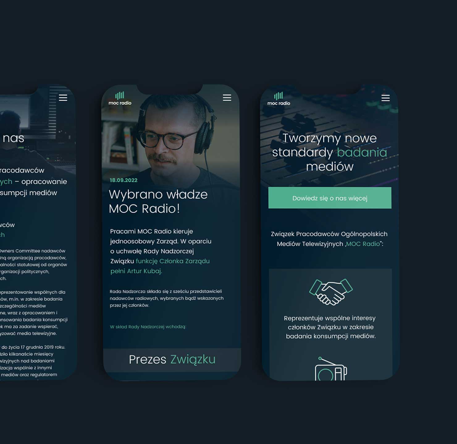
Website – mobile
After accepting the functional layout of the website, we moved on to work on the graphic design. The mobile site was particularly important to us, as the vast majority of the site’s audience view it on their phones.
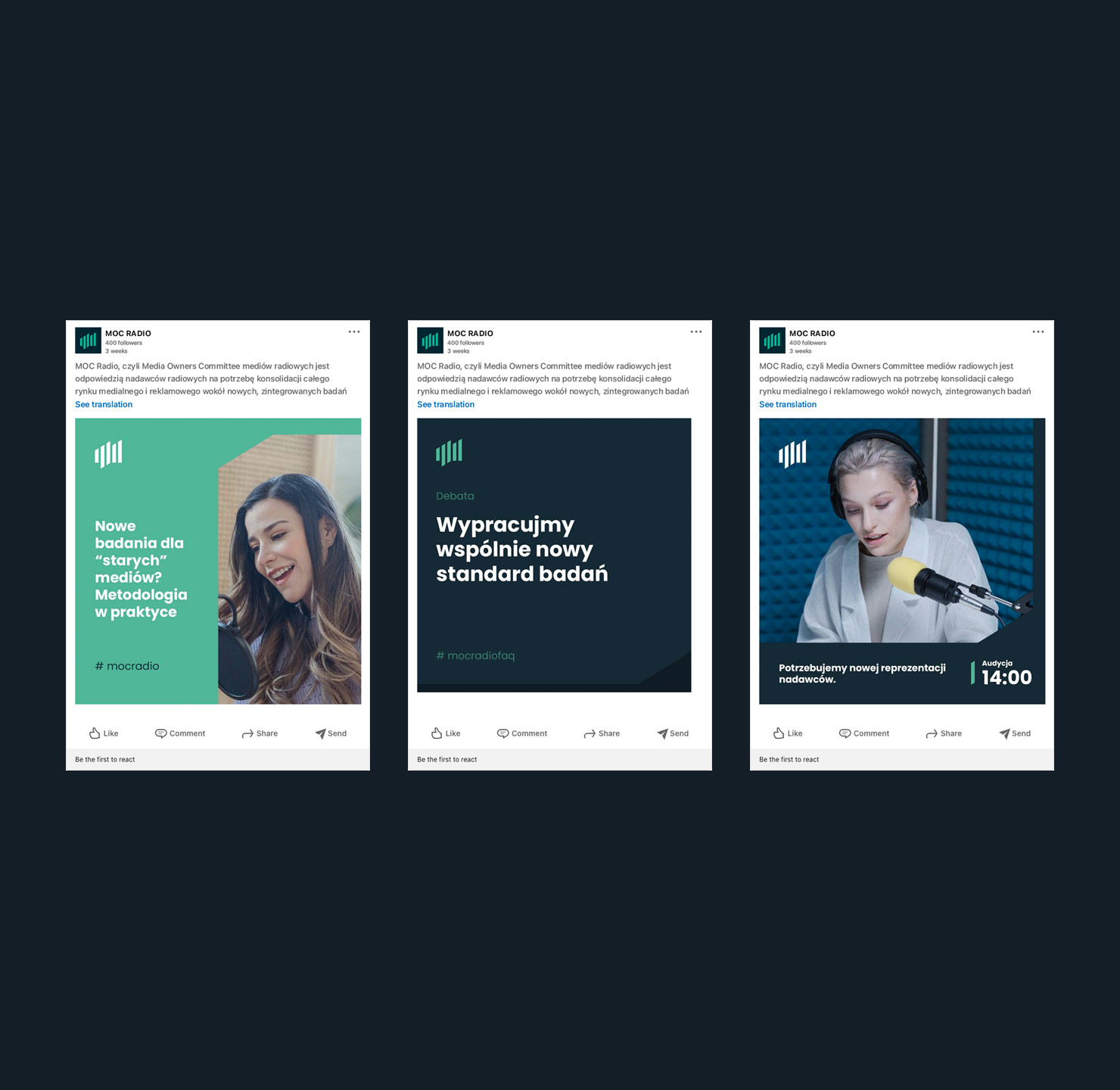
Social media
We also developed a graphics template for MOC Radio’s social media. We developed several possible content layouts so that at a later stage the client could create differentiated content on their SM channels on their own.
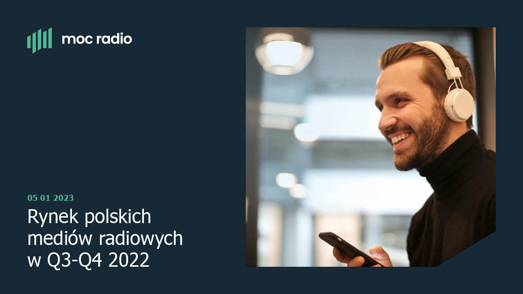
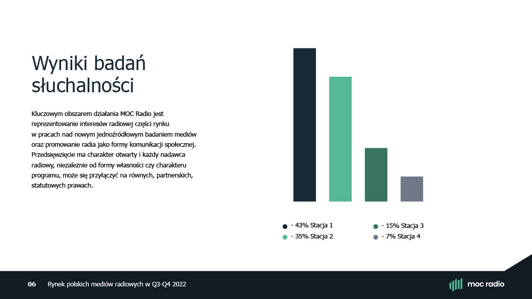
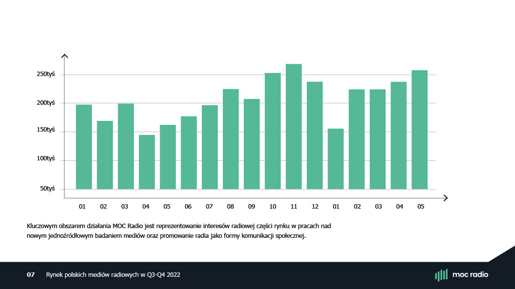
Powerpoint presentation template
We created the MOC Radio presentation template. We developed the style of the individual slides, typography and charts so that the presentations created by the client remained consistent and elegant.
6: guide + grow
Care and supervision of communication consistency
We place great importance on how our work translates into the subsequent functioning of the brand. That’s why we are happy to help with the seamless implementation of a project and include artistic supervision, as we are keen to ensure that once the work is done, it can work for years to come.
