we+Atlas ArenA Amsterdam
The task was to create a visual identity encompassing all aspects of campus life of the Dutch office building complex Atlas ArenA Amsterdam: building and area signage, amenities, hotspots, as well as all forms of communication, from newsletters to social media and the website. The identity needed also to be scalable for all future needs. This called for more than a logotype and a dedicated font.


About Atlas ArenA Amsterdam
After initial brainstormings and workshops we identified key brand pillars of the new AAA brand: vibrance, friendliness, professional but relaxed approach. A key assumption was to capture the essence of a perfect workplace: well maintained and professional, but also light-hearted and fun to work at. To achieve that, we introduced several elements of visual language. All those elements combined comprise AAA’s own visual DNA.
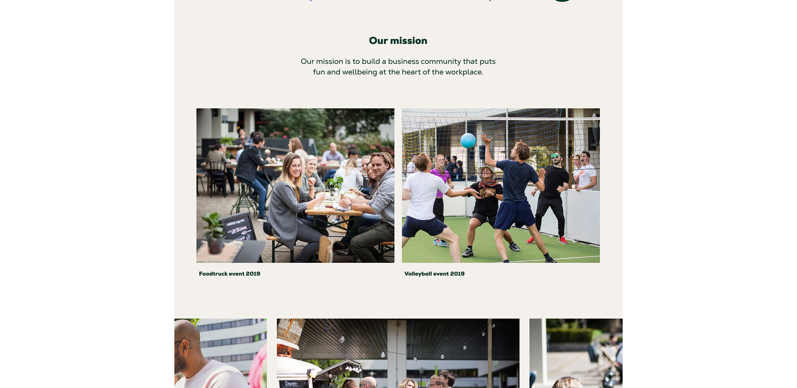
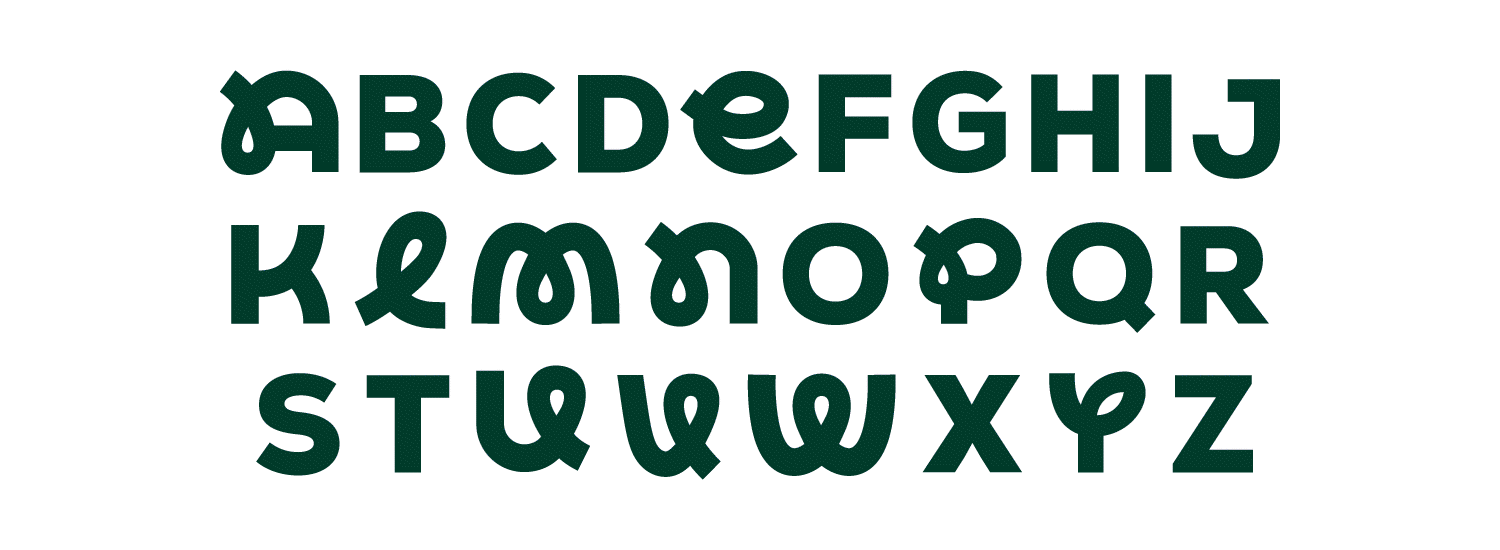
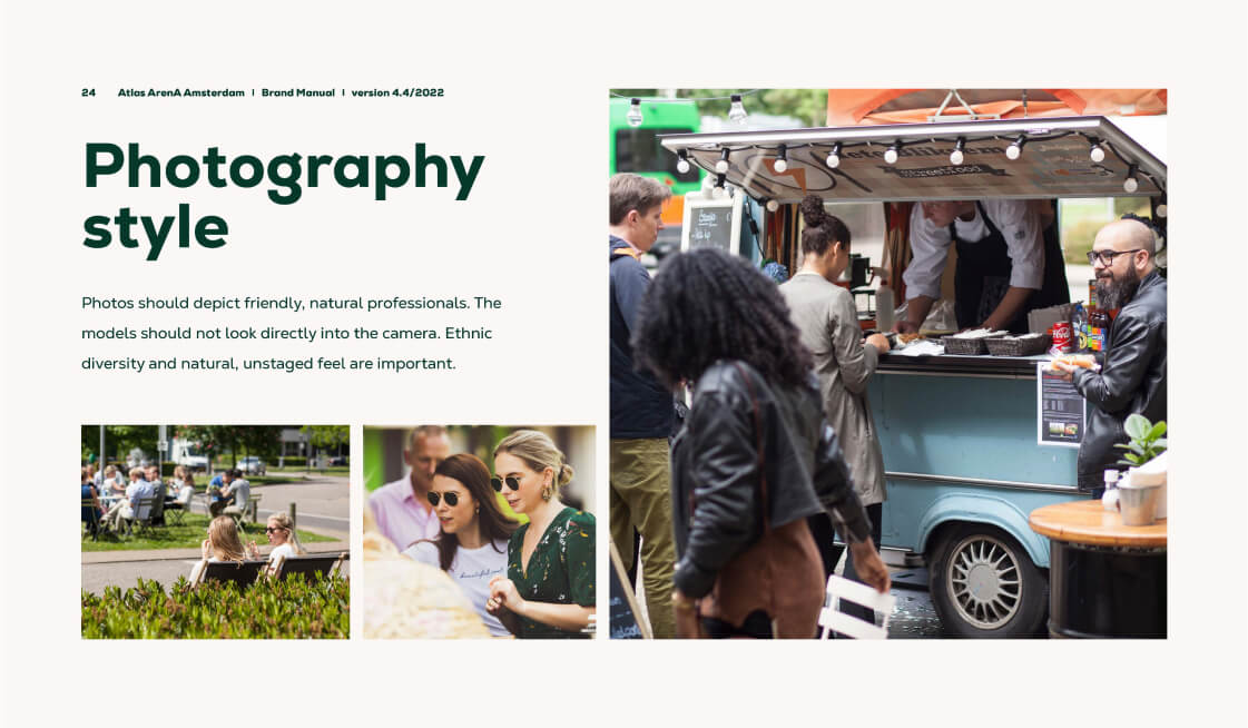
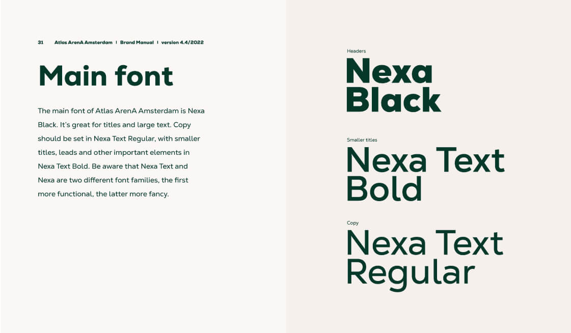
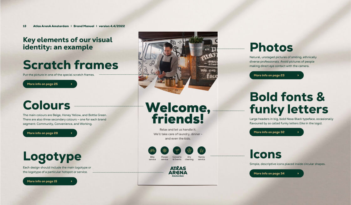
With legibility in mind, we picked a friendly, solid Nexa typeface and enriched it with several additional hand-drawn characters to add just the right amount of personality. To avoid boring rectilinear lines, a variety of so called “scratch shapes” was designed, serving both as picture frames and graphic elements. Rules for photography were set – making sure the campus and its people are portrayed in fun, engaging and contemporary way.
After several trial-and-error print tests, a colour palette was developed. Numerous icons were created. We also established a playful and informal tone of voice for communications.
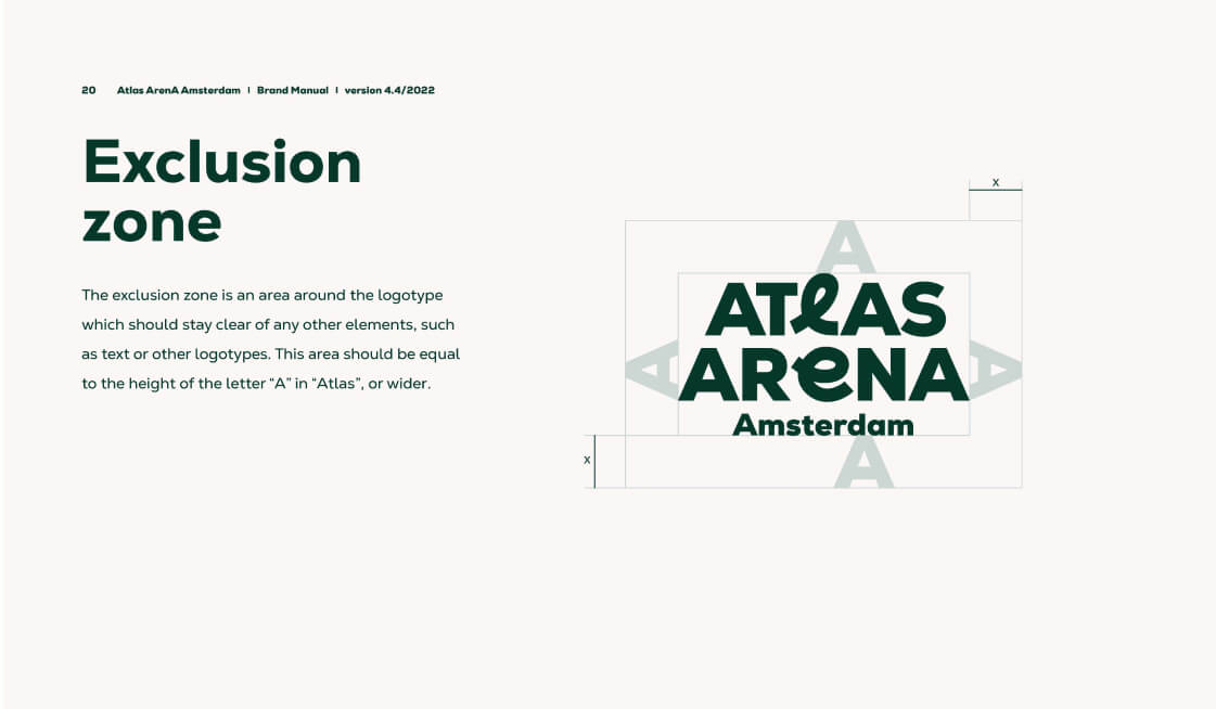
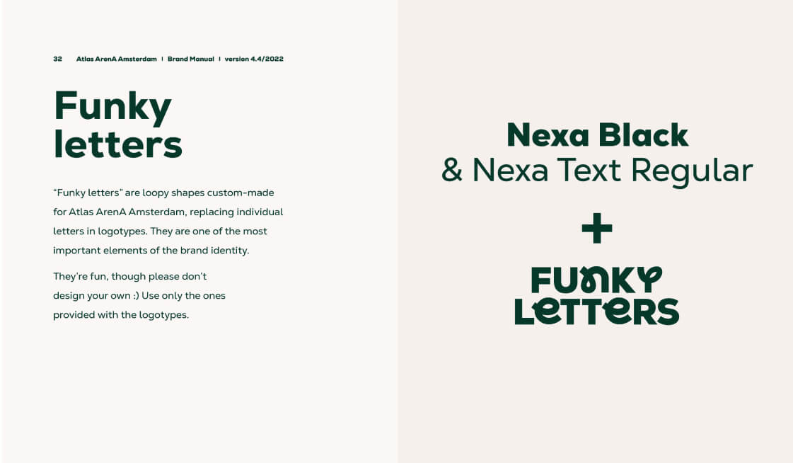
Funky letters
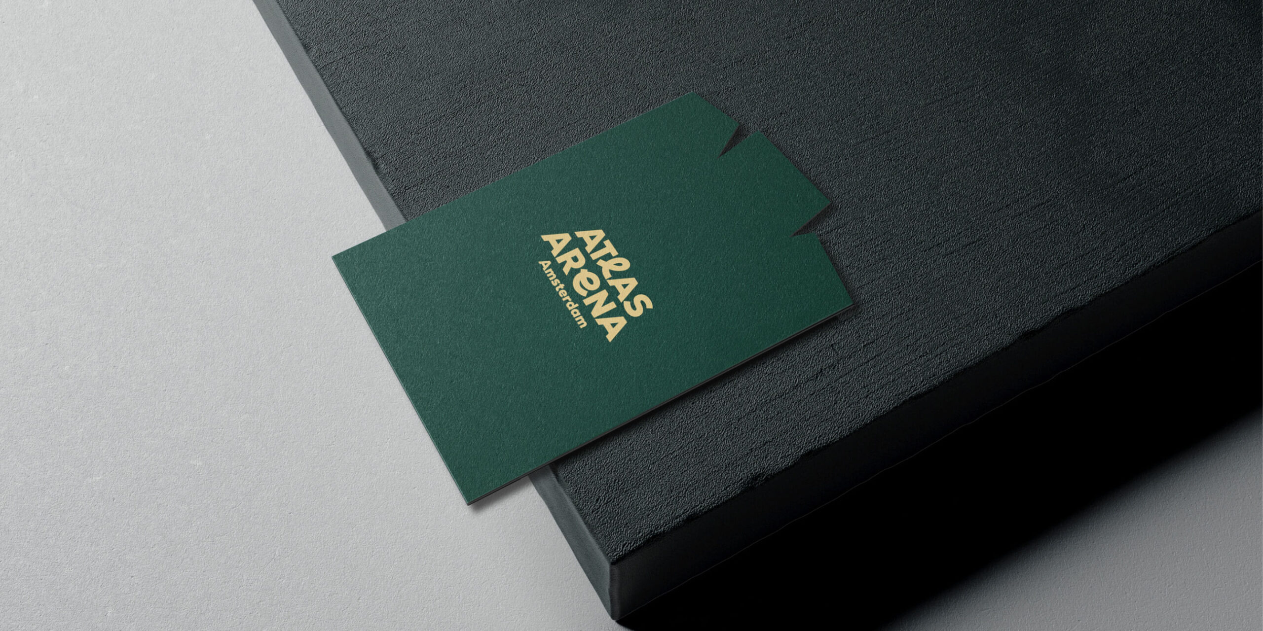
Up to this day, we have created over thirty logotypes for various AAA buildings, amenities and services. Each of them is instantly recognisable as a member of the brand family, thanks to the unified font and colour, and the use of so called funky letters – custom-made loopy shapes replacing individual letters in a logotype. There’s always at least one funky letter in each logotype. They are quirky, fun, and cheerful. They introduce personality. And what’s most important from a design point of view, they unify the identity, and make it scalable, ready for multiple future uses. Thanks to them, the new branding is instantly recognisable and like no other.

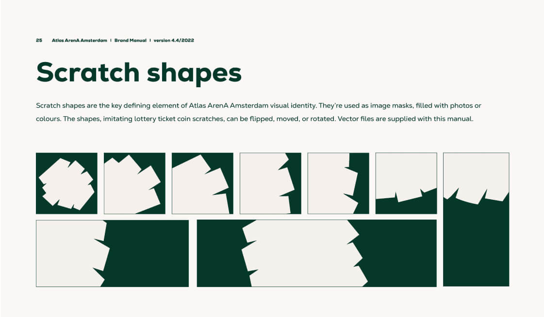
Scratches
The scratch frames and shapes break the boredom of a traditional layout. They are dynamic and playful, just like Atlas! Whether they are filled with pictures or serve as colourful backgrounds, they introduce joy and quirkiness to our visual communication.

Icons
To complement the brand, a diverse set of icons was created. Iconography is an important ingredient in Atlas materials – adding a lighter feel and personal touch to all materials. Quite often icons are complemented by funny taglines. We even created some animated versions for all of us to enjoy!


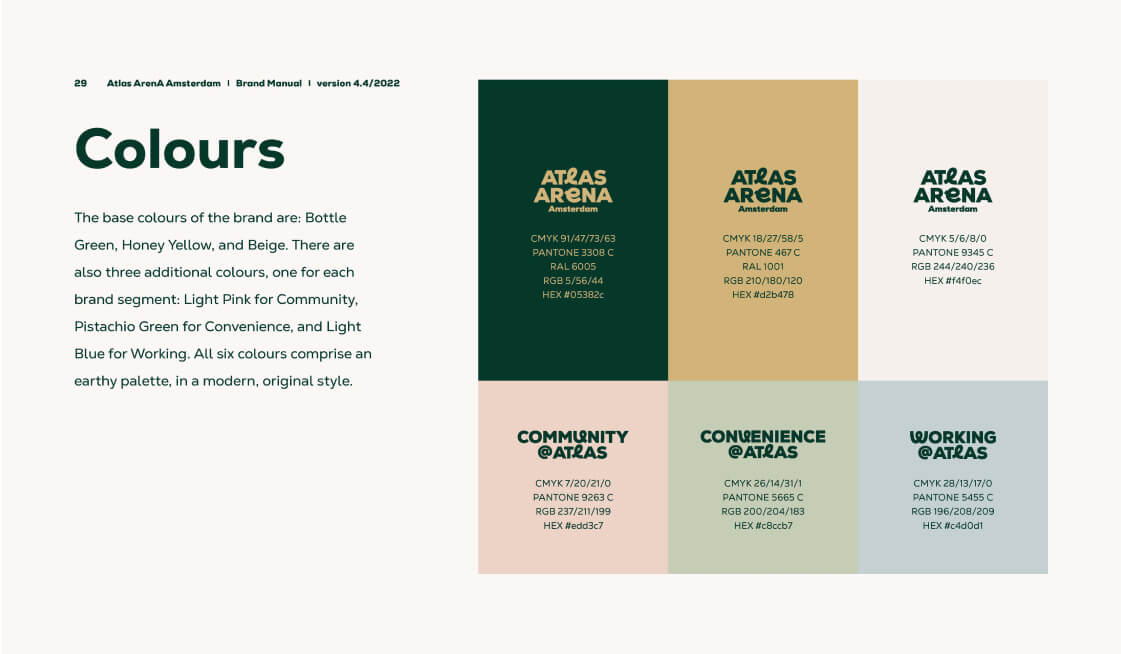
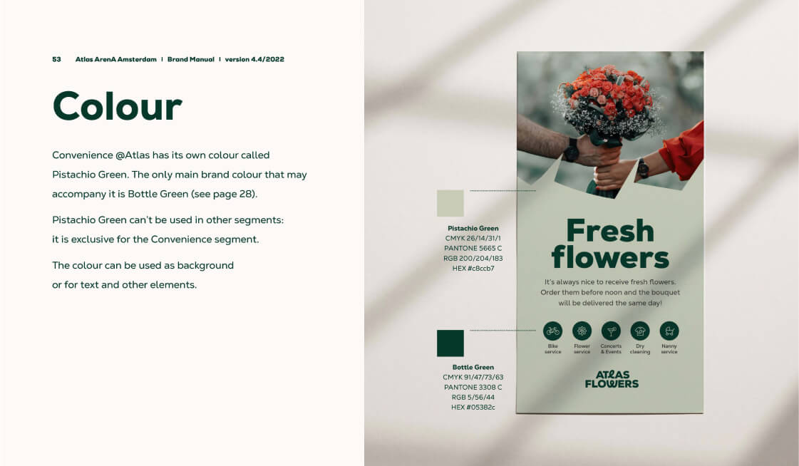
Colour palette
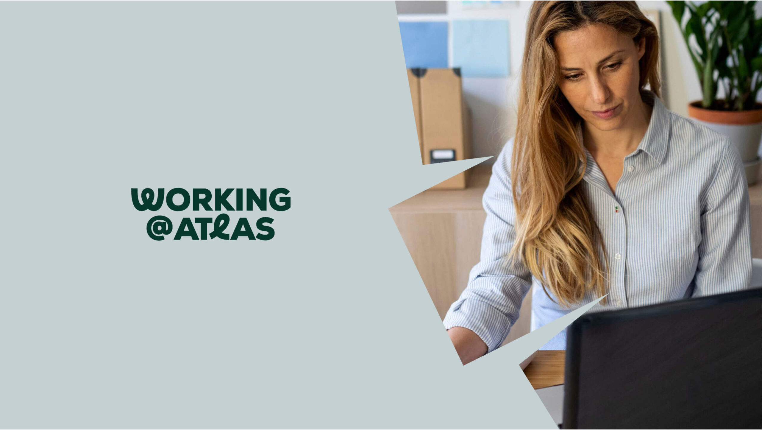
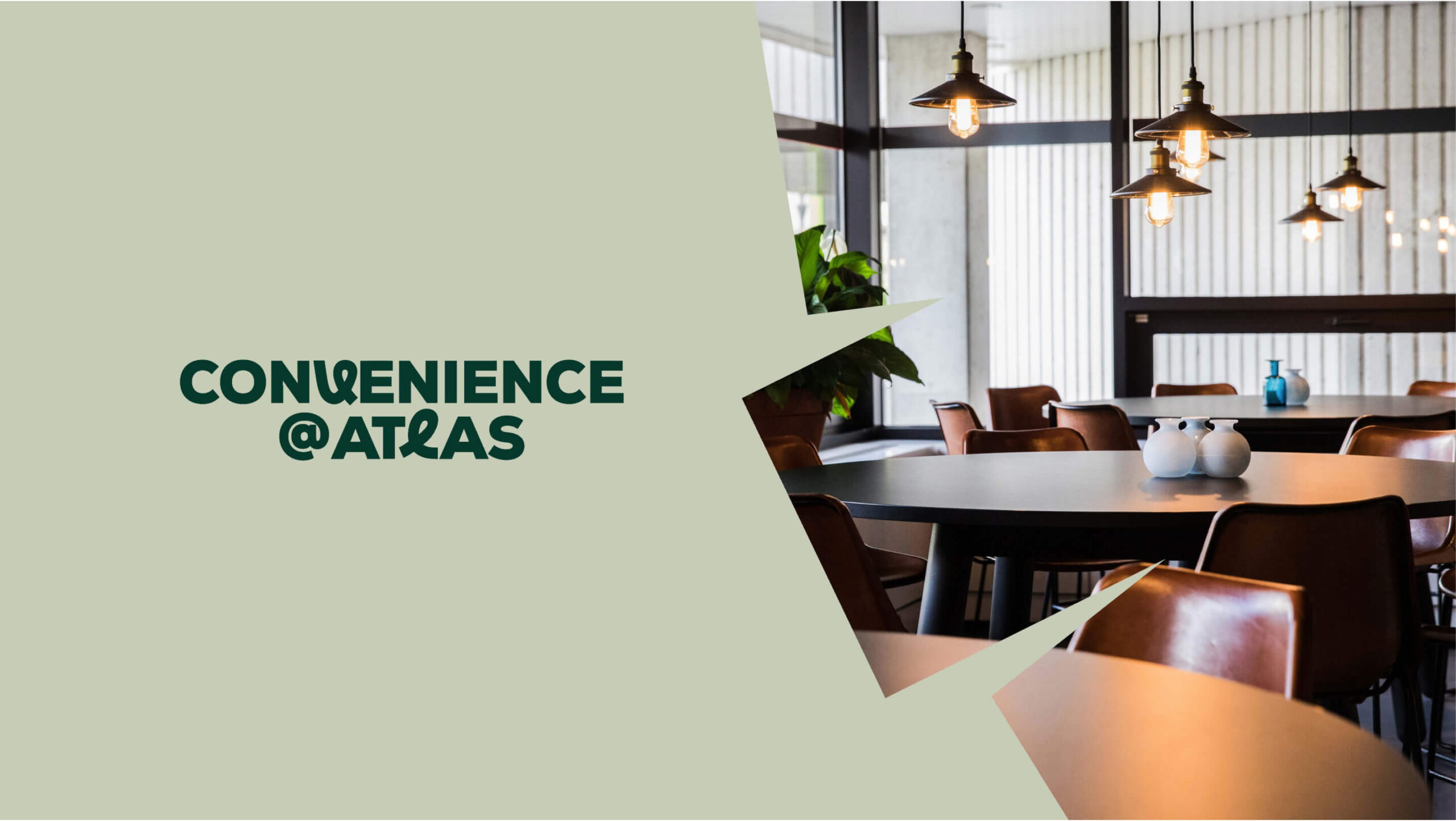
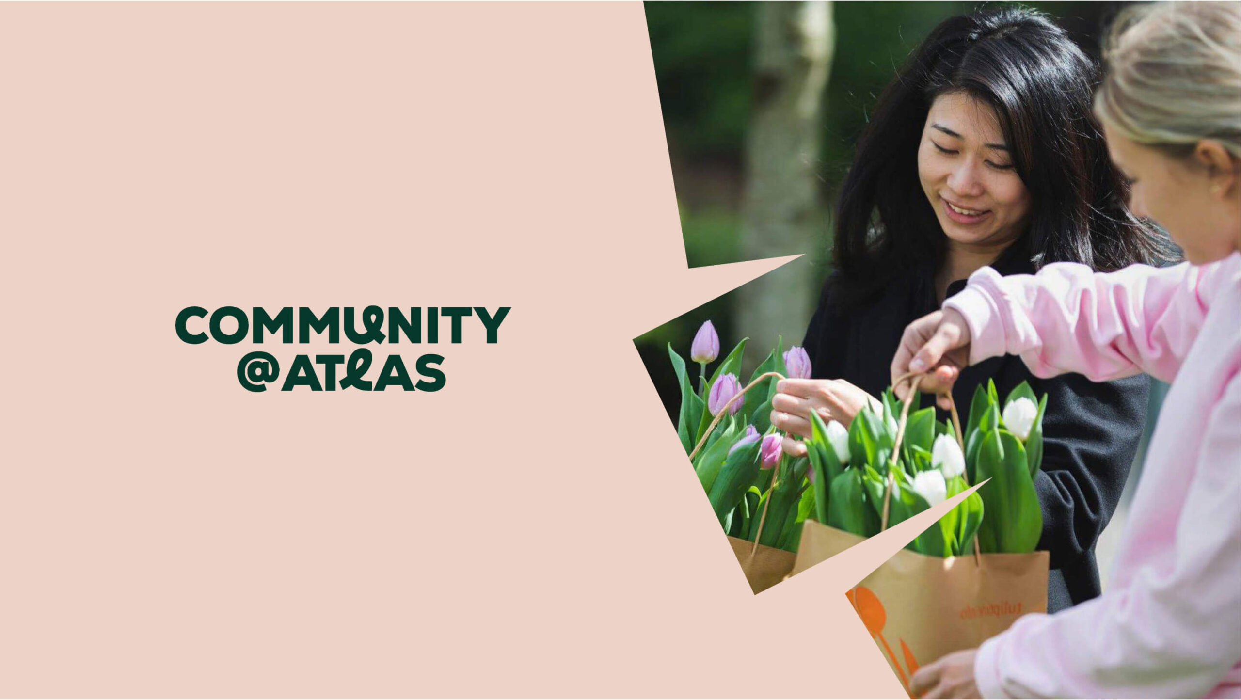
Atlas ArenA Amsterdam colour palette is divided into two parts. The base colours, Bottle Green and Honey Yellow (with light beige serving as a background) needed to be strong and noticeable, as they would be used for signage and main brand communications. The three additional colours, each assigned to one of the brand segments (Working, Convenience and Community), are earthy, calm and muted. Contemporary and inspired by nature.

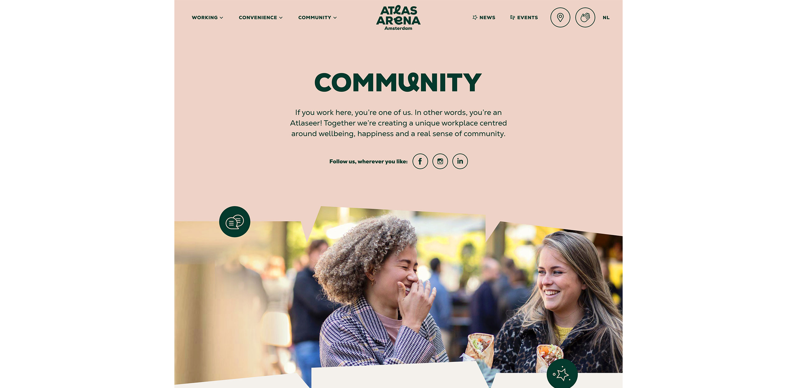
The Atlas ArenA Amsterdam encompasses three segments: Working, Convenience, and Community.
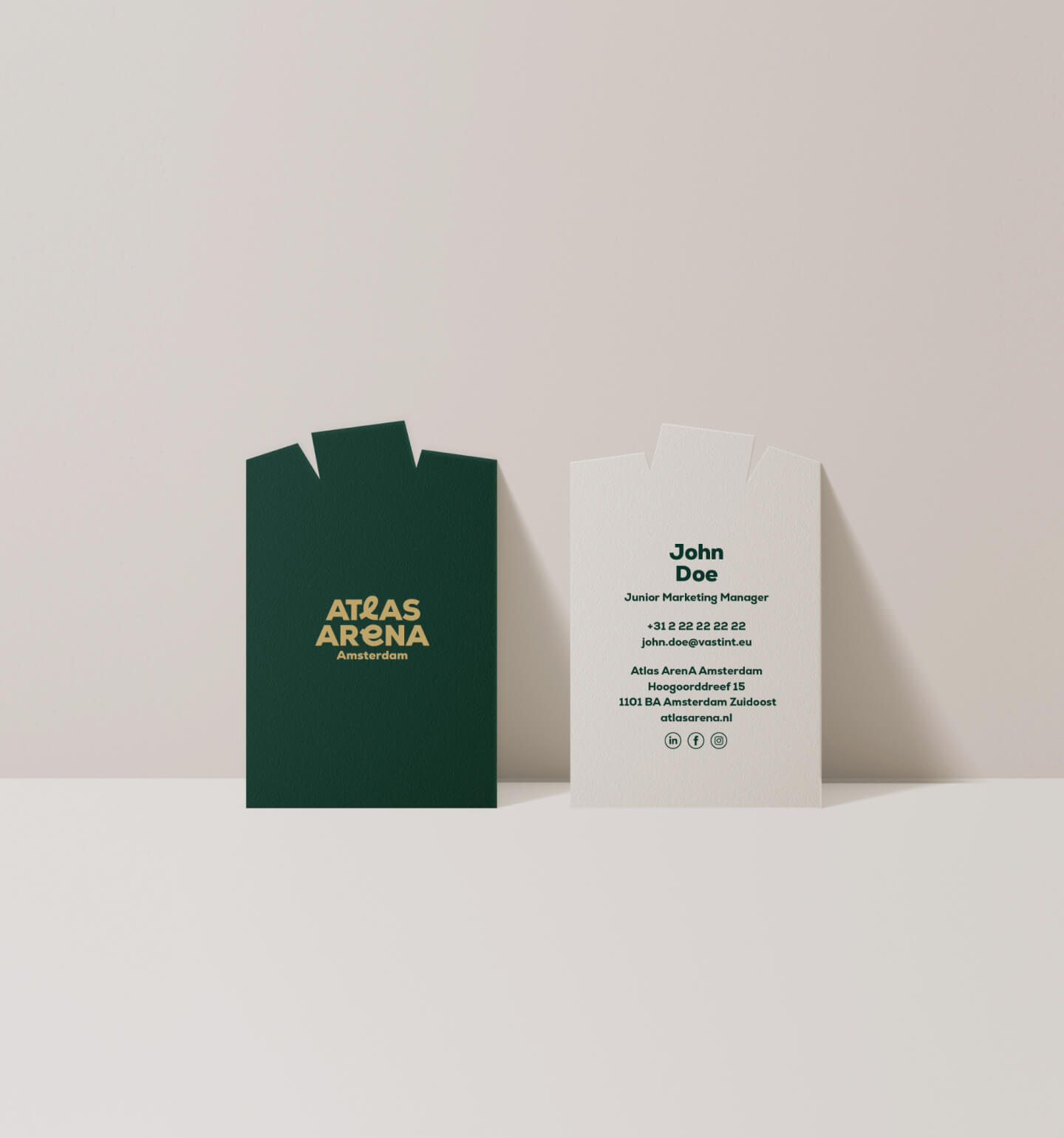
Branding materials
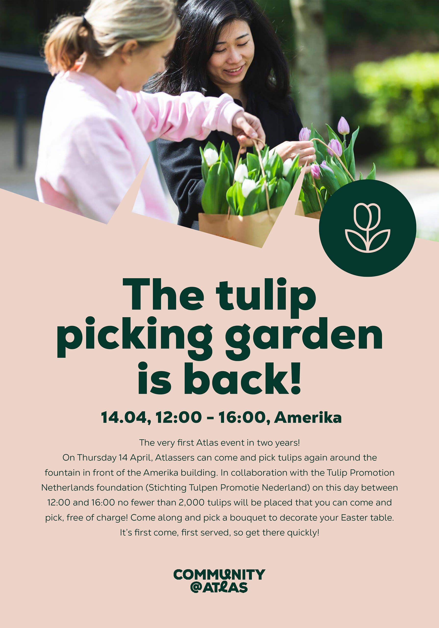
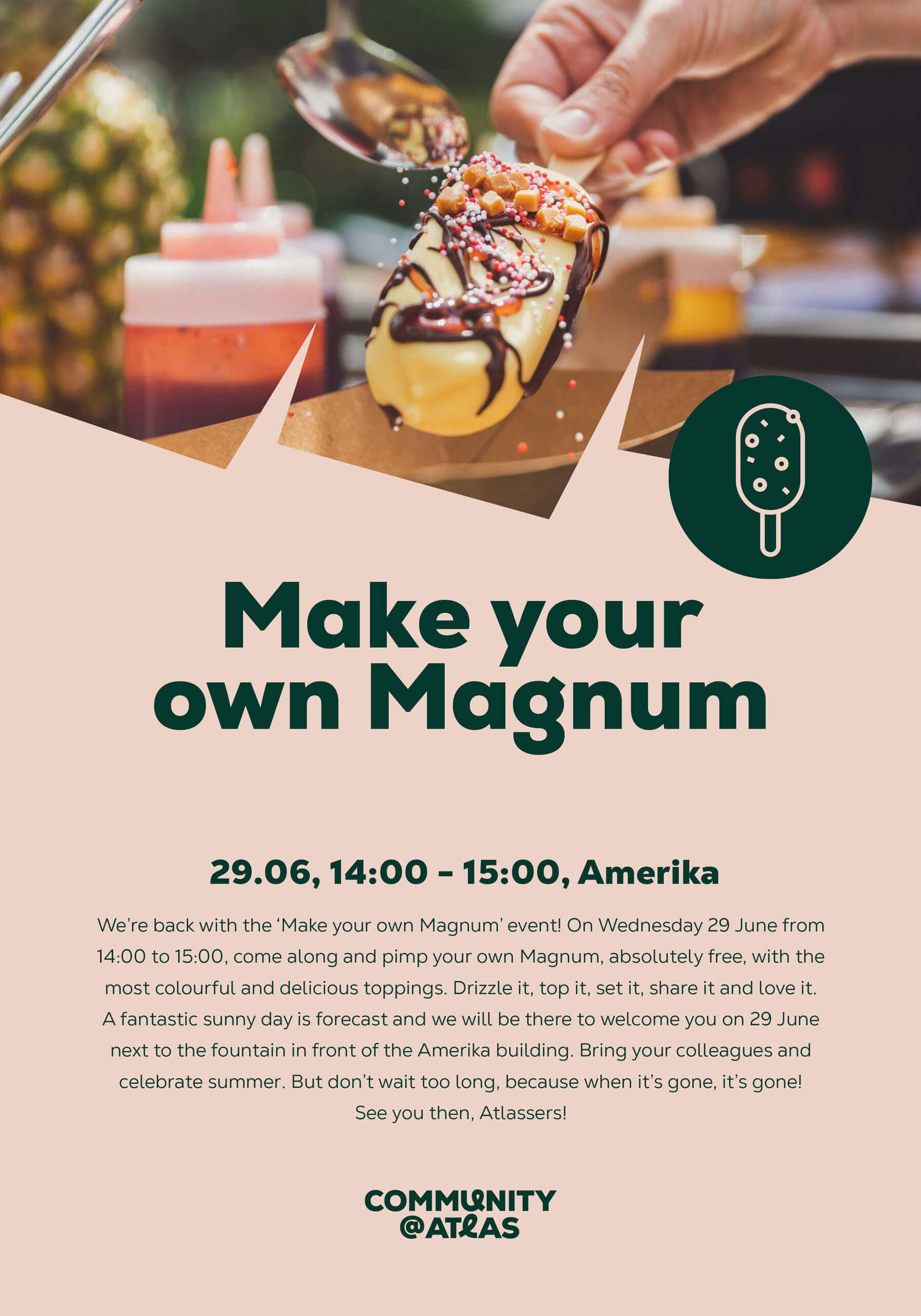
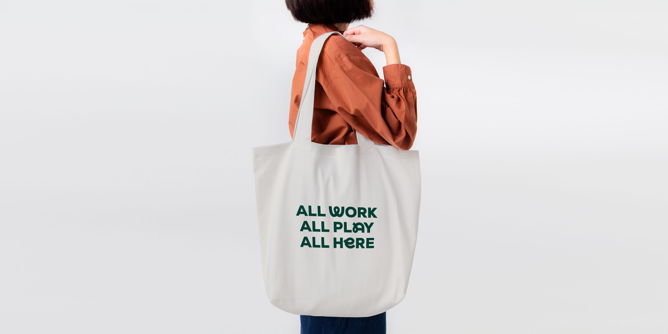
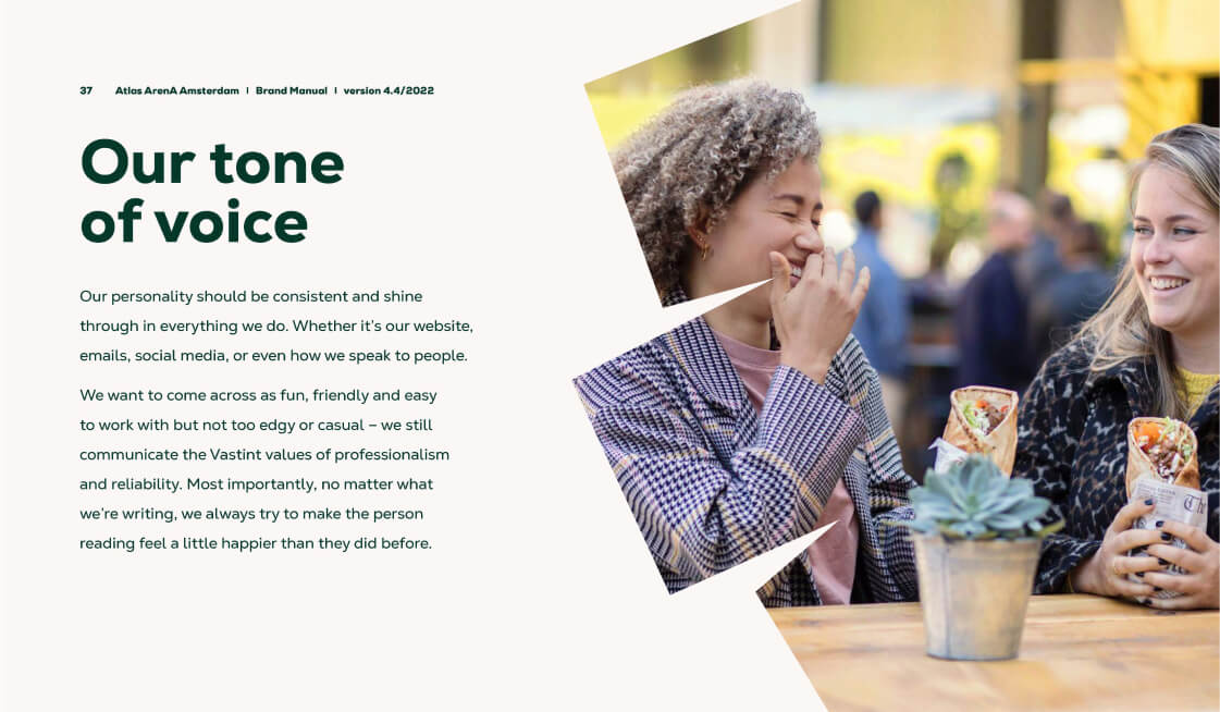
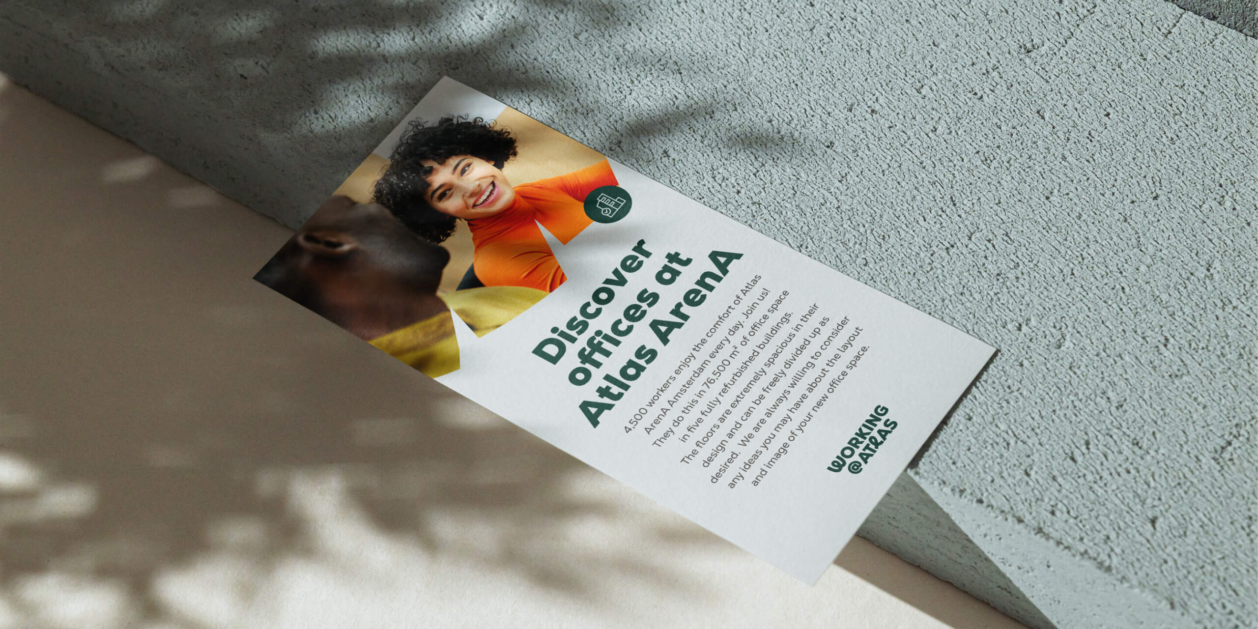
Below are some different uses of the brand in action: a complimentary slip in the scratch shape, event posters, a tote bag, pages from a comprehensive brand book, an advertising flyer and a sample animation.


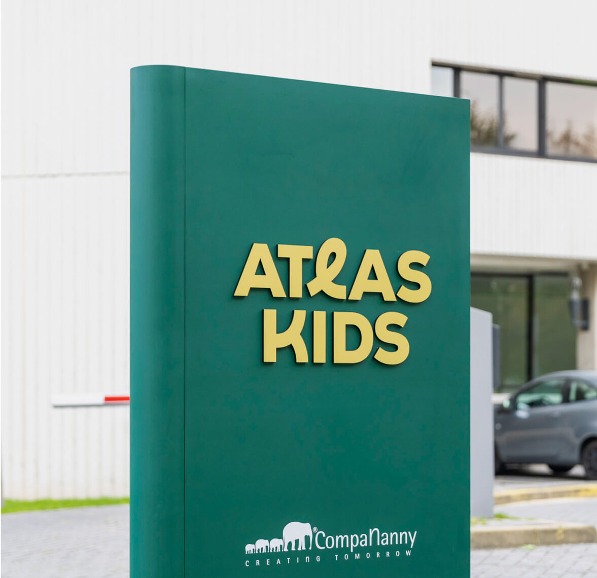
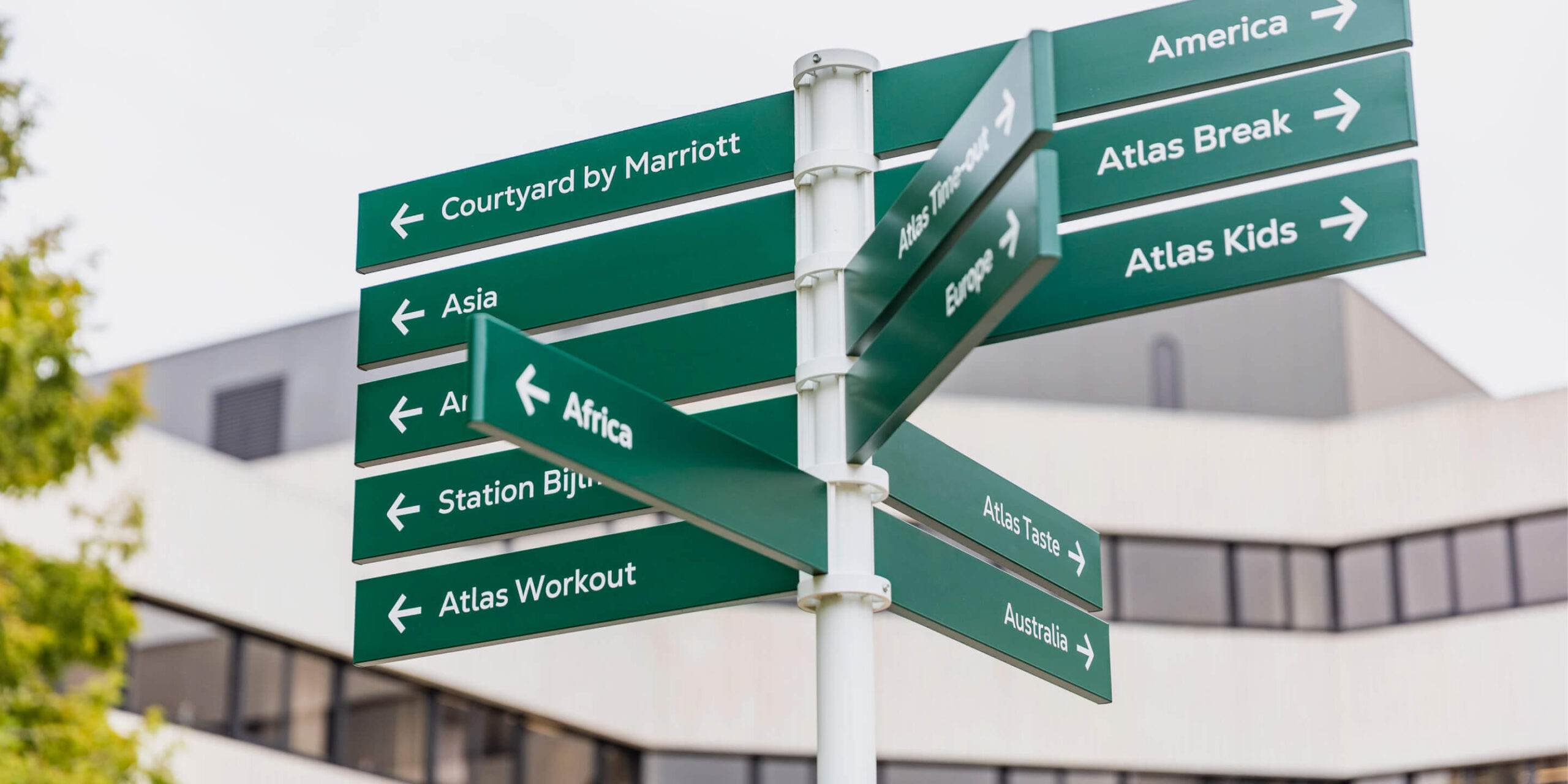
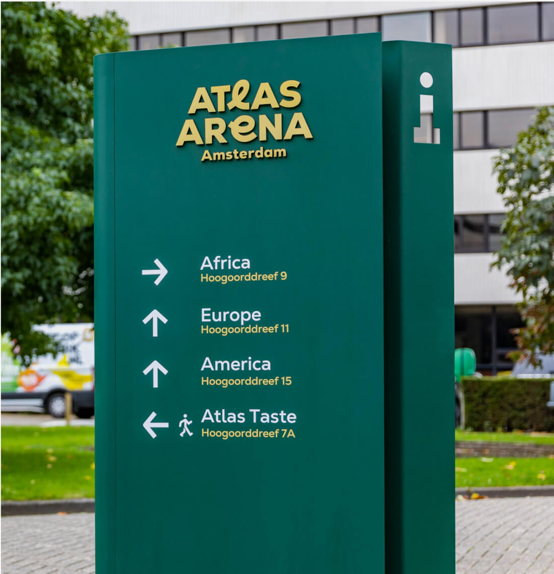
Campus signage
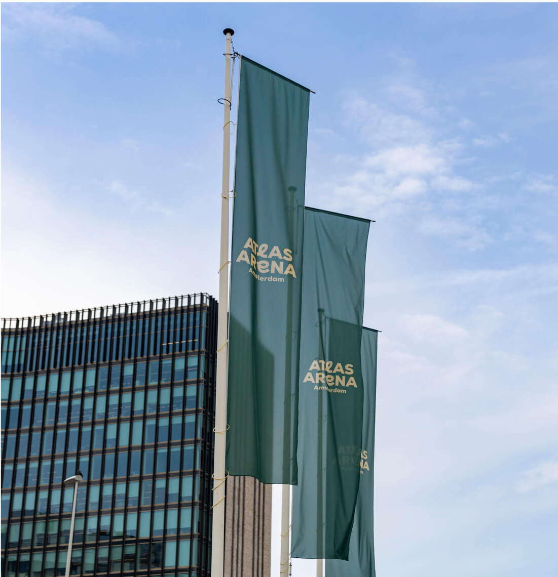
AAA signage follows the idea of funky letters – loops drawn in a single line. Each sign is a single sheet of metal, bent in a playful way. You can see for yourselves when walking on the campus how the main colours of Atlas ArenA Amsterdam – Bottle Green, Honey Yellow and off-white Beige – together create strong and legible visual language.
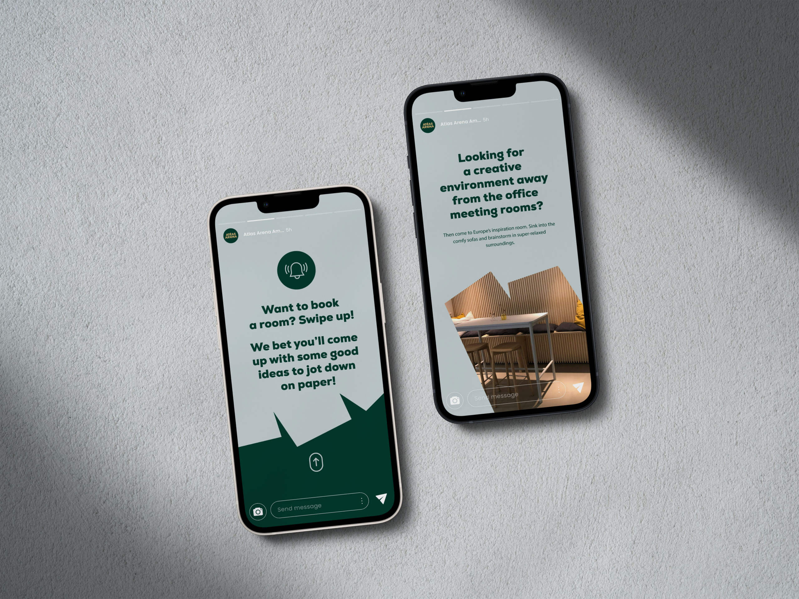
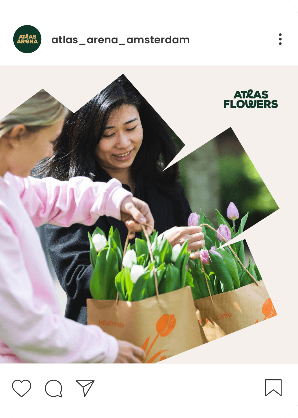
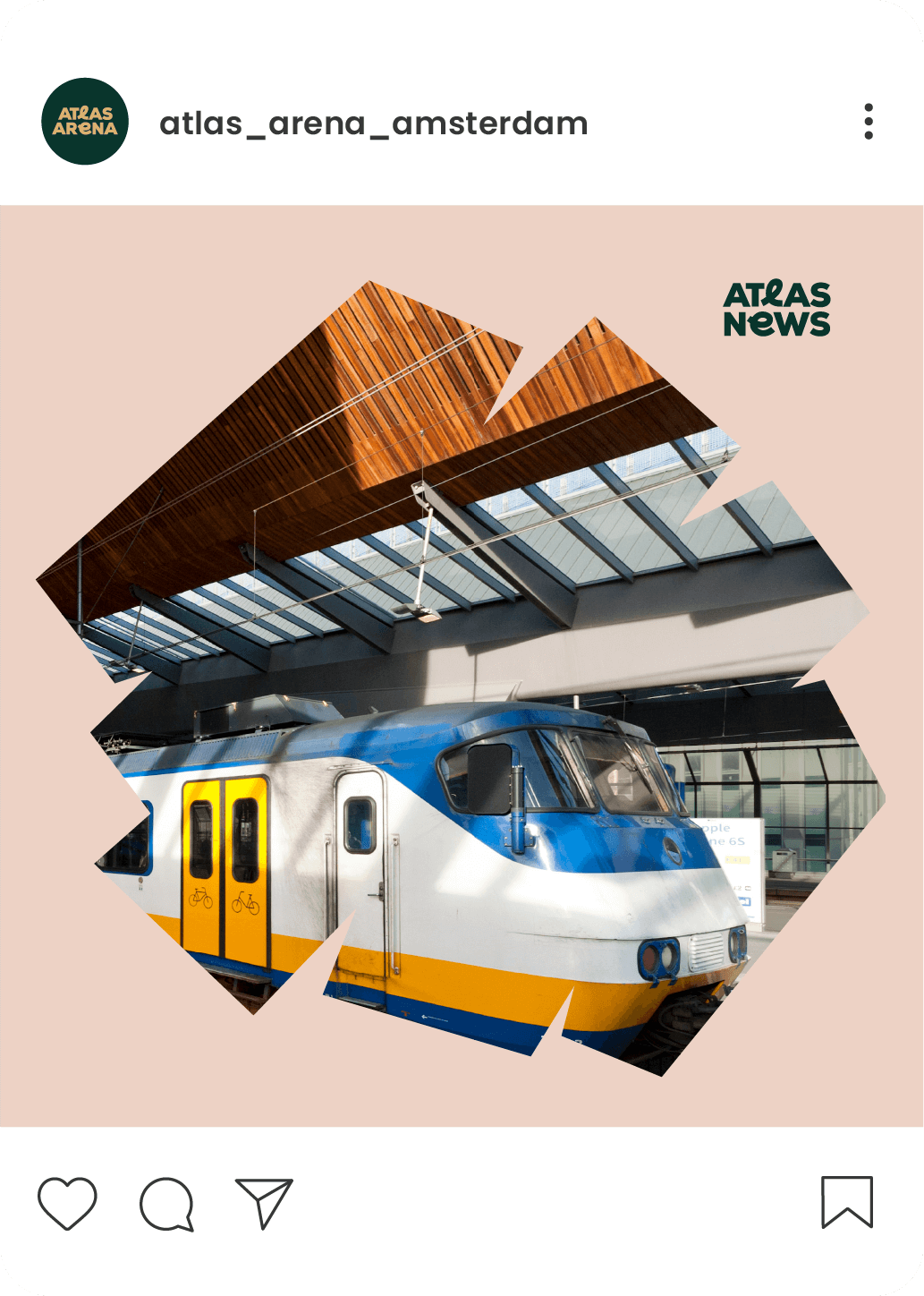
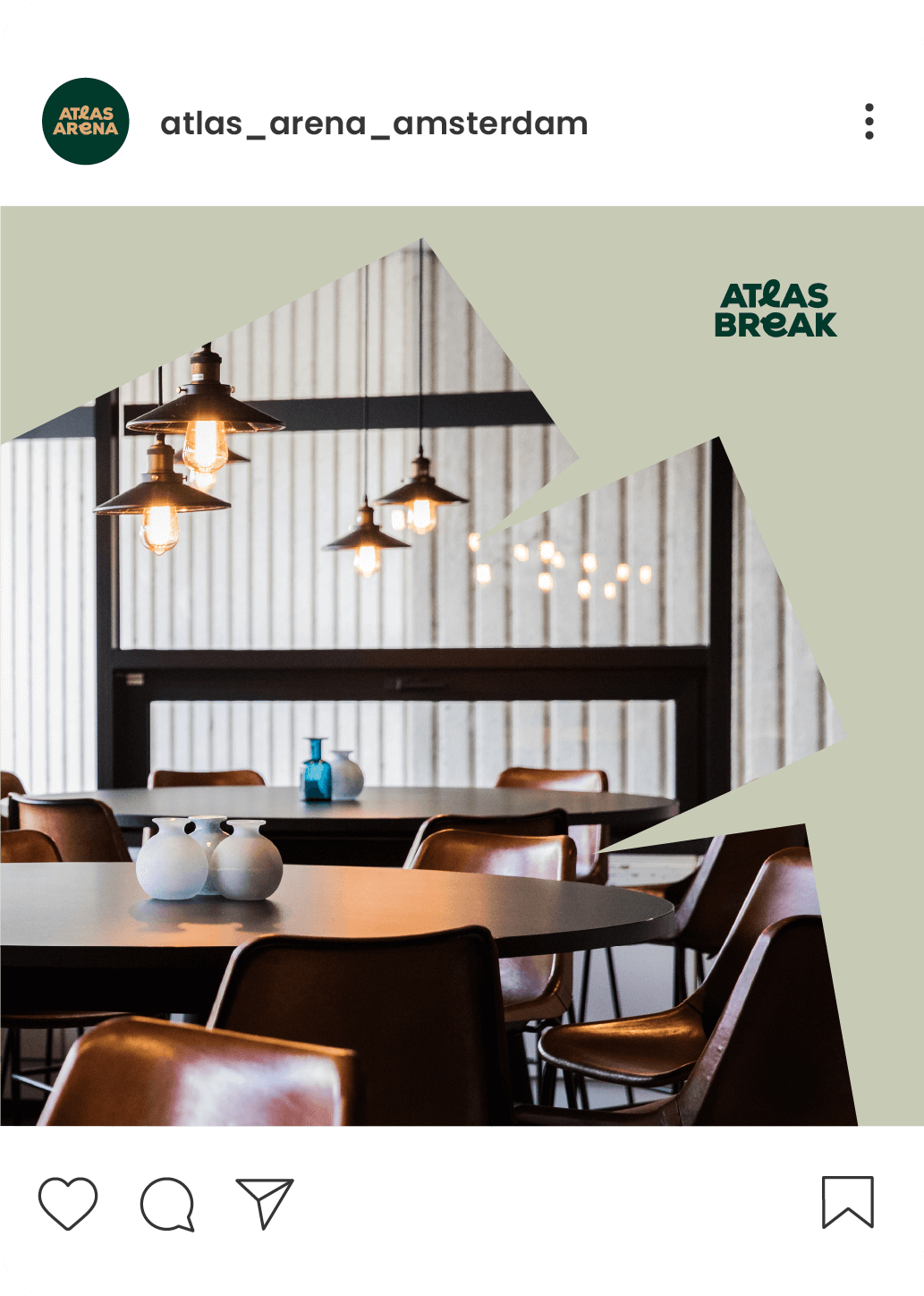
Social media
The social media message reflects the principles of branding: it’s cheerful and professional, full of scratch frames and icons.
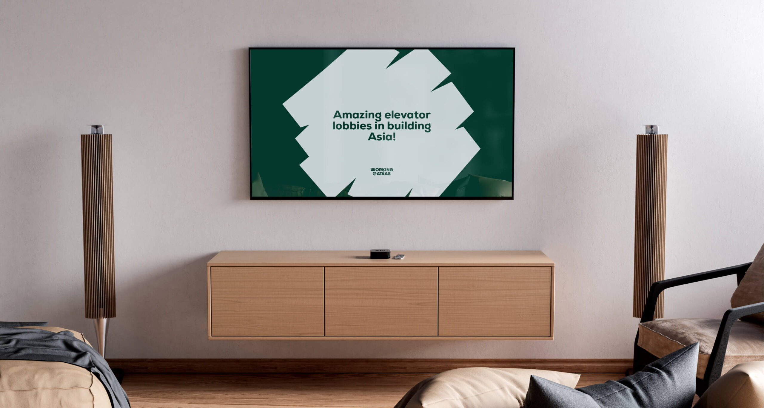
Narrowcasting
An example of a solution not envisaged at the visual identity design stage is narrowcasting – a system of internal communication on screens placed in buildings. This shows how easy it is to scale original solutions to new media and applications.
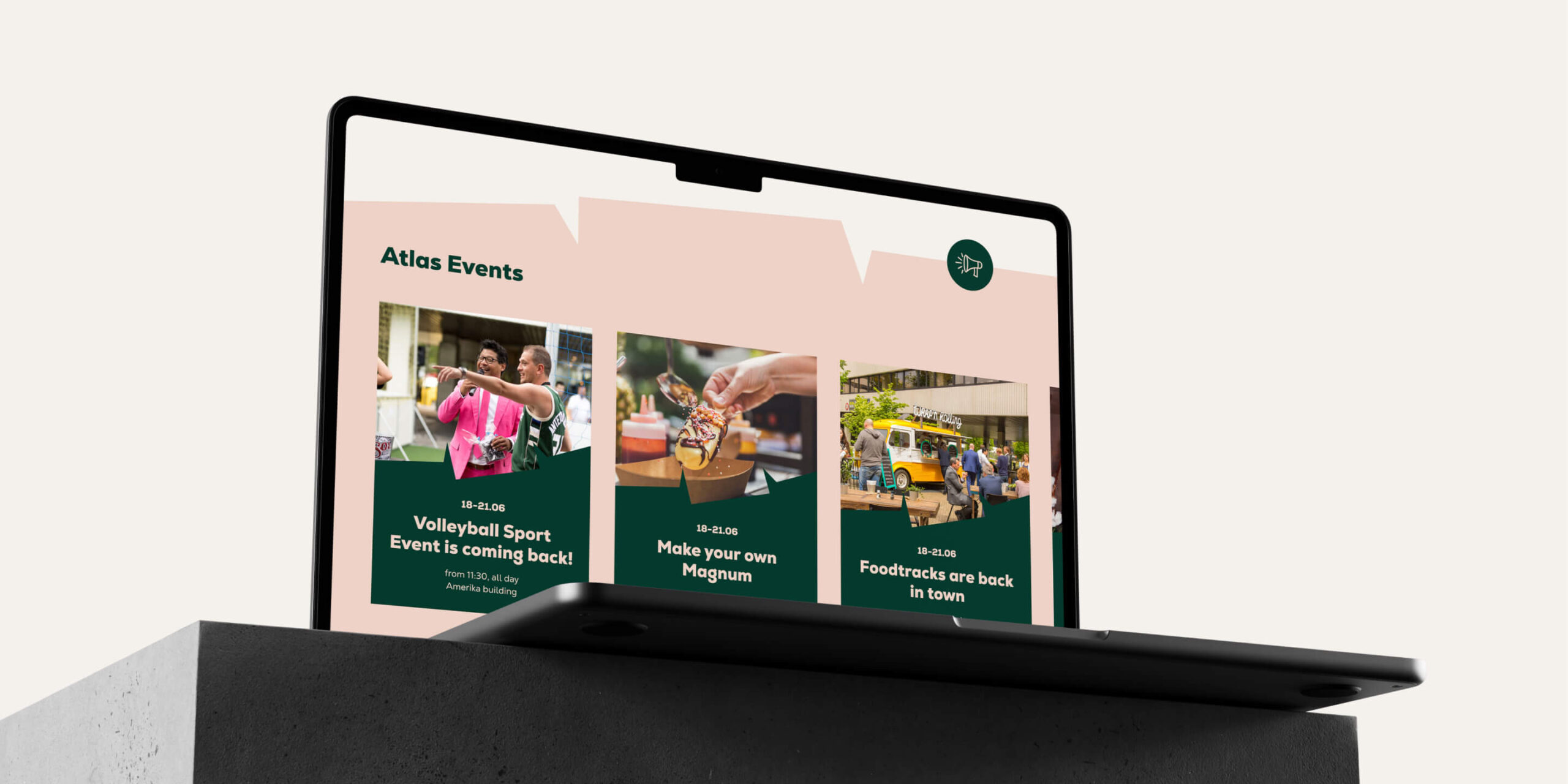
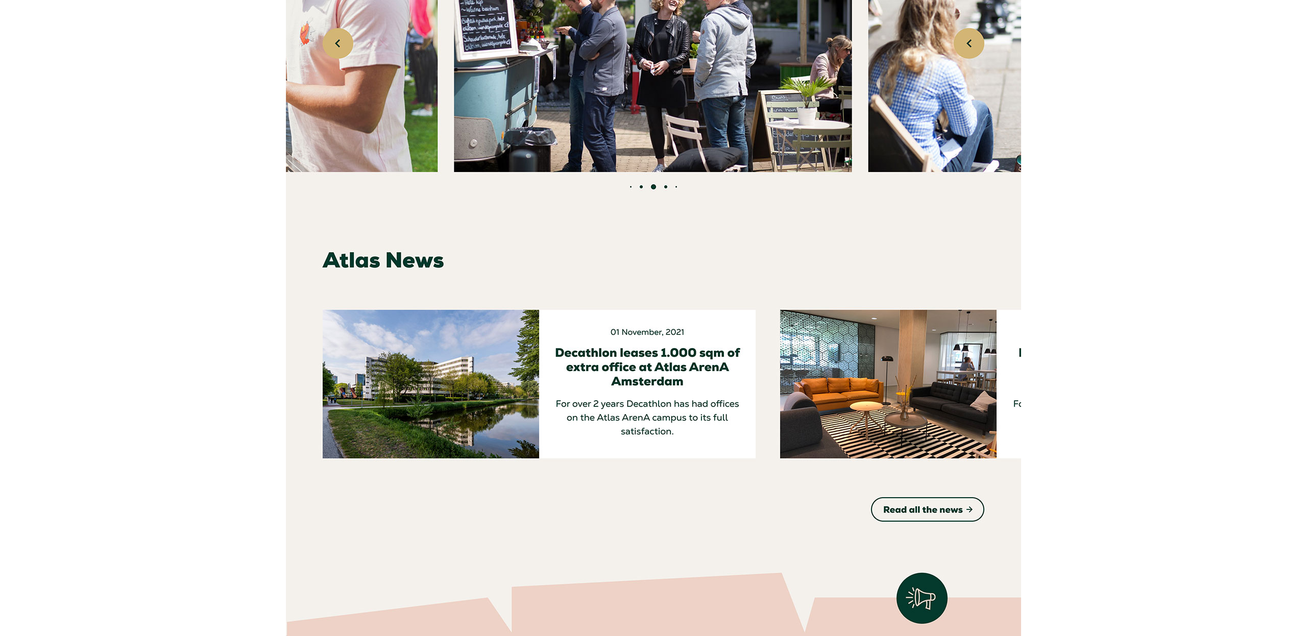
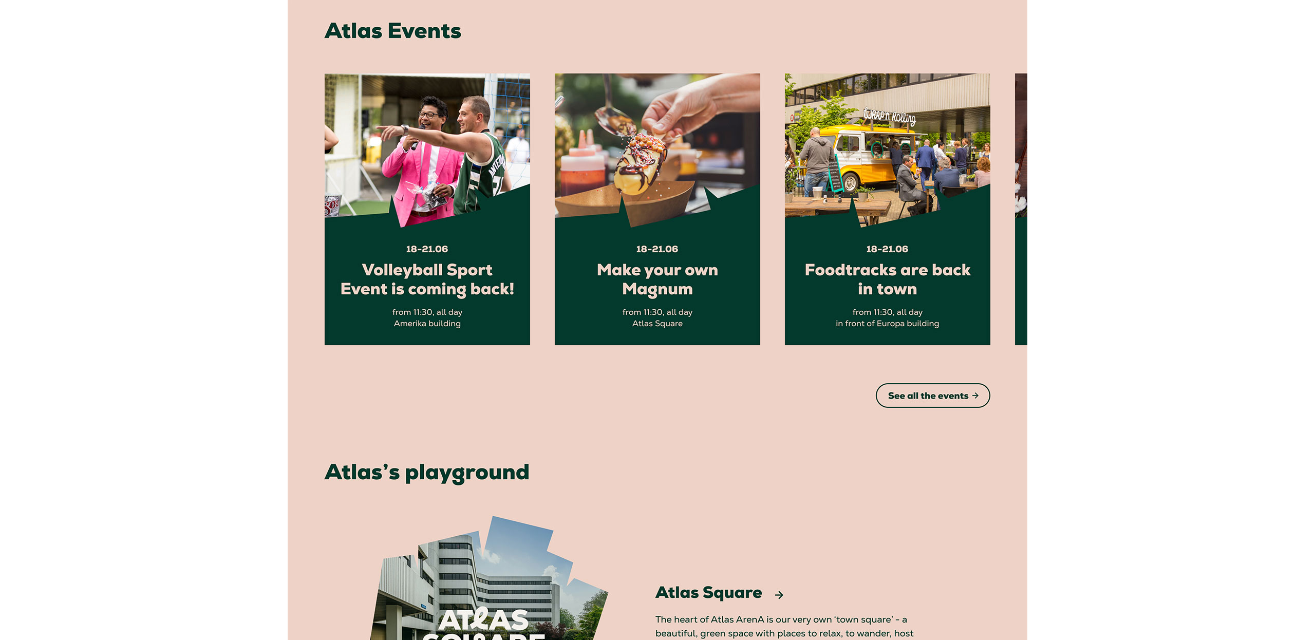
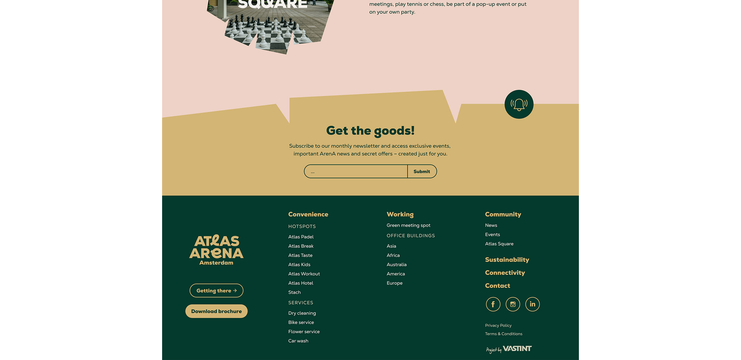
Website
The main information hub of Atlas ArenA Amsterdam is the website we designed. It features the latest news, event information and descriptions of buildings, services and amenities.